If you are looking for an innovative and customizable way to display your work, the Divi Gallery Slider is the perfect solution. With its wide range of features and options, this module allows you to create eye-catching galleries that will grab the attention of your audience. With its impressive flexibility and creative potential, the Divi Gallery Slider is the perfect tool for bringing your work to life in a visually impressive and memorable way.
What is the Divi Gallery Slider?
The Divi Gallery Slider is a module for the popular Divi theme that enables you to create beautiful and responsive image galleries with ease. Whether you are a photographer, artist, or designer, this module is an excellent way to showcase your work to potential clients and customers.
How do I set up the Divi Gallery slider module?
Step 1:
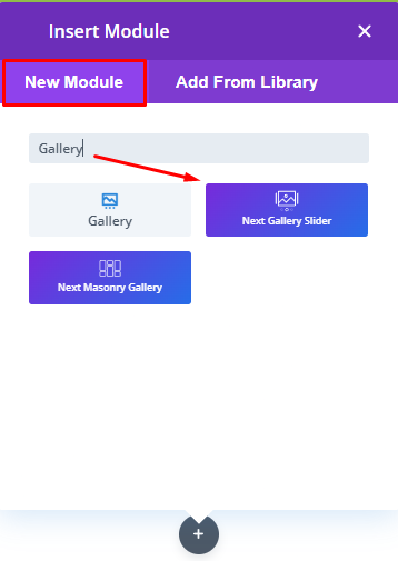
Select the gallery slider module from the visual builder by searching for it in all Divi essential plugin modules, then just click on it.
Step 4:
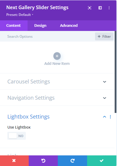
Now add some items. In each “Add Item,” upload the image. Upload all the same-size images for all items. You can also remove any item by clicking on the trash icon.
With the latest content feature, you can now add content over the sliding images to provide additional information to your viewers.
There are three options available for adding content over the sliding images:
Title: This option allows you to add a title to each image in the slider. The title can be used to provide a brief description of the image or to give it a specific name.
Content: The content option allows you to add a longer description or explanation for each image in the slider. This can be used to provide more context or information about the image to your viewers.
Button Text: With this option, you can add a call-to-action button over the sliding image. The button can be used to encourage your viewers to take a specific action, such as visiting a particular page or downloading a file.
By using these options, you can create a more engaging and informative gallery slider that will help to capture the attention of your viewers and keep them engaged with your content.
Step 5:
In each item, you may notice the top gallery and bottom gallery of each image. The settings are the same for both options.
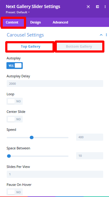
Autoplay: One of the essential features of the carousel settings is autoplay, which allows the slider to automatically move through the images without the need for user interaction. By enabling this option, you can view and adjust the Autoplay Delay, which determines the length of time before the slider moves to the next slide.
Loop: Another useful option in the carousel settings is Loop, which makes the slider go over in a loop, providing a smoother and more continuous viewing experience. By enabling this option, the first slide appears after the last slide, creating a seamless effect.
Center Slide: The Center Slide option in the Carousel Settings highlights one of the slides that are currently in view. This option is particularly helpful when you want to focus on a specific image, product, or message.
Speed: The Speed option allows you to adjust the slider’s speed, which can affect the overall user experience. You can increase or decrease the speed to achieve the desired effect.
Space Between: Another critical setting in the carousel settings is Space Between, which determines the distance between the items added. By adjusting this setting, you can create a more organized and aesthetically pleasing slider.
Slides Per View: Lastly, the Slides Per View option allows you to choose a specific number of slides you want to appear on your website, which can depend on the size of your screen or the amount of content you want to display.
Step 6:
The Navigation Settings in the Content Tab of Divi Gallery Slider offer a range of options for controlling the slider’s navigation tools. By selecting and adjusting these options, you can provide users with a more engaging and interactive experience while browsing your content.
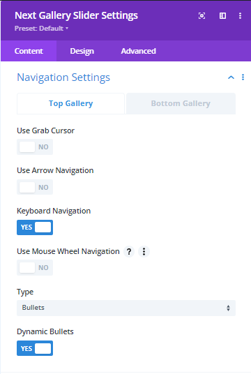
One of the options available in the Navigation Settings is the Grab Cursor, which displays a hand tool to move the slider manually. This option can make it easier for users to interact with the slider and navigate through the content.
Another important feature in the Navigation Settings is Arrow Navigation, which puts arrows on each side of the slider design and moves the slider on click. This option can be useful when you want to give users more precise control over the slider’s movement.
The Keyboard Navigation option enables users to move the slider using the arrow buttons on their keyboard. This feature is particularly helpful for users who prefer to navigate content using keyboard commands.
Mousewheel Navigation allows users to move the slider using the mouse scroller. This option can provide a more seamless and intuitive experience, especially for users who prefer using a mouse over a keyboard.
In the Navigation Settings, you can also select the type of slider, which can be in bullet, fraction, or progress bar format. Each type offers a different visual representation of the slider’s navigation, and you can choose the one that best suits your content and design.
The Dynamic Bullets option helps show the active bullet when sliding, which can help users keep track of their location within the slider. This feature is especially useful for sliders with many slides, as it provides a visual cue that indicates the user’s progress.
Lightbox Settings: Enable it if you want to view the images after clicking the images of each item.
Style the Design Tab
Step 7: To color the arrows, you may go to the design tab and just choose your favorite one. In addition to the color settings, the Design tab of the Divi Gallery module also provides arrow settings, which allow you to adjust the position and size of the arrows within your gallery.
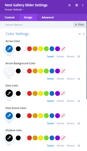
Step 8: From here, just set the arrow size and arrow position. It can stay as the default, or you may select the inner or outer. You can adjust the font size of the arrows to ensure they are legible and easy to use for your users. This is especially important for galleries with smaller images, where the arrows may need to be resized for better visibility.
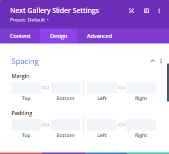
Step 9: Adjust the arrow’s margin and padding, and you may also adjust the gallery slider module’s margin and padding from here. Also, you may notice the border settings to set the module’s border, box-shadow, filters, transform, animation, etc.
Step 10: Now, finally, your gallery slider is ready from both sides: the content tab and the design tab are amazing, right? Let’s check out the latest gallery slider design from the front end of your WordPress website.
Key Features of Divi Gallery Slider
- Fully customizable: The Divi Gallery Slider module is highly customizable, allowing you to adjust the layout, style, and functionality to meet your specific needs. You can choose from a range of options for things like image size, transition effects, and navigation controls.
2. Easy to use: This module is designed to be user-friendly, even for those with little or no experience with web development. The drag-and-drop interface makes it easy to add and arrange images, while the intuitive settings panel lets you customize the gallery to your liking.
3. Mobile-friendly: With more and more people accessing the internet on their mobile devices, it’s crucial to ensure that your website is optimized for mobile viewing. The Divi Gallery Slider module is fully responsive, meaning that it will look great on any device.
Conclusion:
The Divi Gallery Slider module is an excellent tool for anyone looking to showcase their work in an eye-catching and interactive way. With its easy-to-use interface and wide range of features, this module is suitable for both beginners and experienced web developers. So why not give it a try and see how it can help take your website to the next level?


