A multiple content creation tool and a versatile design tool allowing users to create unique web content
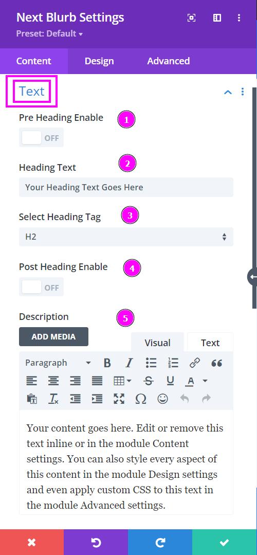
Content → Text
- Pre-Heading Enable – type the pre-heading text
- Heading Text – Include a relevant heading text
- Select Heading Tag – as the name suggests select the specific heading tag
- Post-Heading Enable – type the post-heading text
- Description – add a description to your blurb design
Content → Image & Icon
This is where you begin structuring your blurb design. Progress to having a more visionary look and feel using the Blurb to create your content.
- Use Icon – enable the switch to include an icon to the blurb module design
- Image – select an image that goes with the content for the blurb
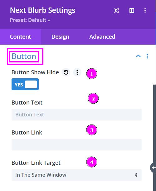
Content → Button
- Button Show Hide – enable to open the options to add a button
- Button Text – type in what the button should be called
- Button Link – Include a link to the button
- Button Link Target – specify how the link would open when clicked.
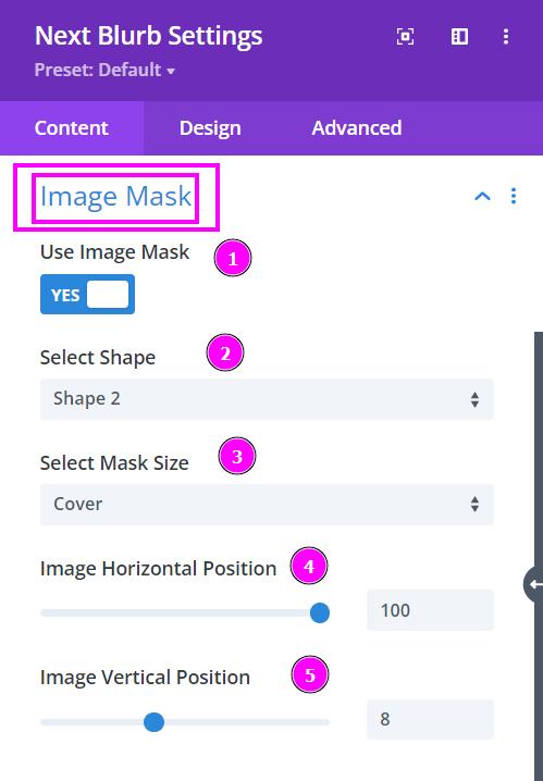
Content → Image Mask
- Use Image Mask – enable the switch to use Image Mask
- Select Shape – select a prebuilt shape to mask the image to
- Select Mask Size – select how you want the image to cover or contain within the shape of the mask
- Image Horizontal Position – adjust the horizontal position of the image within the shape
- Image Vertical Position – adjust the vertical position of the image within the shape
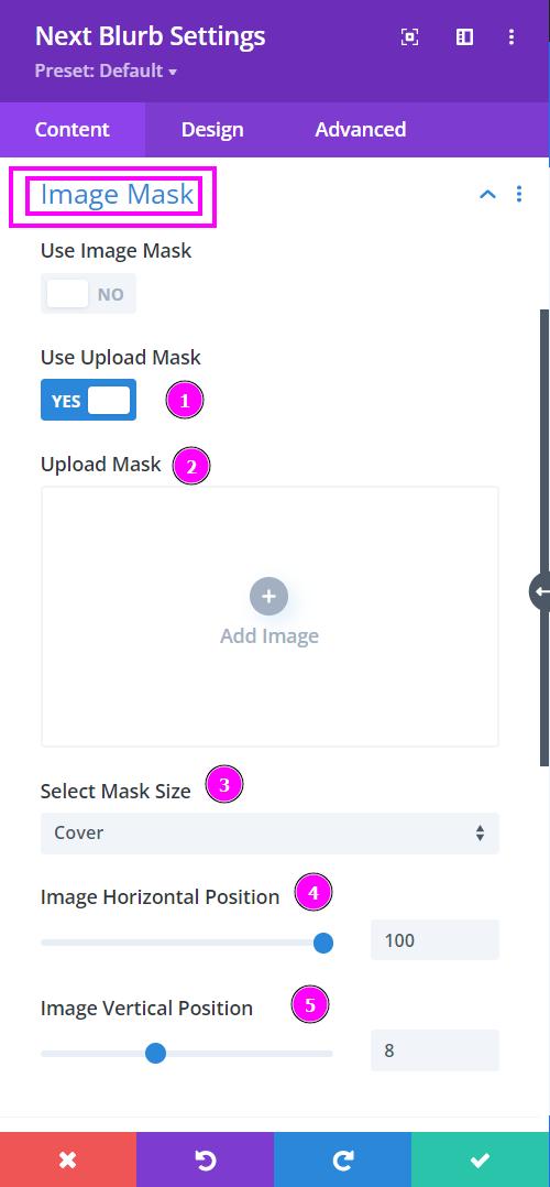
Content → Image Mask
- Use Upload Mask – enable the switch to use Image Mask
- Upload Mask – Upload the custom mask available as an SVG file
- Select Mask Size – select how you want the image to cover or contain within the shape of the mask
- Image Horizontal Position – adjust the horizontal position of the image within the shape
- Image Vertical Position – adjust the vertical position of the image within the shape
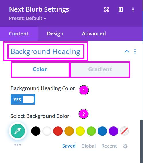
Content → Background Heading
- Background Heading Color – enable to view the background color settings
- Select Background Color – select the background color using the pointer or simply add the hex code to get the exact color required
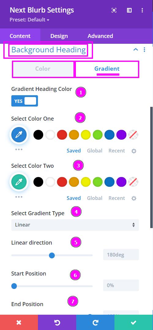
Content → Background Heading
Gradient settings for any color-applying features are the following:
- Gradient Heading Color – enable to view the gradient settings
- Select Color One – select a color for the top
- Select Color Two – select the color for the bottom part of the background
- Select Gradient Type – select a type of gradient for your design either Linear or Radial
- Linear/Radial Direction – adjust the direction of the colors within the background
- Start Position – adjust the start position using the slider
- End Position – adjust the end position of the color
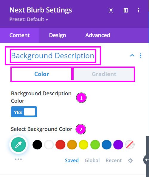
Content → Background Description
- Background Description Color – enable to view the background color settings
- Select Background Color – select the background color using the pointer or simply add the hex code to get the exact color required
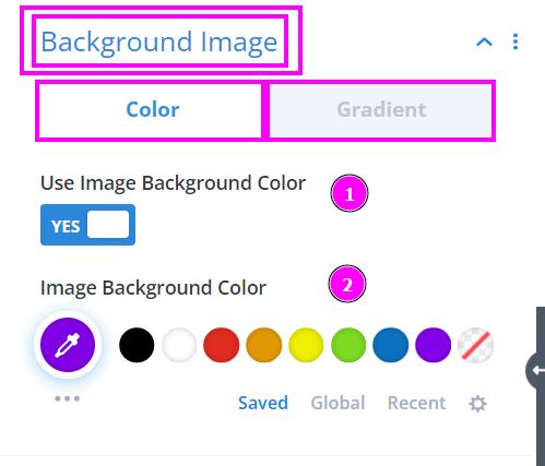
Content → Background Image
- Use Background Image Color – enable to view the background color settings
- Image Background Color – select the background color using the pointer or simply add the hex code to get the exact color required
Content → Background Icon
- Use Icon Font Background Color – enable to view the background color settings
- Icon Background Color – select the background color using the pointer or simply add the hex code to get the exact color required
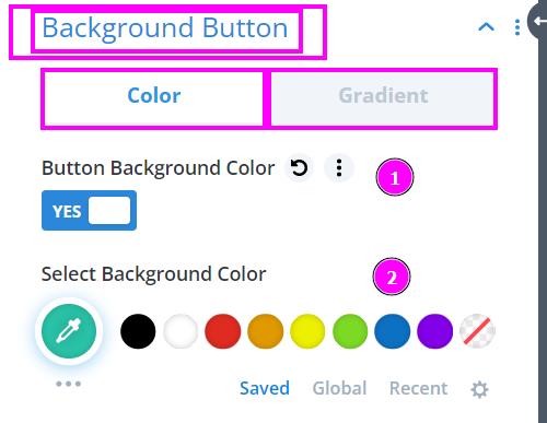
Content → Background Button
- Button Background Color – enable to view the background color settings
- Select Background Color – select the background color using the pointer or simply add the hex code to get the exact color required
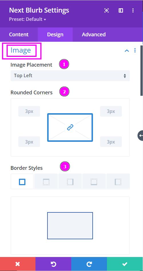
Design → Image
- Image Placement – choose where the image should be displayed
- Rounded Corners – adjust the four corners to apply rounded corners
- Border Styles – add a border on each side or on all four sides
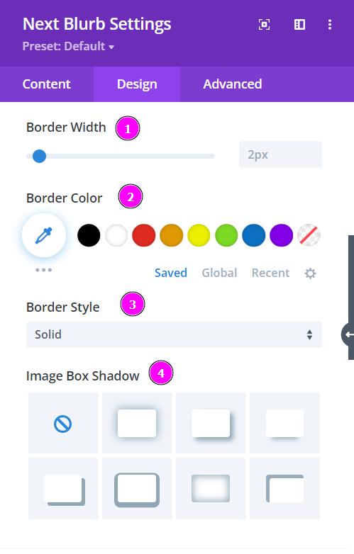
Design → Image (continuation)
- Border Width – adjust the image’s border width using the slider
- Border Color – select a color for the border using the pointer or simply put the hex code to get the exact color required
- Border Style – select a prebuilt style of the border for the image
- Image Box Shadow – add a box shadow to the image
Design → Icon
- Icon Color – select a color for the icon using the pointer or simply put the hex code to get the exact color required
- Icon Font Size – resize the icon using the slider
- Rounded Corners – adjust the four corners to apply rounded corners
- Border Styles – add a border on each side or on all four sides
Design → Icon (continuation)
- Border Width – adjust the width of the border using the slider.
- Border Color – pick a color for the border you’ve added.
- Border Style – select a style of the border from the premade border styles
- Box Shadow – add a box-shadow to the text element
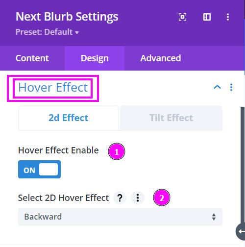
Design → Hover Effect
- Hover Effect Enable – enable to view the list of premade hover effects
- Select 2D Hover Effect – select a hover effect from the list of effects available here
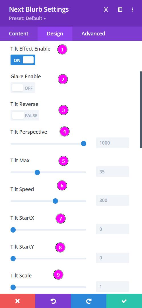
Design → Hover Effect (Tilt)
- Tilt Effect Enable – turn the switch on to view the tilt effect settings
- Glare Enable – when enabled, add a glare to the image as you hover on it
- Tilt Reverse – reverse the tilt effect by enabling the tilt reverse
- Tilt Perspective – adjust the perspective of the tilt as it shifts in all directions. Changing the perspective allows the tilt to stretch more as hovered on.
- Tilt Max – adjust the max perspective of the tilt effect
- Tilt Speed – configure the speed and motion at which the tilt effect is moving
- Tilt StartX – allows the tilt effect to stretch to the right before hovering
- Tilt StartY – allows the tilt effect to be slanted from the bottom before hovering
- Tilt Scale – adjust the scale of the tilt effect to have it zoomed in when hovered on
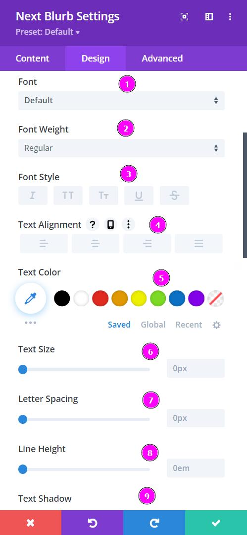
Design → Title Text (Pre | Heading | Post)
- Font – Select a font from the collection or use a custom font.
- Font Weight – this is where you define how you want your font to show either regular, italic, bold extra, or even extra light.
- Font Style – Pick a style of font for both front and back.
- Text Alignment – align the text for both the front and back text.
- Text Color – manually select a color for the background of the text using the pointer or you can simply state the hex code and get the exact color you require.
- Text Size – easily resize the text for both the front and back parts of the flip box.
- Letter Spacing – space out the letters using the slider for an easier read for the website visitors.
- Line Height – easily include gaps between the lines using the slider
- Text Shadow – add text shadow to have the texts highlighted.
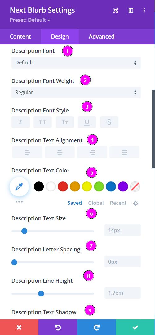
Design → Description Text
- Font – Select a font from the collection or use a custom font.
- Font Weight – this is where you define how you want your font to show either regular, italic, bold extra, or even extra light.
- Font Style – Pick a style of font for both front and back.
- Text Alignment – align the text for both the front and back text.
- Text Color – manually select a color for the background of the text using the pointer or you can simply state the hex code and get the exact color you require.
- Text Size – easily resize the text for both the front and back parts of the flip box.
- Letter Spacing – space out the letters using the slider for an easier read for the website visitors.
- Line Height – easily include gaps between the lines using the slider
- Text Shadow – add text shadow to have the texts highlighted.
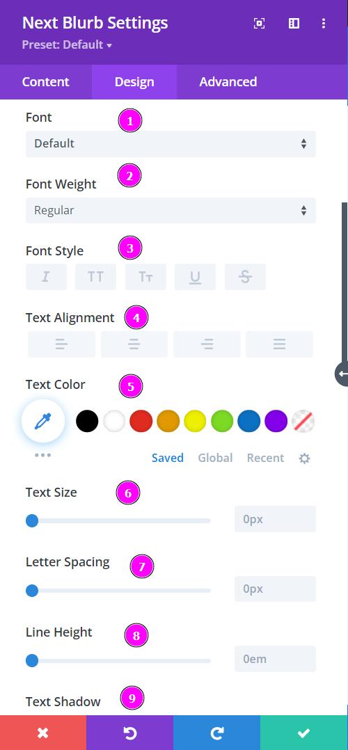
Design → Button Text
- Font – Select a font from the collection or use a custom font.
- Font Weight – this is where you define how you want your font to show either regular, italic, bold extra, or even extra light.
- Font Style – Pick a style of font for both front and back.
- Text Alignment – align the text for both the front and back text.
- Text Color – manually select a color for the background of the text using the pointer or you can simply state the hex code and get the exact color you require.
- Text Size – easily resize the text for both the front and back parts of the flip box.
- Letter Spacing – space out the letters using the slider for an easier read for the website visitors.
- Line Height – easily include gaps between the lines using the slider
- Text Shadow – add text shadow to have the texts highlighted.
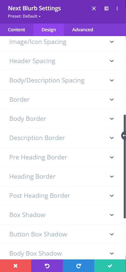
Here we present to you the Spacing, Border, and Shadow features for each toggle.
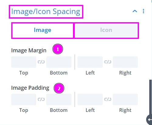
Design → Image/Icon Spacing
- Image Margin – margin adds extra space to the outside of an element, increasing the distance between the element and the other items on the page
- Image Padding – padding adds extra space to the inside of the element, increasing the distance between the edge of the element and its inner contents
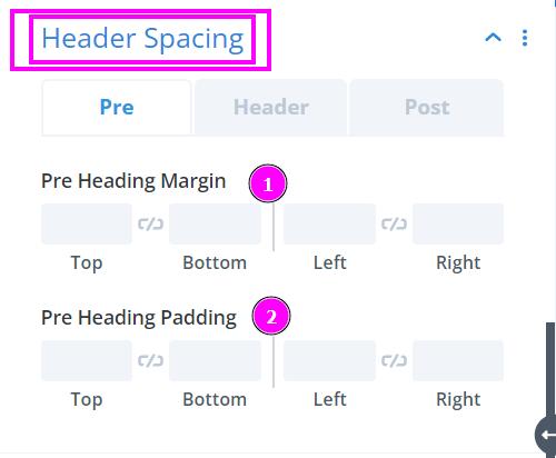
Design → Header Spacing (Pre | Header | Post)
- Margin – margin adds extra space to the outside of an element, increasing the distance between the element and the other items on the page
- Padding – padding adds extra space to the inside of the element, increasing the distance between the edge of the element and its inner contents
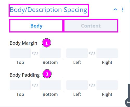
Design → Body/Description Spacing
- Body Margin – margin adds extra space to the outside of an element, increasing the distance between the element and the other items on the page
- Body Padding – padding adds extra space to the inside of the element, increasing the distance between the edge of the element and its inner contents
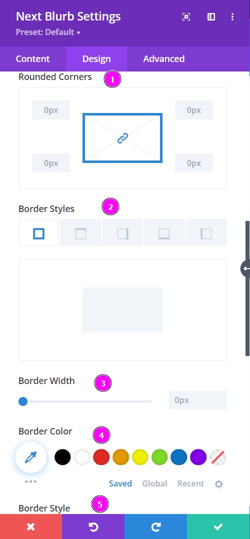
Design → Border
- Rounded Corners – adjust the four corners to include rounded corners
- Border Styles – include borders on any side of the text or all four sides.
- Border Width – adjust the width of the border using the slider.
- Border Color – pick a color for the border you’ve added.
- Border Style – select a style of the border from the premade border styles.
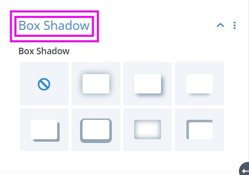
Design → Box Shadow
Include box-shadow to the entire design. Choose the best one from the following shadows and adjust them to your liking.
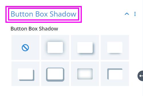
Design → Button Box Shadow
Include a box-shadow to the Button. Choose the best one from the following shadows and adjust them to your liking.
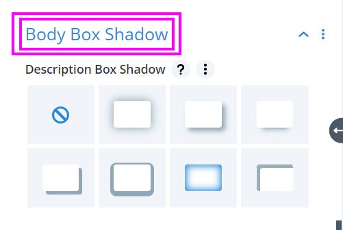
Design → Body Box Shadow
Include a box-shadow in the Description. Choose the best one from the following shadows and adjust them to your liking.


