Create unique buttons with its down-to-earth features.
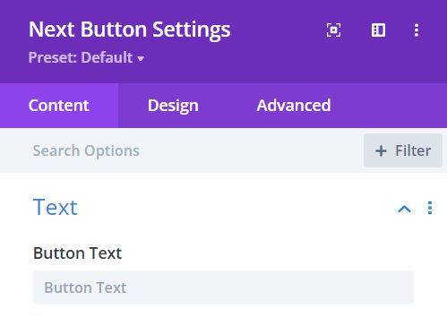
Content → Text
Button Text – type the text you want to place on your button.
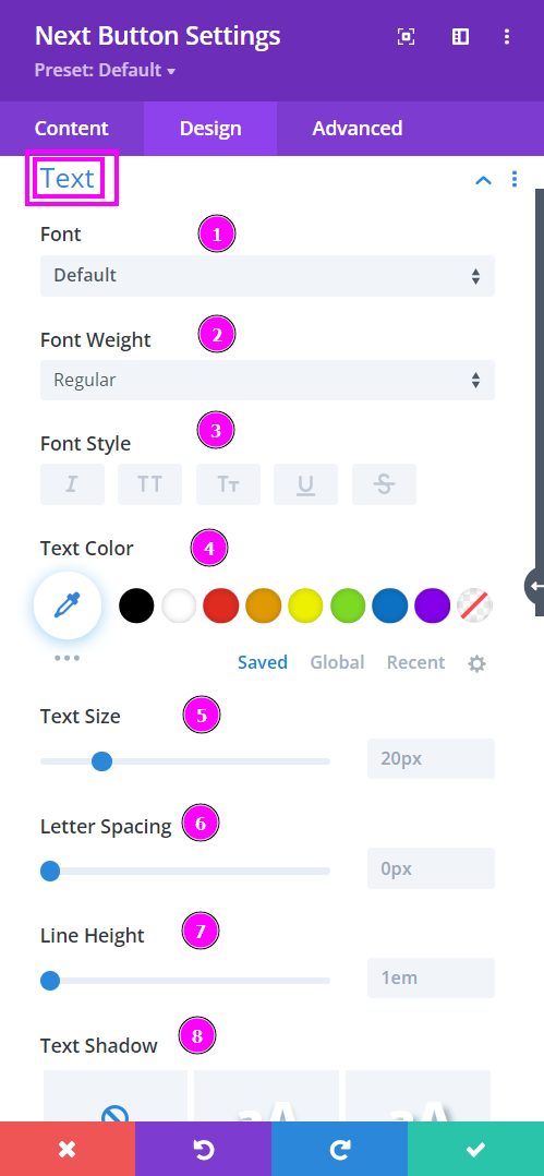
Design → Text
- Font – Select a font from the collection or use a custom font.
- Font Weight – define how you want your font to show either regular, italic, bold extra, or even extra light.
- Font Style – Pick a style of font for the design.
- Text Color – choose a color for the text.
- Text Size – easily resize the text using the slider. This feature is for desktops, tablets, and phones.
- Letter Spacing – adjust the spacing between the letters using the slider.
- Line Height – adjust the space between the lines using the slider.
- Text Shadow – select a prebuilt shadow for your text.
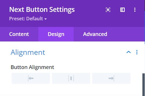
Design → Alignment
Button Alignment – align your button to the left, center, or right.
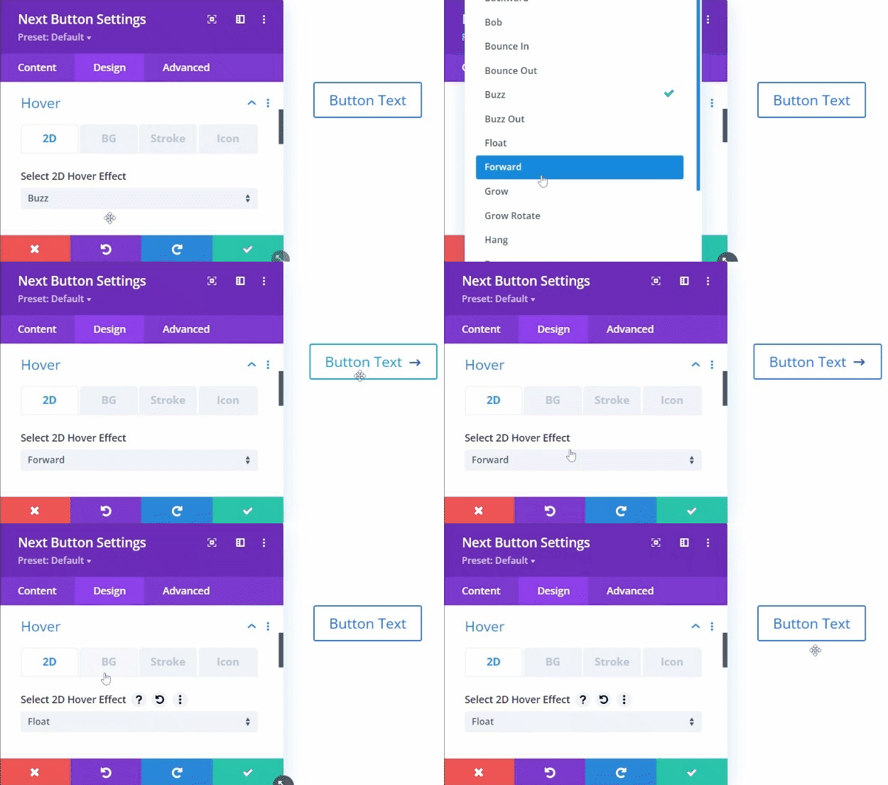
Design → Hover
Hover 2D – from the collection of hover effects select the best 2D hover effect.
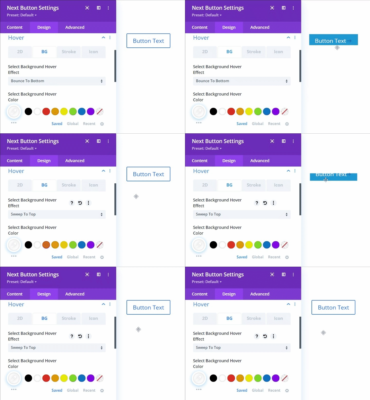
Design → Hover (continued)
Hover BG – Select the best Background hover effect from the collection of hover effects.
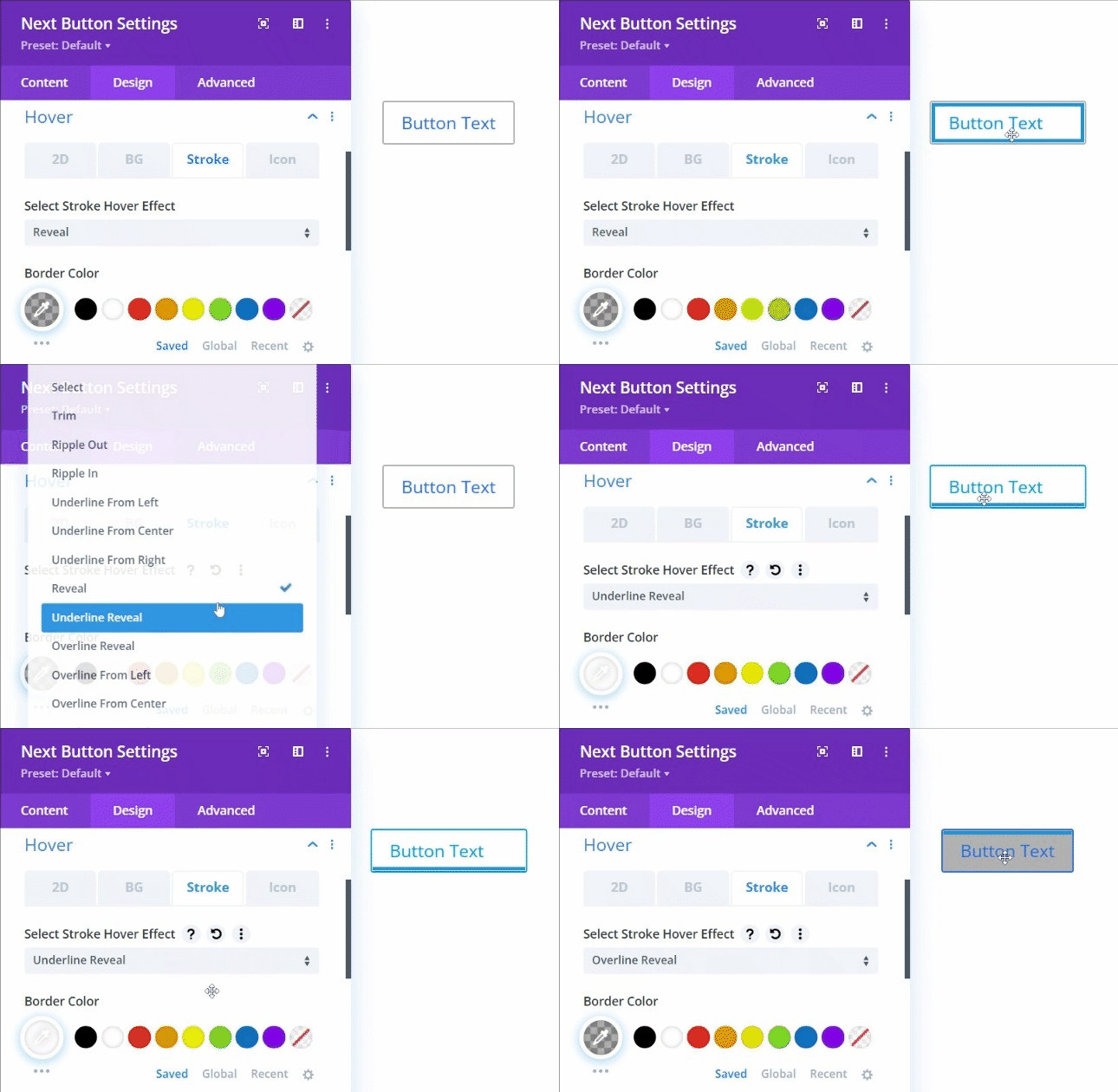
Design → Hover (continued)
Hover Stroke – Select the best stroke hover effect from the collection of hover effects.
Design → Hover (continued)
Hover Icon – Select the best Icon hover effect from the collection of hover effects.
Design → Icon
- Show Icon – enable to show/choose an icon.
- Button Icon – choose an icon for your button from the collection of icons.
- Button Icon Color – choose a color for the icon.
- Button Icon Placement – select a position for the icon.
- Only Show Icon on Hover for Button – show icon on hover for the button.