Divi Carousel Module
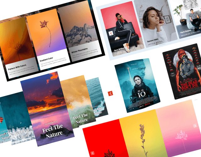
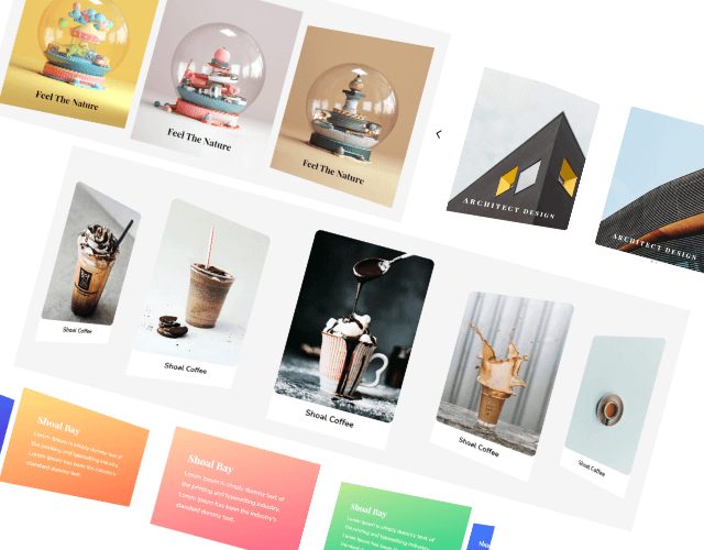
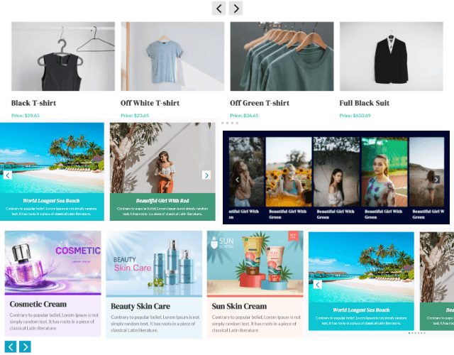
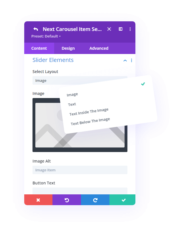
The carousel’s items are divided into four layouts allowing you to choose between image, text, text inside image, and text below the image. In your carousel design, you can display an infinite number of items!



Slider
Add Versatile Slider Stylizing Design Options
Here you can add as many relevant image items as you like. When you use text for the carousel, you have amazing options to stylize your text. Another brilliant feature is the option to add text below the images! Carousel is now very versatile. It is ready to fulfill your design needs.
Feature
Personalize Carousel Settings
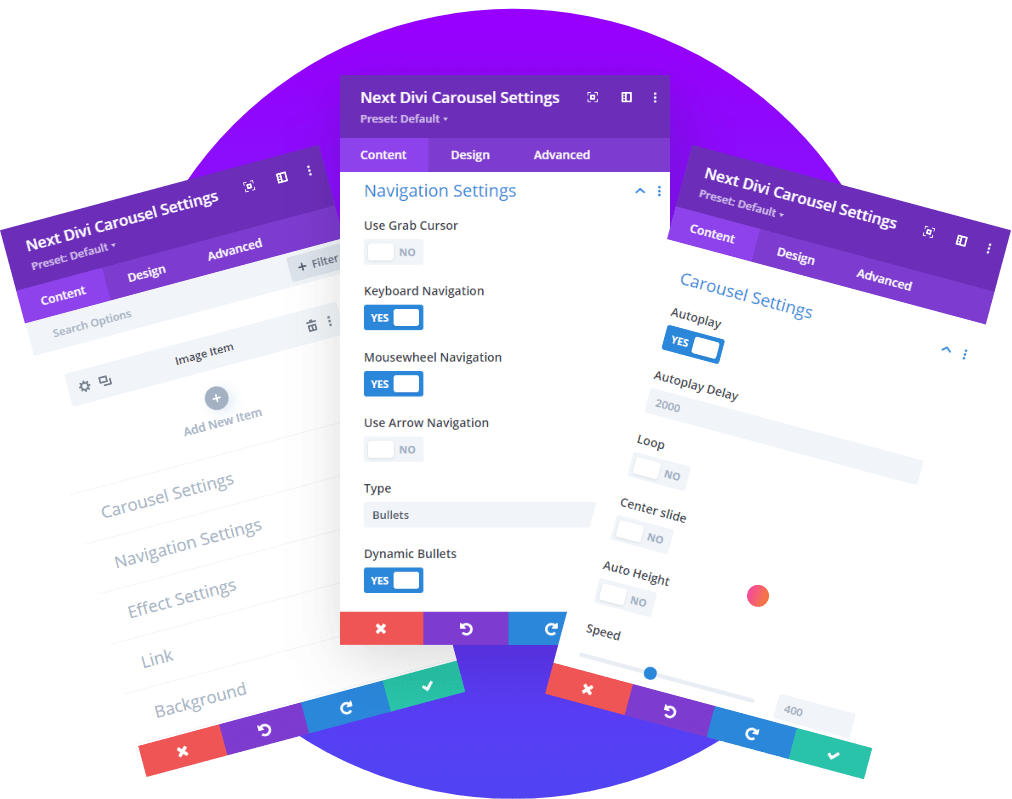
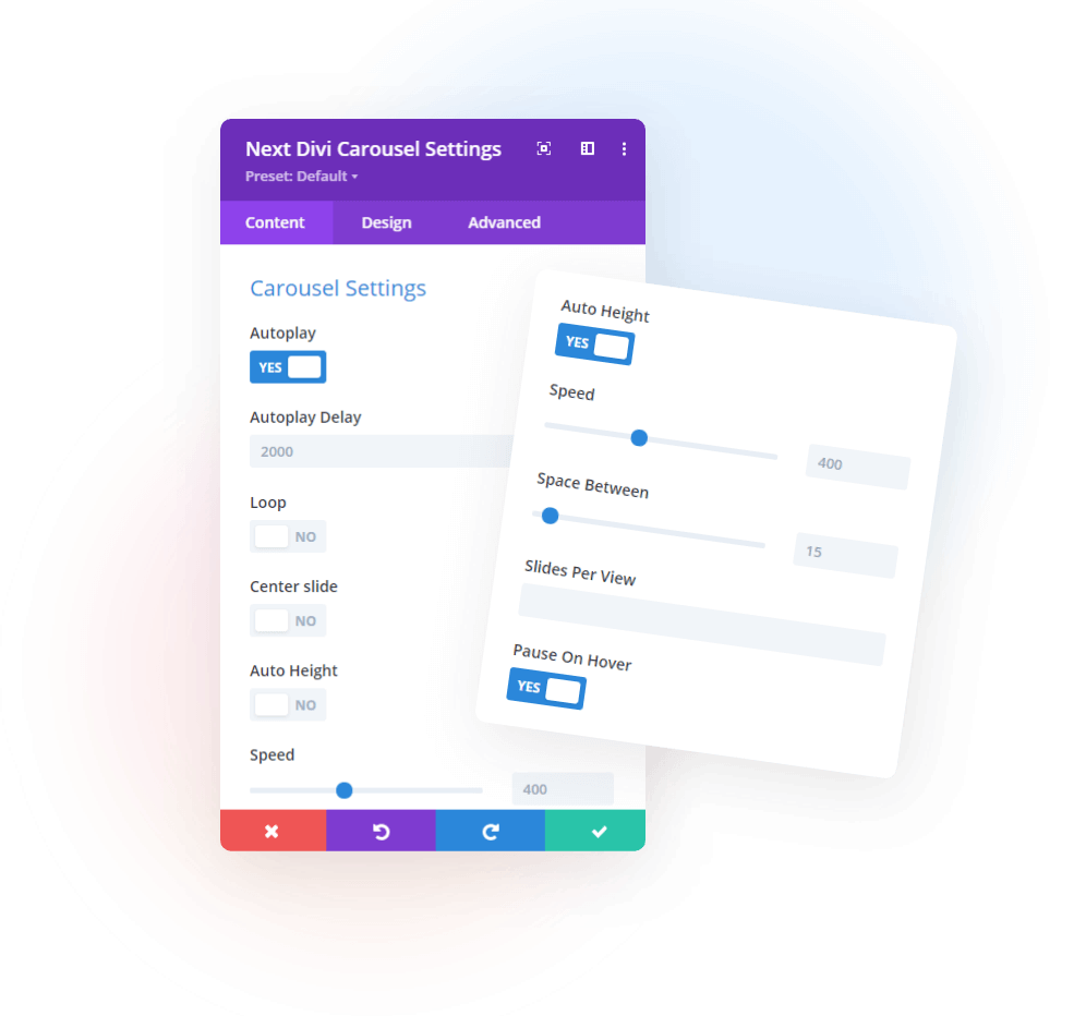
Get great features that help you adjust the speed much more easily. You can choose what works for you. There’s a Center Slide that will help the current image to be centered, there’s Auto Height, Slides per view, and finally, Pause on Hover when enabled, this pauses the slider and makes a stop on the image.

Feature
Configure Navigation Settings
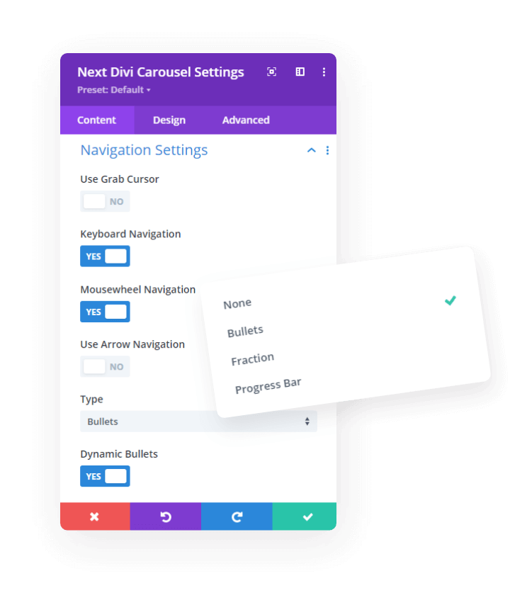
For those who prefer manual sliders, we have the Arrows and Grab Cursor features. With Mouse Wheel navigation you can slide using the scrolling wheel of your mouse when enabled. And as for keyboard navigation, you can use the arrows on your keyboard to help slide the images.
Feature
Modify Carousel Effect Settings
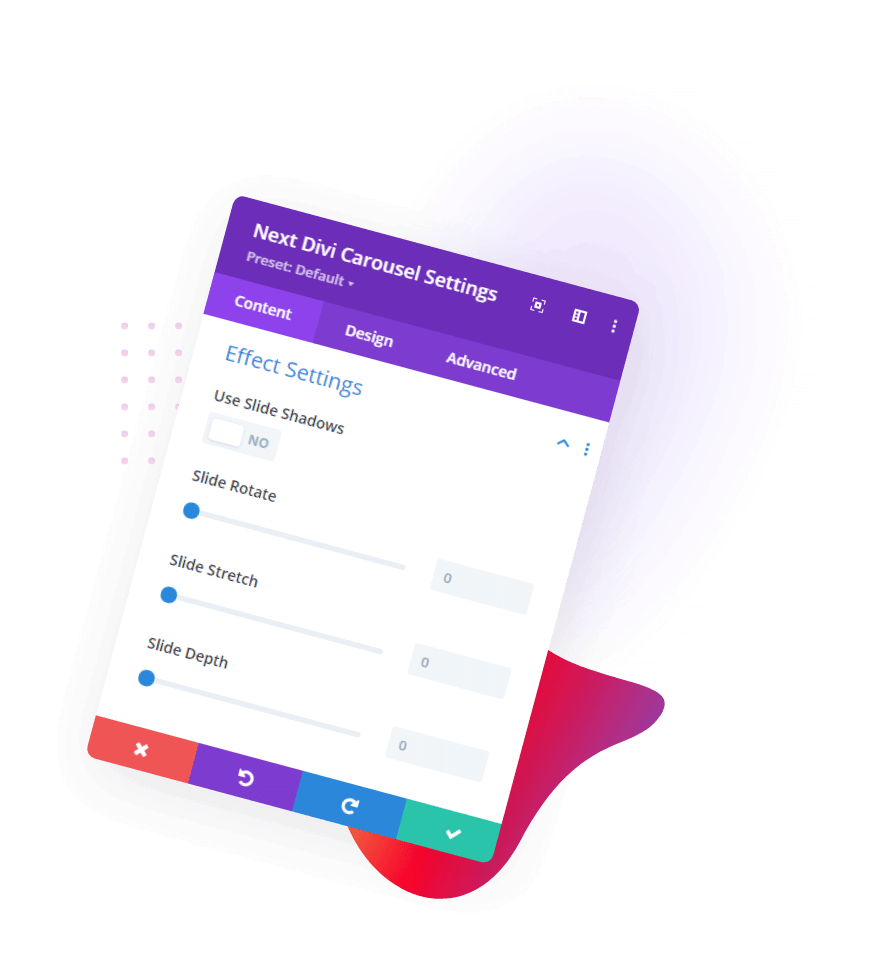
This contains some stylish features like Slide Rotate, Stretch, and Depth. These help you put on cool effects to the items within the Carousel module.

Feature
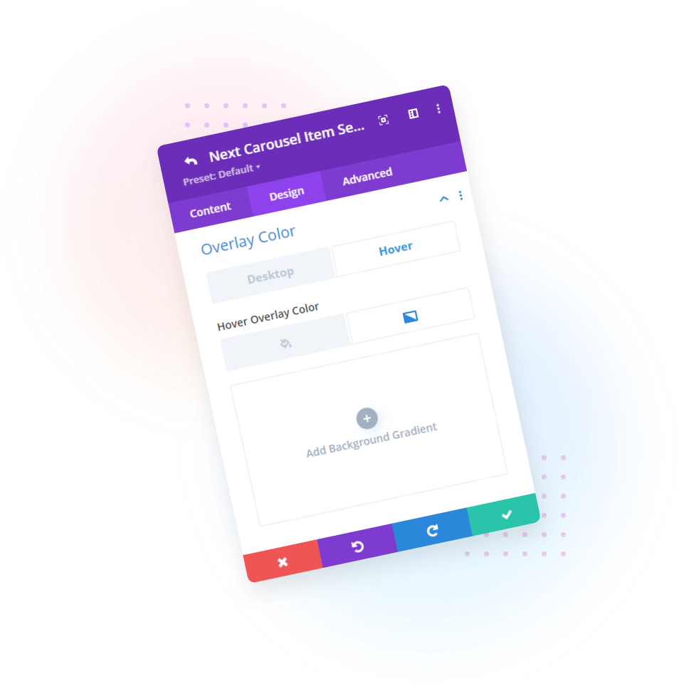
Add Overlay Color On Slider Image
Here in the Design tab, we have an Overlay Color toggle. You can add beautiful shades of color using Gradient. And you can also go with a fill color. Have fun with it.
