Add beautiful Images on a cube-like slider that will showcase the brand of your company, your products, and it’s so versatile you can create all kinds of interesting cube designs!
Content
Content →Add New Item → Image
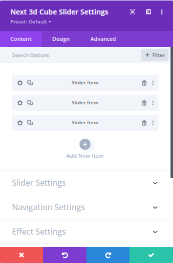
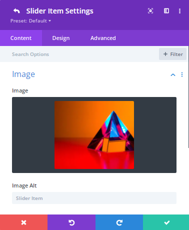
From here you can add multiple images using this toggle
Content →Add New Item → Image → Text
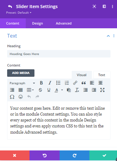
Using this feature you can add your thoughts or images related texts. Also you can attract your visitors by showing the texts above the image here.
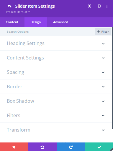
Content →Add New Item → Design → Heading Settings
Use this option to add the Heading level. You can set the Font here as well as the Font weight, Font style and the text Alignment. Here you can stylize the texts more by adding different colors.
Content →Add New Item → Design → Content Settings
This valuable option gives you the opportunity to change the text Horizontal Position as well as the Vertical Position.
You can set the Font here as well as the Font weight, Font style, and Text Alignment. Here you can stylize the texts more by adding different colors.
Content →Add New Item → Design → Spacing
For stylizing your Headings, Contents then you can use here the Margin,Padding options.
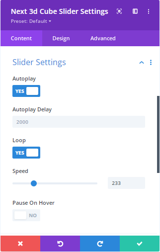
Content → Slider Settings
Autoplay: Enable it to run the slider. You can disable it as well to turn off the slider.
Auto Delay: Use this option to delay the functionality.
Loop: Content entered here will appear inside the module and by enabling this you the slider will be moving round . Here you can disable it by turning off the loop option.
Speed: Use this option to increase or decrease the speed of the slider.
Pause on Hover : You can pause the slider for a moment if you enable this option. Visitors might want to pause the slider to check the text of images. In that case this option is important for them. You can disable this option by turning off.
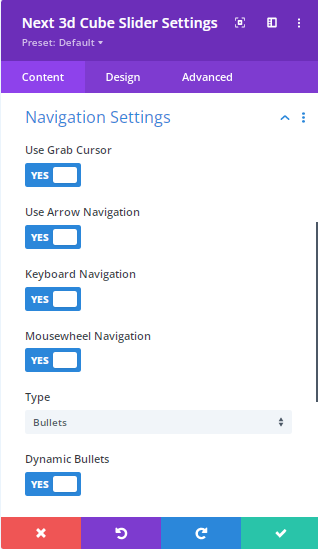
Content → Navigation Settings:
Grab Cursor: Using this you are able to grab the slider easily.
Enable or Disable it when you need it.
Arrow Navigation: This important navigation adds the style of the slider. By symbolizing this option you can present the slider in an organized way.
Keyboard Navigation: Using this navigation you can change the slider by using your keyboard without any effort.
Select a Type : Here you can select several types such as Bullets/Fraction/Progress Bar to understand the images changing moment of the slider.
Dynamic Bullet : Enable/Disable this option to use the Dynamic Bullets.
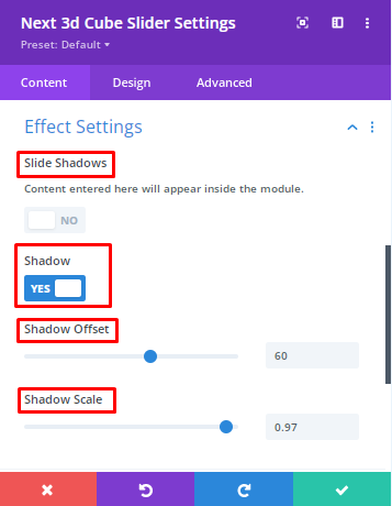
Content → Effect Settings:
Slide Shadow: Slide Shadow property is used to apply one or several shadows to an element. Use this option to specify a Horizontal also a Vertical Shadow.
Enable or Disable this option when you need it.
Shadow → Shadow Offset:
Shadow Scale: This scale is wonderful cause using this you are able to show your visitor a unique shadow feature here.
Design
Design→Image Settings:
Use this option to stylize the image rounded corners, image border styles, Image Border Width, Image Border Color, Image Border Style, Box shadow.
Design → Heading Settings:
Choose this option to stylize the Texts Font, Font weight, Font Style, Text Alignment, Text Size, Text Spacing, Line Height, Text Shadow, Heading Border width, Heading Border Color, Heading Border Style etc
Design → Content Settings:
This valuable option gives you the opportunity to change the text Horizontal Position as well as the Vertical Position.
You can set the Font here as well as the Font weight, Font style and the text Alignment. Here you can stylize the texts more by adding different colors.
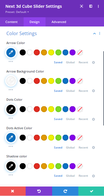
Design → Color Settings:
Stylize your slider’s Arrow, Arrow Background, Dots, Shadow by adding colors by using this option
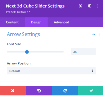
Design → Arrow Settings:
Use this option to increase or decrease the size of Arrow . Also you can change the position of an arrow by adding the inner/outer option. Moreover, you can set this default functionality here.
Design → Sizing:
Choose this option to change the width, Max width, Module Alignment, Height etc of the 3D Cube Slider.
Design → Spacing:
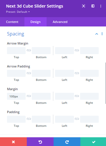
After adding multiple design elements, you can decide how the designs relate to each other by the amount of space between them. Without spacing, it will be hard for a user to check a page and it will be tough for them to know what items that are related and what are not.
You can stylize the Arrow margin, Arrow padding as well as the Module Margin padding.
