

Content → New Item
Within the content tab, we have the option for you to add new items. You can add as many items as you like here.

Content → Slider Elements → Six Layouts
There are six layouts within Slider Elements. You can pick any of them for each item according to your requirement.
Here are the four layouts:
- Image
- Text
- Text Inside The Image
- Text Below The Image
- Left Image, Right Content
- Right Image, Left Content

Content → Slider Elements → Image Layout
Within an item, if you went for the image layout, place an image of your choice.

Content → Slider Elements → Text Layout
We are showing you the text layout above. Here you can add text as a carousel slider item.

Content → Slider Elements → Text Inside The Image
In the Text Inside The Image layout, you can add text to the image which will appear on the image.

Content → Slider Elements → Text Below The Image
In the Text Below The Image layout, you can include the text below the image just as the name suggests.

Content → Slider Elements → Left Image, Right Content
In the Left Image, Right Content layout, you can include the text to the right side of the image just as the name suggests.

Content → Slider Elements → Right Image, Left Content
In the Right Image, Left Content layout, you can include the text to the left side of the image.

Content → Slider Elements → All Six Layouts → Button Text, Link, and Link Target
Within all six layouts in the Slider Elements, we have included the Button setting where you can add Button Text, Link, and Button Link Target.

Content → Carousel Settings
- Autoplay – enable to view the settings for the autoplay
- Loop – enable to have the slider go over in a loop for a smoother view
- Autoplay Delay – adjust the delay using the slider provided
- Center Slide – highlight one of the slides that are in view
- Auto Height – enable to automatically configure the height for all items
- Equal Height – enable to have the items arranged in equal height
- Speed – adjust the speed of the slider
- Space Between – adjust the space between the items added
- Slides Per View – pick a specific number of slides you want to appear on your website. Finally,
- Pause on Hover – allows the slider to pause when you hover on it.

Content → Navigation Settings
In the Navigation Settings, you have the option to select the provided navigation tools.
- Grab Cursor shows a hand tool for you to move the slider manually.
- Keyboard Navigation helps the slider move with the keyboard arrow buttons
- Mousewheel Navigation – this helps the slider move using the mouse scroller.
- Arrow Navigation puts arrows on each side of the design and on click you can move the slider.
- Type – select a type for the slider like in bullet, fraction, or progress bar
- Dynamic Bullets helps show the active bullet when sliding.

Content → Effect Settings
The Effect Settings feature helps put a little effect on all of the items in the slider.
- Use Slide Shadows – Add a little shadow to all of the items by enabling the Use Slide Shadow option
- Slide Rotate – adjust Slide Rotate so the items will slide with the rotation level applied to the item.
- Slide Stretch – adjust the space between the items.
- Slide Depth – adjust the slider to include a little depth between each item you can bring them all packed closer or take items far apart from one point on the surface.
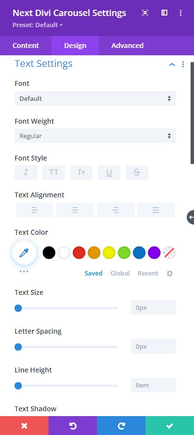

Design → Text Setting
Within Text Settings, you have everything you need to stylize your text.
- Font – Select a font from the collection or use custom font.
- Font Weight – this is where you define how you want your font to show either regular, italic, bold extra, or even extra light.
- Font Style – Pick a style of font for both front and back.
- Text Alignment – align the text for both the front and back text.
- Text Color – manually select a color for the background of the text using the pointer or you can simply state the hex code and get the exact color you require.
- Text Size – easily resize the text for both the front and back parts of the flip box.
- Letter Spacing – space out the letters using the slider for an easier read for the website visitors.
- Line Height – easily include gaps between the lines using the slider
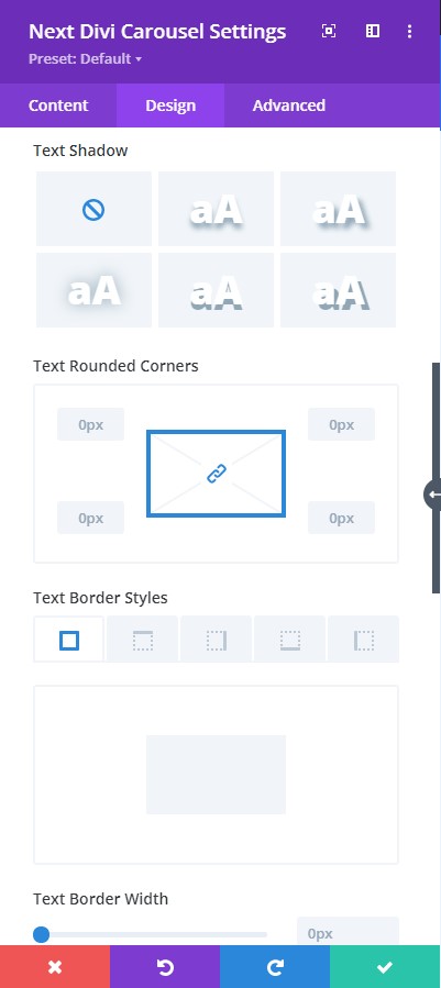
- Text Shadow – add text shadow to have the texts highlighted.
- Text Rounded Corners – adjust the four corners to include rounded corners to the text.
- Text Border Styles – include borders on any side of the text or all four sides.
- Text Border Width – adjust the width of the border using the slider.
- Text Border Color – pick a color for the border you’ve added.
- Text Border Style – select a style of the border from the premade border styles.
- Box Shadow – add a box-shadow to the text element.
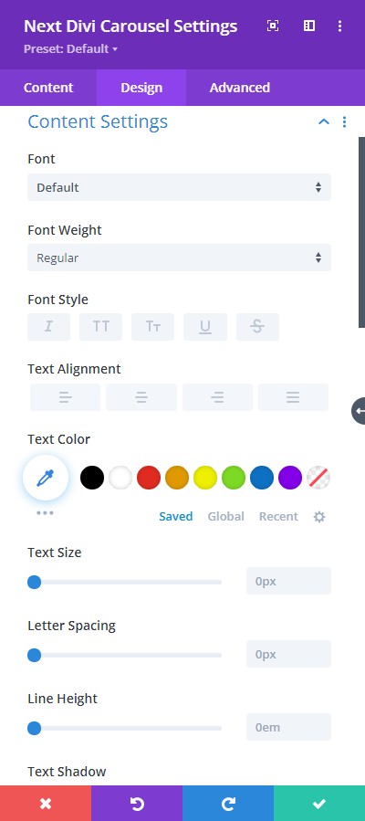

Design → Content Settings
Within Text Settings, you have everything you need to stylize your text.
- Font – Select a font from the collection or use custom font.
- Font Weight – this is where you define how you want your font to show either regular, italic, bold extra, or even extra light.
- Font Style – Pick a style of font for both front and back.
- Text Alignment – align the text for both the front and back text.
- Text Color – manually select a color for the background of the text using the pointer or you can simply state the hex code and get the exact color you require.
- Text Size – easily resize the text for both the front and back parts of the flip box.
- Letter Spacing – space out the letters using the slider for an easier read for the website visitors.
- Line Height – easily include gaps between the lines using the slider
- Text Shadow – add text shadow to have the texts highlighted.
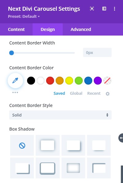
- Content Rounded Corners – adjust the four corners to include rounded corners to the text.
- Content Border Styles – include borders on any side of the text or all four sides.
- Content Border Width – adjust the width of the border using the slider.
- Content Border Color – pick a color for the border you’ve added.
- Content Border Style – select a style of the border from the premade border styles.
- Box Shadow – add a box-shadow to the text element.
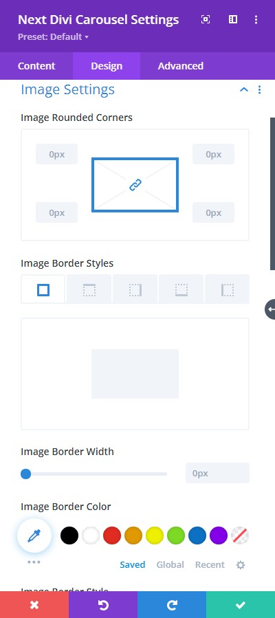
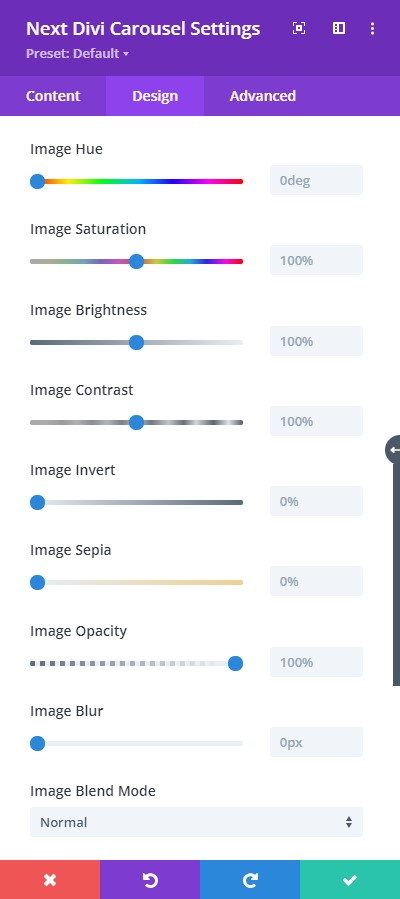
Design → Image Settings
Image Settings allow you to stylize the image you’ve added to your design layout.
To elaborate, we have some helpful design tools present here.
- Add rounded corners to the image items
- Include border style, border width, and color to the borders
- Choose a premade border style from the list of border style
- Adjust image filter using the editing tools provided.
- There’s Image Blend Mode for quick image edit
- You can also add box-shadow to the images

Design → Color Settings
In Color Settings, you get to select specific colors for the following elements:
- Arrow
- Arrow background
- Dots
- Active Dot’s color.
In just a few clicks, you can achieve a great design with this feature.
Design → Arrow Settings
And finally, for Arrow Settings, you have the option to position your Arrows and resize them.