With this, you can grab the attention of your users no doubt. Make your posts look creative and artsy with 50+ hover effects. Design using our creative design tools for images using Divi Next’s new collection of Image Modules.
Content → Text → Content
Attract the Web visitors with extraordinary image designs and exceptional text.
In this option write the texts which will appear when visitors hover over an image. Suppose it is a product & when any visitor hovers over the image they can easily check the texts about the product.
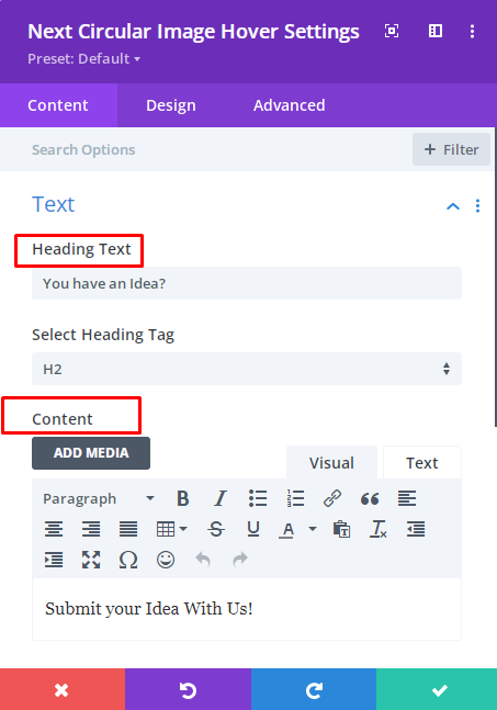
Content → Content
If you are sharing a product on your website and you want to share short information about the product, surely you can keep those information here. Because here your product information will be highlighted perfectly.
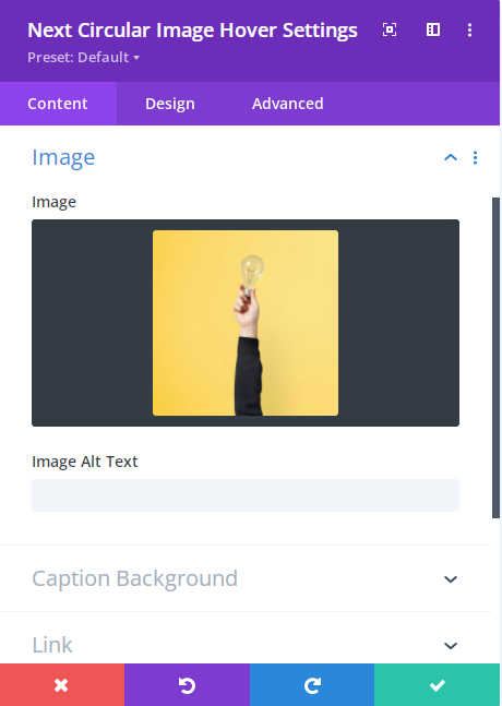
Content → Image
Keep your preferable image here that you want to showcase. The images will nicely appear as circular images after hovering.
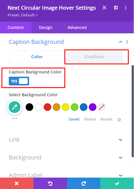
Content → Caption Background
Excellent design needs a superb caption. That’s why in this option the Developers of DiviNext Team have provided a color feature.
Here in the color option, you can enable the “Caption Background Color” option. Style your caption by adding various colors from here.
Also, you can find the “Gradient” option. Here you can enable the “Caption Gradient color” as well.
Design → Design Hover Effect
Hover Effects: Stunning Designs need magnificent effects. By selecting this option you can get a chance to apply 19 Super cool hover effects.
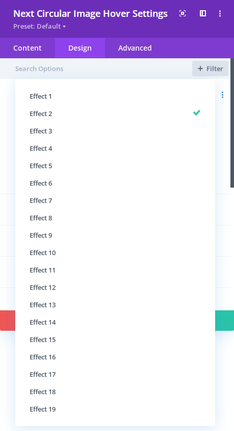
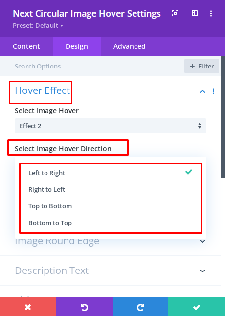
Effects Direction: From this option, you can easily move the effects as you want. Below options are available here:
1. Left to Right
2. Right to Left
3. Top to Bottom
4. Bottom to Top
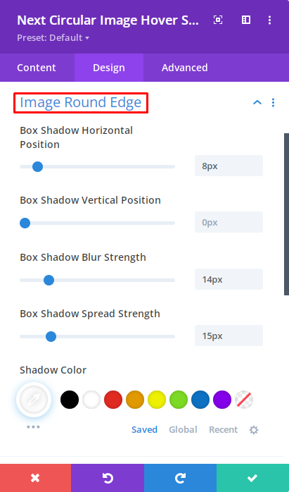
Design → Design Image Round Edge
Using this option you can change styles which are given below:
- Box shadow Horizontal Position
- Box shadow Vertical Position
- Box shadow Blur Strength
- Box Shadow Spread Strength
- Shadow Color
Design → Description Text
On the circular images when a visitor hovers that time texts will appear. Fonts can fascinate visitors easily. From here you can choose magnificent fonts.
Also from here, you can set the font weight, font style, Text Alignment, Text color, Text size, Letter spacing, Letter height, etc.
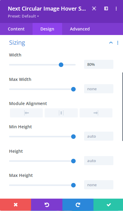
Design → Sizing
This design option gives you the opportunity to change the width, Max width, Min Height, Height, Max Height, Module alignment, etc.
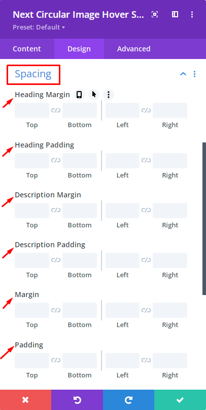
Design → Spacing
Choose this option so that you can use the below options to design the circular image more fascinating.
- Heading Margin
- Heading Padding
- Description Margin
- Description Padding
- Margin
- Padding
