Create innovative primary and secondary content switches!
You can showcase your key information beautifully and interactively with Content Toggle, speed up traffic, and optimize conversion rates on your website as well. With this Toggle element, you can insert saved layouts, text and create a stunning website for the viewers.
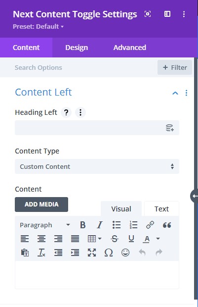
Content tab → Content Left (left switch)
Here we are going to go over what is there for the Content Left toggle:
- Heading Left – type the text for the left heading
- Content Type – choose a content type either you can add from Library or add custom content
- Content – type in the paragraphs for the body text
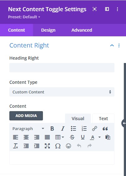
Content tab → Content Right (right switch)
Here we are going to go over what is there for the Content Right toggle:
- Heading Right – type the text for the right heading
- Content Type – choose a content type either you can add from Library or add custom content
- Content – type in the paragraphs for the body text
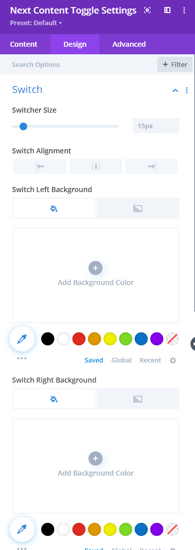
Design tab → Switch
- Switcher Size – adjust switch size using the slider below
- Switch Alignment – align the switch to either left, right, or center
- Switch Left Background – select either fill color or gradient for the left switch background
- Switch Right Background – select either fill color or gradient for the left switch background
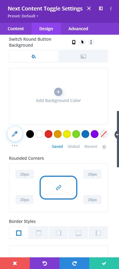
Design tab → Switch
- Switch Round Button Background – select either fill color or gradient for the switch round button background
- Rounded Corners – adjust the rounded corners with this feature
- Border Styles – pick where you want to add the border
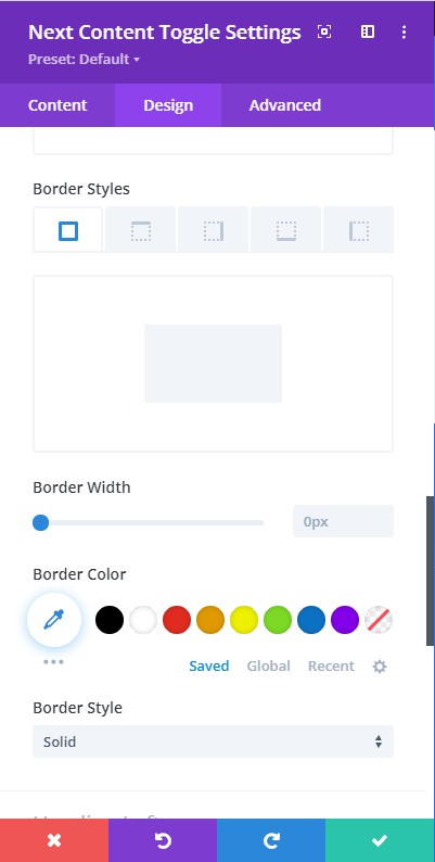
Design tab → Switch
- Border width – adjust the thickness of the border using the slider
- Border Color – choose a color for the border
- Border Styles – here you can pick a type of border from the collection provided
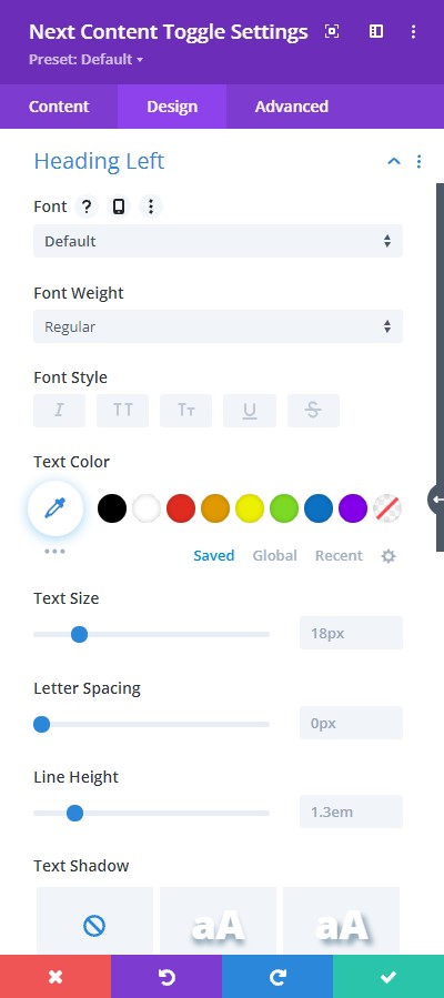
Design tab → Heading Left
- Font – select a font for the left heading text
- Font Weight – pick a font-weight either regular, bold, italic, and more.
- Font Style – choose a font style
- Text Color – pick a color for the text
- Text Size – resize the text using the slider
- Letter Spacing – adjust the spacing of the letters using the slider
- Line Height – adjust the height between the lines using the slider
- Text Shadow – add a shadow style to the text
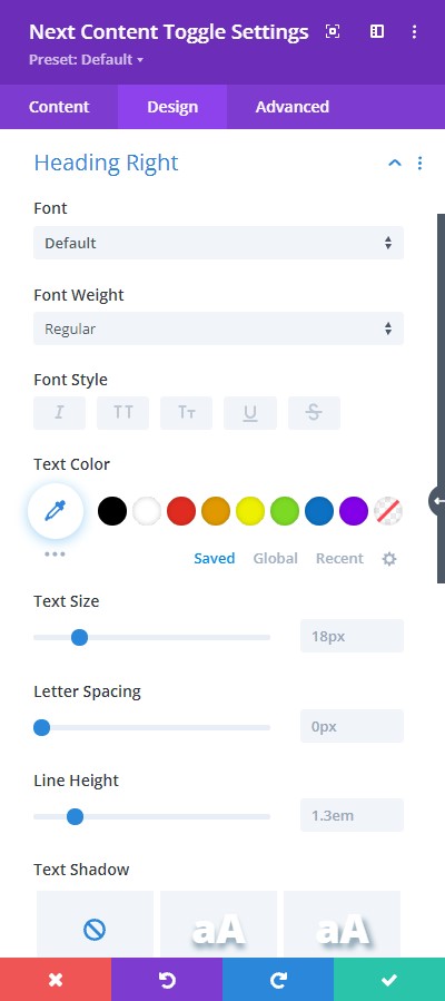
Design tab → Heading Right
- Font – select a font for the right heading text
- Font Weight – pick a font-weight either regular, bold, italic, and more.
- Font Style – choose a font style
- Text Color – pick a color for the text
- Text Size – resize the text using the slider
- Letter Spacing – adjust the spacing of the letters using the slider
- Line Height – adjust the height between the lines using the slider
- Text Shadow – add a shadow style to the text
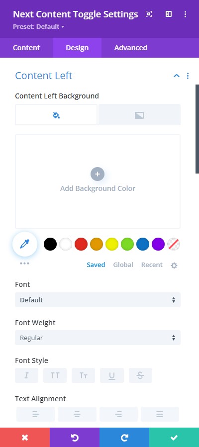
Design tab → Content Left
- Content Left Background – choose a background color for the left switch content
- Font – select a font for the right heading text
- Font Weight – pick a font-weight either regular, bold, italic, and more.
- Font Style – choose a font style
- Text Alignment – align the content either to the left, right, or center
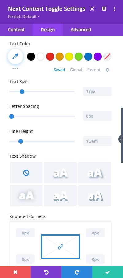
Design tab → Content Left
- Text Color – pick a color for the text
- Text Size – resize the text using the slider
- Letter Spacing – adjust the spacing of the letters using the slider
- Line Height – adjust the height between the lines using the slider
- Text Shadow – add a shadow style to the text
- Rounded Corners – adjust the rounded corners using this feature
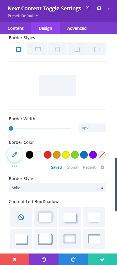
Design tab → Content Left
- Border Styles – pick where you want to add the border
- Border width – adjust the thickness of the border using the slider
- Border Color – choose a color for the border
- Border Styles – here you can pick a type of border from the collection provided
- Content Left Box Shadow – include a type of box-shadow to the content
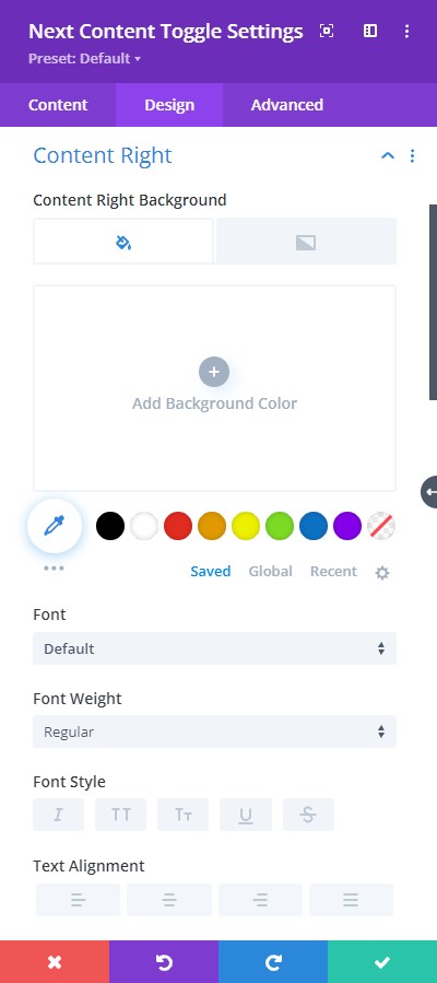
Design tab → Content Right
- Content Right Background – choose a background color for the right switch content
- Font – select a font for the right heading text
- Font Weight – pick a font-weight either regular, bold, italic, and more.
- Font Style – choose a font style
- Text Alignment – align the content either to the left, right, or center
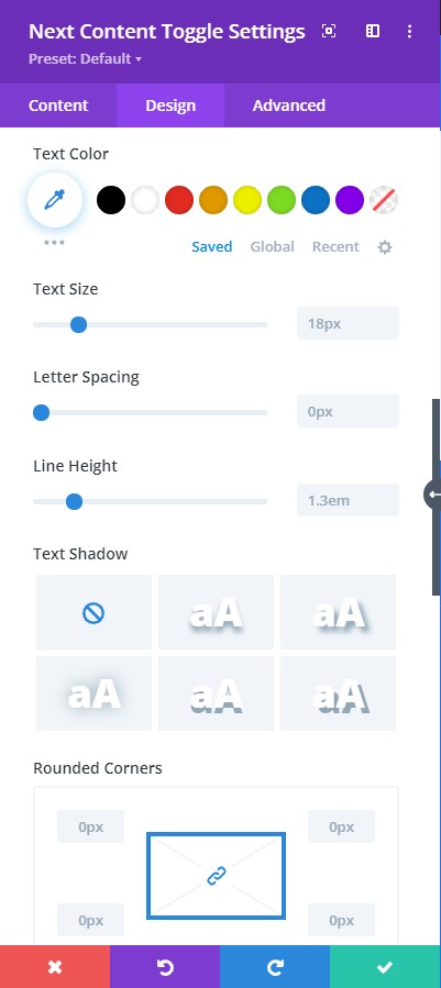
Design tab → Content Right
- Text Color – pick a color for the text
- Text Size – resize the text using the slider
- Letter Spacing – adjust the spacing of the letters using the slider
- Line Height – adjust the height between the lines using the slider
- Text Shadow – add a shadow style to the text
- Rounded Corners – adjust the rounded corners using this feature
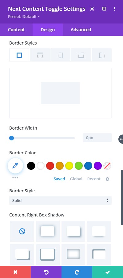
Design tab → Content Right
- Border Styles – pick where you want to add the border
- Border width – adjust the thickness of the border using the slider
- Border Color – choose a color for the border
- Border Styles – here you can pick a type of border from the collection provided
- Content Right Box Shadow – include a type of box-shadow to the content
