An eye-catching, user-friendly, and customizable Dual Button setup for your website!
Divi Essential’s Dual Button module lets you add a pair of super trendy buttons to the webpage of your website. Using the Dual Button, you can make your webpage stylish and classy.
Check out the clip below to view the design possibilities using the Dual Button on your website:
You can see the attached video, where you can get an insight into how to use the Dual Button Module to create stunning designs.
Moreover, you can check our documentation for a detailed step-by-step guide and get started.
Installing Process
Do you want to set the dual button with just a click? You need to install the Divi Essential plugin. If you are reading this part of the documentation, we assume you are attempting to know the installation process of the Divi Essential Plugin (click here)
If you own Dual Button Plugin separately, you can install Divi Dual Button. From the clip above, we learned that it is pretty straightforward.
Go to the Dashboard > then Plugins > then click on Add New. Drag and drop the Dual Button plugin’s zip file onto Choose File > click Upload. That’s it!
Getting Started:
To use the Divi Dual Button module, first, you need to add “A New Section” by clicking on the “+” icon in the Visual Builder. Then insert a row by selecting your preferable column.
Now you can notice a black round icon where you can add a new module, now, search Dual Button and select it.
Content
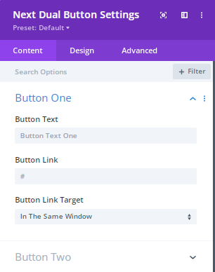
Content → Button One and Button Two
For the Button One and Button Two options, Button Text, Button Link, and Button Link Target features are available. Here, add any gorgeous word that can be attractive to your website visitors or customers.
Make sure the Divi Dual Button text entices as well as encourages action.
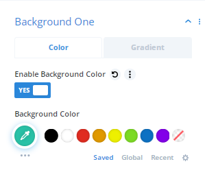
Content → Background One & Background Two:
Best Companies across the world are constantly looking for the best ways to reach visitors,customers and encourage them to take action. One of the easiest ways to implement this process is through the color scheme. Several studies have been done to prove what colors are the best for buttons on websites.
First Enable the Background color and Gradient color then you can find numerous colors and pick the colors which can match with your web contents, images.
From the gradient color option you can set 2types of colors.
Different background colors provide a different mood and tone to images that’s why for matching the subject, the background color should different.
Design
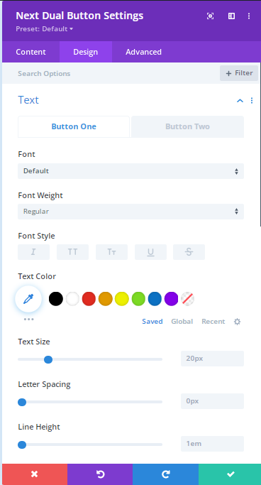
Design → Text Button 1 & Text Button 2
Internet Marketers have found by doing lots of research that presenting the texts in the button can make massive
difference because by checking the texts visitors read your contents and products information. Button texts can be more eye catching for your website.
From the Design>Text option you can design the text Font, style, color, size etc.
Design → Alignment
From this option you can easily align the buttons. You can keep them in the letf side or right side or in the center.
Design → Hover One and Two
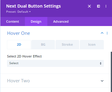
Here you can adjust the Hover effects. Almost 30 hover effects are available in the 2D section. In the BG option you will get more than 15 hover effects.
From here you can easily set the Background hover color. Choose the stroke effect and Icon effect if you want to see while hovering.
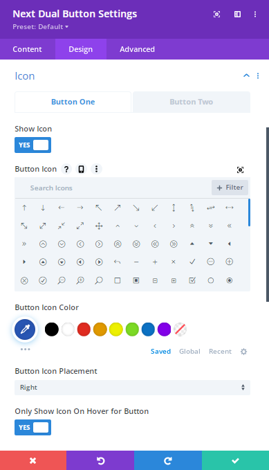
Design → Icon
Choose your preferable color from here.
Here you can can change design of 2 Button icons.
Enable/ Disable Icon: By enabling icon you can easily get the Button icon as well as Button icon color moreover Button icon placement opportunity.
You can also use here the “Only show icon on Hover for Button ” functionality. Here you can enable or disable this option smoothly.
Design → Border One and Border Two
Select this option so that you can set the rounded corners, border styles width moreover the border colors.
Design → Spacing
The visitors whom are viewing your website on a larger screen there button space will significantly improve button text’s readability. From here you can set Dual button’s margin, padding smoothly without any coding.
Sizing → Border One and Border Two
Dual button introduces the smart visualization to the visitors. Dual button should be the perfect in size so that anyone can click on a buttons without any hesitation also they shouldn’t feel any disturbance in their mind. That’s why you can set the sizing here by setting the module alignment, height, max height, width, max width.