With the Divi Feature List module, you get to showcase your product features in styles that are trendy, sleek, and professional.
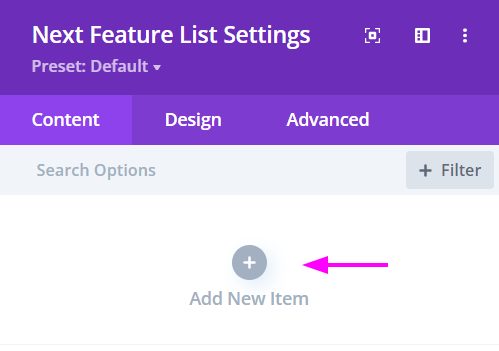
Content → New Item
Add either text, number or Image as bullet points for the feature list design layout.
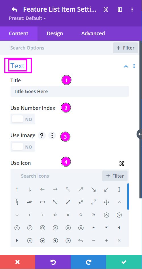
Content → Text
- Title – type title text here in the text field
- Use Number Index – if you want to have a numbered list, enable this option.
- Use Image – enable this to use an image for each item
- Use Icon – place an icon for each item
Design → Icon Settings
- Icon Color -pick a color for the icon using the pointer or simply put the hex code to get the exact color you need
- Icon Background Color – Add color to the icon background
- Rounded Corners – include rounded corners by adjusting the four corner
- Border Styles – add a border to any side you like or have borders on all four sides
Design tab → Icon Settings (continued)
- Icon Border Width – adjust the width of the border
- Icon Border Color – select a color for the border
- Icon Border Style – include a style to the border from the collection of prebuilt styles available
- Box-shadow – add a box-shadow to the element as well
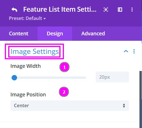
Design tab → Image Settings
- Image Width – adjust the width of the image using the slider
- Image Position – select a position for the image applied to the item
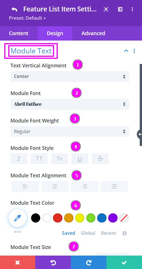
Design → Item Text
- Text Vertical Alignment – use the set of positions available to align the text
- Font – Choose a font. All Google web fonts are available here. You can upload a custom font as well.
- Font Weight – select the weight of the font from Light to Ultra Bold
- Font Style – select a font style from
- Text Alignment – align the text to left, right, or center
- Text Color – pick a text color using the pointer or simply place the hex code to get the exact color needed
- Text Size – resize the text as needed
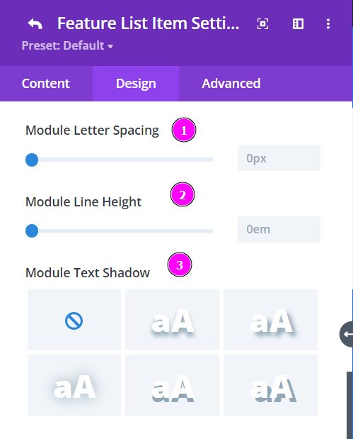
Design → Item Text (continued)
- Letter Spacing – Adjust the spacing between the letters of the text
- Line Height – adjust the space between multiple lines added to the design
- Text Shadow – add a shadow to the text from the prebuilt shadows
Design → Icon Settings
- Position – position the icon using the options available
- Icon Color -pick a color for the icon using the pointer or simply put the hex code to get the exact color you need
- Icon Background Color – Add color to the icon background
- Icon Size – resize the icon using the slider
- Icon Rounded Corners – include rounded corners by adjusting the four corner
Design tab → Icon Settings (continued)
- Icon Border Styles – include a border to the icon
- Icon Border Width – adjust the width of the border
- Icon Border Color – select a color for the border
- Icon Border Style – include a style to the border from the collection of prebuilt styles available
- Box-shadow – add a box-shadow to the element as well
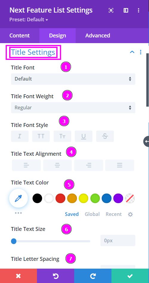
Design → Title Settings
- Font – Choose a font. All Google web fonts are available here. You can upload a custom font as well.
- Font Weight – select the weight of the font from Light to Ultra Bold
- Font Style – select a font style from the following (e.g italic, all caps, and more)
- Text Alignment – align the text to left, right, or center
- Text Color – pick a text color
- Text Size – resize the text as needed using the slider
- Letter Spacing – Adjust the spacing between the letters of the text
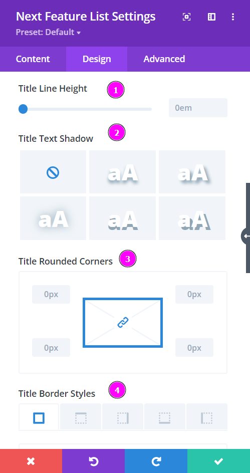
Design → Title Settings (continued)
- Line Height – adjust the space between multiple lines added to the design
- Text Shadow – add a shadow to the text
- Rounded Corners – include rounded corners by adjusting the four corners
- Box-shadow – add a box shadow to the element
- Text Border Styles – add a border to any side you like or have borders on all four sides
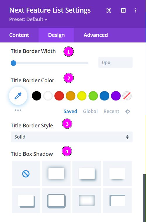
Design → Title Settings (continued)
- Border Width – adjust the width of the border
- Border Color – select a color for the border
- Border Style – include a style to the border from the prebuilt styles
- Box Shadow – Include box-shadow to the title and configure the settings to your liking.
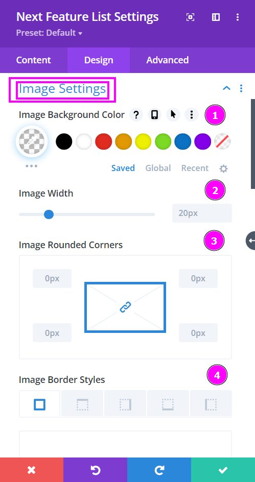
Design tab → Image Settings
- Image Background Color – Add an overlay background fill color or gradient on top of the image
- Image Width – adjust the width of the image using the slider
- Image Rounded Corners – include rounded corners by changing the four corner
- Image Border Styles – add a border to the image
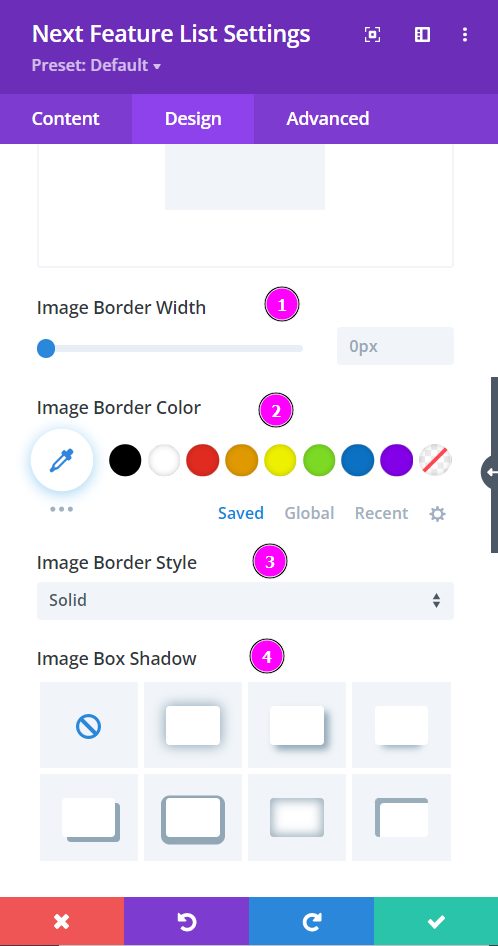
Design tab → Image Settings
- Image Border Width – adjust the width of the border added to the image
- Image Border Color – select a color for the border with the pointer or simply put the hex code to get the exact color required
- Image Border Style – include a style to the border from the collection of prebuilt styles
- Image Box-shadow – add a box-shadow to the element
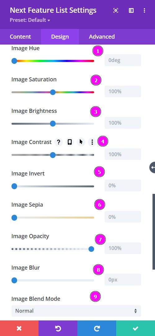
Design tab → Image Settings
- Image Hue – adjust image hue using the slider
- Image Saturation – adjust the intensity of the image
- Image Brightness – configure the brightness of the image
- Image Contrast – include contrast to the image
- Image Invert – use this to shift to an inverted image
- Image Sepia – adjust to apply sepia color tone to the image
- Image Opacity – adjust the opacity of the image
- Image Blur – add blur to the image
- Image Blend Mode – Select from the 16 types of image blend mode for a quick configuration
