
Divi Hotspot is excellent for displaying interactive elements on your website. Put hotspots and tooltips on your images so that visitors can easily identify which products you are selling.
Here we will go over the step by step use of the hotspot module and its special features:

Content → New Item
Add multiple new items in this field. After adding the number of items you require for your design just move on to the settings for each of them separately to position them to where you need them to be in the image.


New Item Setting → Hotspot → Tooltip
Move on to adding Hotspot text and icon. Then add Tooltip text and image for each of them as required.

Content → Tooltip Image
Here you can choose to add an image for the tooltip.
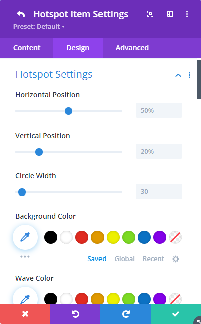
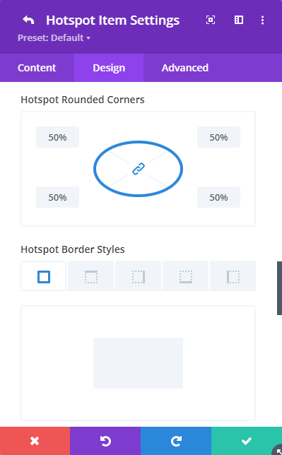
Design → Hotspot Settings
As mentioned above, this is where you can position the hotspots. Position and stylize each hotspot item with all the features provided.
- Several stylizing features are available here
- Adjust the position of the hotspot
- Pick the background-color
- Add wave color surrounding the hotspot
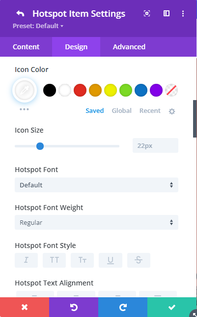
- Adjust icon size and select icon color
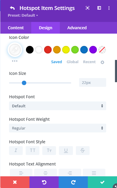
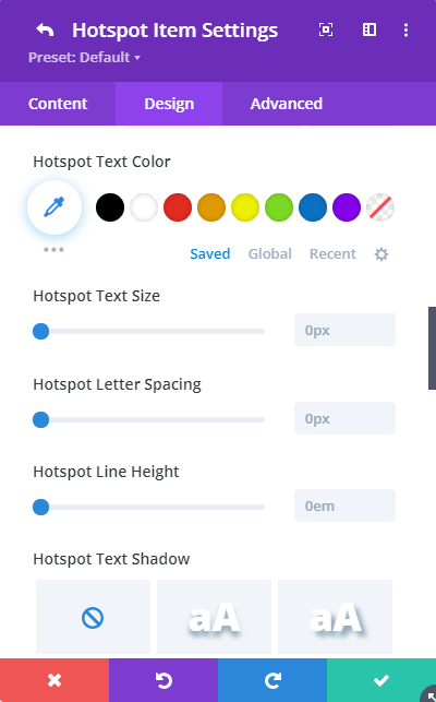
- Stylize the text for the hotspot
- Align the hotspot text
- Add shadow to the text
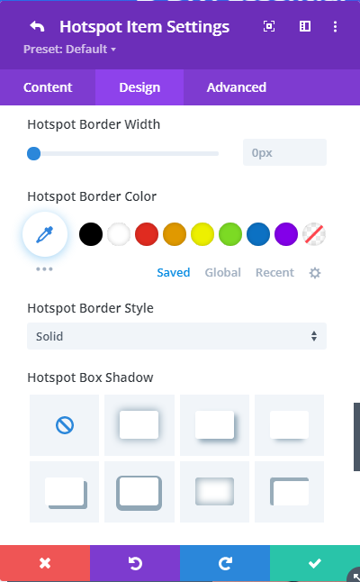
- Adjust the border, pick border color,
- and border style
- Finally, select shadow for the hotspot if need be

Design → Tooltip Settings
Position and stylize the tooltip text, add background color, and adjust the width of the Tooltip.
Several stylizing features are available for a tooltip:
- Adjust the position of the tooltip
- Pick the background-color
- From the four layouts available pick the best one
- Adjust the width of the tooltip
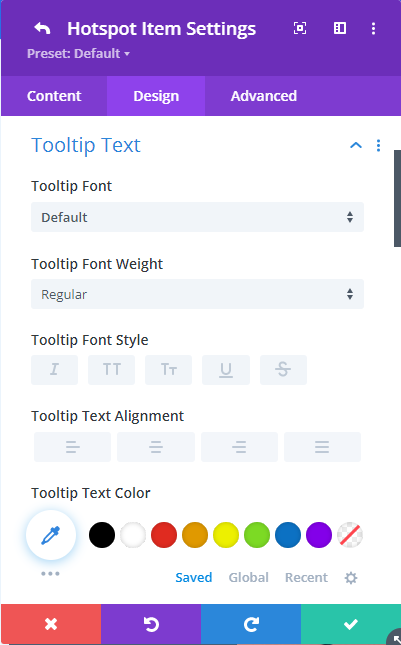


Design tab → Tooltip Text
Here you have all the features required to stylize and align the text as you need for the tooltip. Pick a font, font weight, font style, align text, and pick a color.
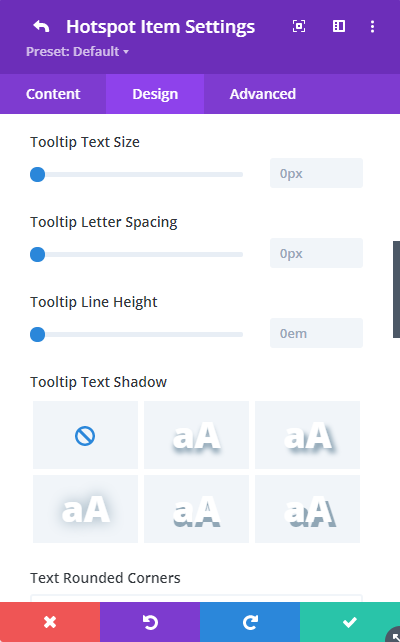
- Adjust text size
- Stylize the text for the tooltip
- Align the tooltip text
- Add shadow to the tooltip text
- Add rounded corners, adjust the border, pick border color, and border style
- Finally, select shadow for the tooltip if required
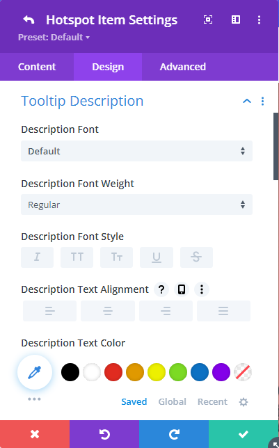
Design tab → Tooltip Description
Use the typography features available for the texts you’ve added for Tooltip Description
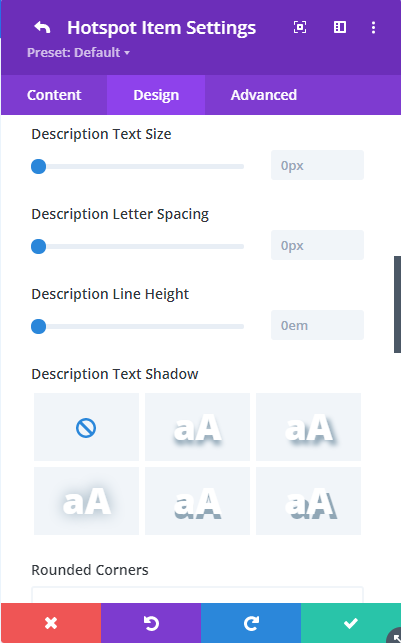
Stylizing features for the Tooltip Description text:
- Choose font
- Adjust Description weight
- Pick Description font style
- Adjust text size
- Stylize the description text for the tooltip
- Align the tooltip description text
- Choose description text color
- Add shadow to the description text
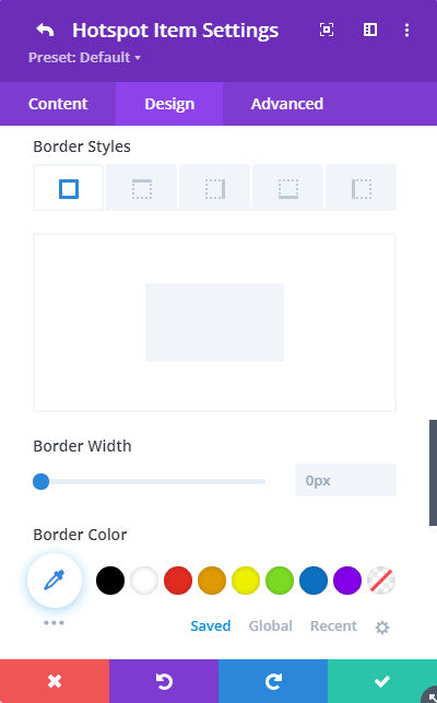
- Add rounded corners, adjust the border, pick border color, and border style
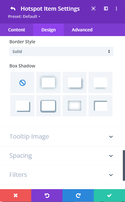
- Finally, select shadow for the tooltip if required


Design tab → Tooltip Image
Stylize the image added to the Tooltip for your design layout. Here you can adjust image size, position, rounded corners, borders, border style, and box-shadow.

Change Hotspot and Tooltip Settings all together
Without going to the individual settings for each item you can stylize the hotspots and tooltips using the module’s Design tab where there are similar settings providing stylizing options for both fields.