Divi Image Accordion module enables you to create interactive image galleries. You can include multiple images and each image can have its own icon, title, description, and button which can be revealed with a pleasant animation on hover or when the image is clicked.
Divi Next Accordion module makes sure the Best image quality as well as it combines images nicely with stunning accordion effects.
First, find the ‘Image Accordion‘ module from the Divi Visual Builder> Section Settings> Row Settings> Click on the Gray circle, and in the search bar finds the Divi Next Accordion Module.
Content → Add New Item
From the Divi Next Accordion Module you can notice the “Add New Item” and from the Settings of each Item you can get the Content, Design, and Advanced option.
- First Add an image
- After adding the image you will get the Accordion option where you will get the below options.
Content → Add New Item → Settings → Content → Accordion

In the content tab , click on Add new item and then you will get the Accordion Function from the settings of Add new item.
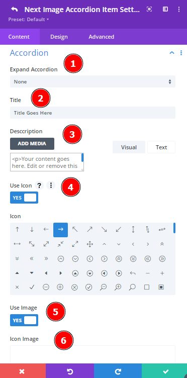
Expand Accordion: Choose any options from here: Expand Onload/Expand Onload/Expand On Mouse Out.
Title: Write Title here so that visitors can understand the concept of the image.
Description: Use a good quality description that can enable a Visitor or reader to picture the images from your description.
Use Icon: Enable this option to use the Icon.
Icon: Select an Icon to
Use Image: Enable this option o use the Icone Image.
Icon Image: Add image here for Icon.
Image Alt Text: Use Alt Text Here.
Button Show Hide: Enable this option and you can show the Button.
Button Text: Write important text on the Button.
Button Link: You can add a link to the Button.
Button Link Target: From here you can select “In the Same Tab”/”In New Tab”
Horizontal Align: Horizontally you can assign Left/right/center.
Vertical Align: Vertically you can assign Left/right/center.
Content → Add New Item → Settings → Content→Button Background
Choose the color to add background color & you can add background gradient here as well to make it magnificent.
Content → Add New Item → Settings → Content → Icon Background
Select the color to add background color and you can add background gradient from here to stylize the icon properly to show to the visitors.
Content → Accordion Settings

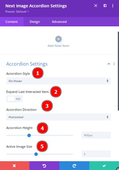
Accordion Style: By selecting the Accordion Style option you can add the ” On Hover ” or ” On Click ” option.
Expand Last Intersected Item: Enable this option to expand the last interested Item.
Accordion Direction: You can set the path or instruction by selecting the Accordion Direction. You will get 2options from here:
- Horizontal 2. Vertical
Accordion Height: You can select this option to set the height of the Accordion.
Active Image Size: Select this option to activate the Image size properly.
Content → Add New Item → Settings→ Design

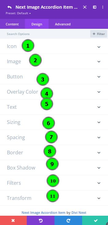
Content → Add New Item → Settings→ Design → Icon
Alignment : Align the icon to the left/right/corner
Icon Size : Select this option to resize the Icon.
Icon Color : Using this you can adjust the icon color flexibly
Rounded Corners : Control the corner radius of the icon and enable the link icon to control all four
corners at once or disable to define custom values for each.
Border Styles : You can add borders to any element, customize their appearance and assign unique styles to each edge.
Border Width : Choose this option to increase the border which will increase it’s size or thickness.
Border Color: Select an amazing color to be used for the Border as well.
Border Style: Borders support various different styles, each of the border will change the the shape of the border element
such as Solid/DashedDotted/Double/Groove/Ridge/Inset/Outset/None
Content → Add New Item → Settings→ Design → Image
Alignment : Selct this ooption and Align the icon to the left/right/corner
Image Size : If you need to change the size of the image then you can select this option
Rounded Corners : Here you can control the corner radius of the image and enable the link icon to control all four
corners at once or disable to define custom values for each.
Border Styles : Select this option to cuztomize the appearance and assign unique styles to each edge.
Border Width : Select this option to increase the border of the image.
Border Color : Choose a color to be used for the Border which might show this image like incredible.
Border Style : By choosing this option you can get lots of Border styles.
Content → Add New Item → Settings→ Design → Button
Font: Select this font option where you will get Google web fonts available.Font Weight : By choosing this option you can change the Font Weight into Light/Regular/Semi Bold/Bold/Ultra Bold
Font Style: Select this option to change the font style that you need.
Text Alignment : Align the text to left, right, center or justify.
Text Color : Pick a color and your Button will be colorful nicely
Text Size : Selct this option to change the size of text which will appear on the button.
Letter Spacing : This option will adjust the distance between each letter.
Line Height : This option can be noticeable if you choose it long and wraps on to multiple lines.
Rounded Corners: By choosing this you can control the Button’s corner radius.
In the Button you can have below options for the Border :
1. Border Styles
2. Border Width
3. Border Color
4. Border Style
Content → Add New Item → Settings→ Design → Overlay Color
Text → Title / Description
In the Title/ Description below options will be available:
Title Heading Level
Title Font
Title Font Weight
Title Font Style
Title Text Alignment
Title Text Color
Title Text Size
Title Letter Spacing
Title Line Height
Content → Add New Item → Settings→ Design → Button
To change this width/Max width/ Module Alignment/Min Height/Height/Max Height you can select this option.
Design Tab
Design → Sizing
While designing using Image Accordion module, size plays really an important role in making a layout.
Select this option to make it functional, attractive and organized.
Design → Spacing
Title Goes Here
Your content goes here. Edit or remove this text inline or in the module Content settings. You can also style every aspect of this content in the module Design settings and even apply custom CSS to this text in the module Advanced settings.
This is the simplest way to add spacing in the Module. Choose this option to set the Margin, Padding, etc.
Design → Border
Use this option to round corners, style borders as well as you can set the border width as well as border color.