A Lottie’s JSON-based animation file format allows designers to use animations on any platform as easily as shipping static assets. They are files that work on any device and can scale up or down without pixilation.
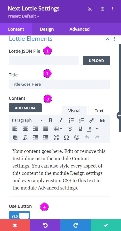
Content → Lottie Elements
- Lottie JSON File – upload the JSON file for Lottie
- Title – Include the title to your Lottie design
- Content – add a summury relevant to the Lottie design you are trying to achieve
- Use Button – enable to view the button and its settings
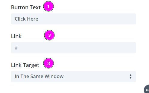
Content → Lottie Elements (Continued)
- Button Text – Add text to the button
- Link – include a link for the button to direct the visitors.
- Link Target – this is to specify whether you want the link clicked to appear in a separate window or a new tab.
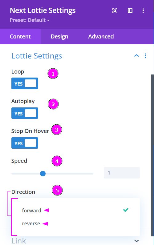
Content → Lottie Settings
- Loop – enable this to keep the animation going on a loop
- Auto-play – enable this to have the auto-play feature
- Stop on Hover – you can enable this to stop the animation when hovered on
- Speed – adjust the speed of the Lottie animation
- Direction – use the direction feature to have the animation go backward with reverse or forward to have the animation go as is.
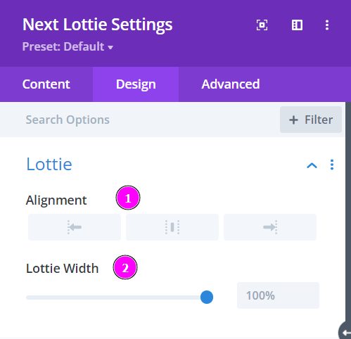
Design → Lottie
- Alignment – Align the Lottie animation either to the left, center or the right
- Lottie Width – adjust the size of the Lottie animation using the slider
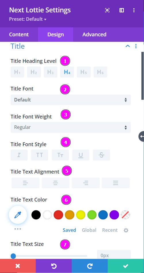
Design → Title
- Heading Level – select a level for the heading
- Font – Select a font from the collection or use a custom font.
- Font Weight – this is where you define how you want your font to show either regular, italic, bold extra, or even extra light.
- Font Style – Pick a style of font for both front and back.
- Text Alignment – align the text either to the left, right, center, or the right, and keep the
- Text Color – manually select a color for the background of the text using the pointer or you can simply state the hex code and get the exact color you require.
- Text Size – easily adjust the size of the text using the slider.
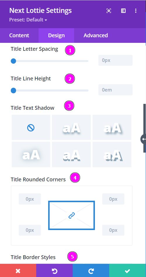
Design → Title (continued)
- Letter Spacing – space out the letters using the slider for an easier read for the website visitors.
- Line Height – adjust the space between the lines using the slider.
- Text Shadow – select a prebuilt shadow for your text
- Rounded Corners – adjust the four corners to include rounded corners
- Border Styles – include borders on any side of the text or all four sides.
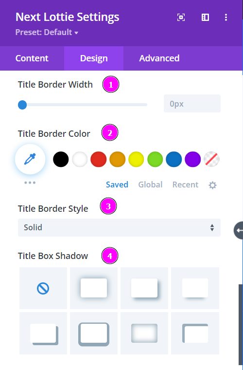
Design → Title (continued)
- Border Width – adjust the width of the border using the slider.
- Border Color – pick a color for the border you’ve added.
- Border Style – select a style of the border from the premade border styles.
- Title Box Shadow – choose a box shadow to the title text
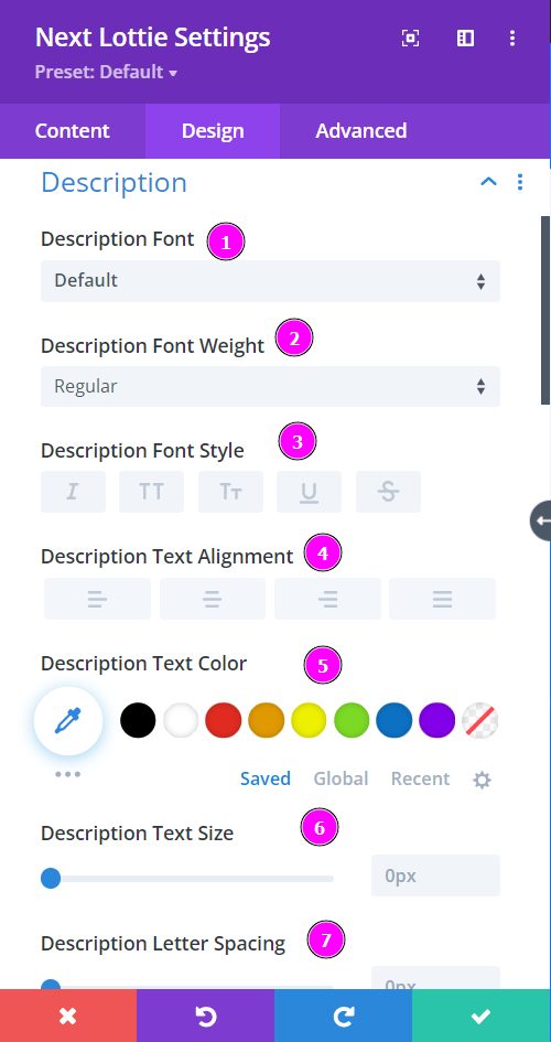
Design → Description
- Font – Select a font from the collection or use a custom font.
- Font Weight – this is where you define how you want your font to show either regular, italic, bold extra, or even extra light.
- Font Style – Pick a style of font for both front and back.
- Text Alignment – align the text either to the left, right, center, or the right, and keep the
- Text Color – manually select a color for the background of the text using the pointer or you can simply state the hex code and get the exact color you require.
- Text Size – adjust text size using the slider.
- Letter Spacing – space out the letters using the slider for an easier read for the website visitors.
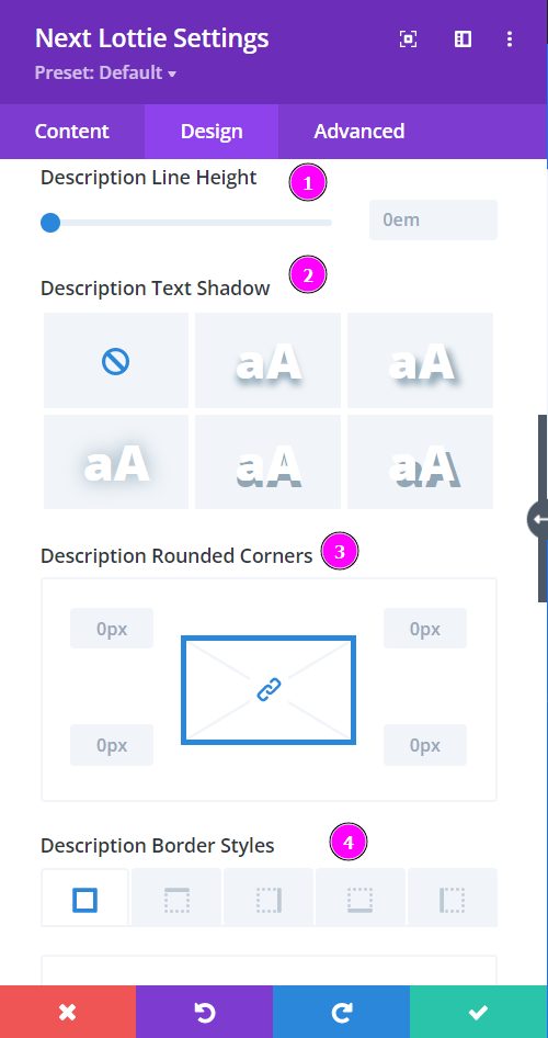
Design → Description (continued)
- Line Height – adjust the space between the lines using the slider.
- Text Shadow – select a prebuilt shadow for your text
- Rounded Corners – adjust the four corners to include rounded corners
- Border Styles – include borders on any side of the text or all four sides.
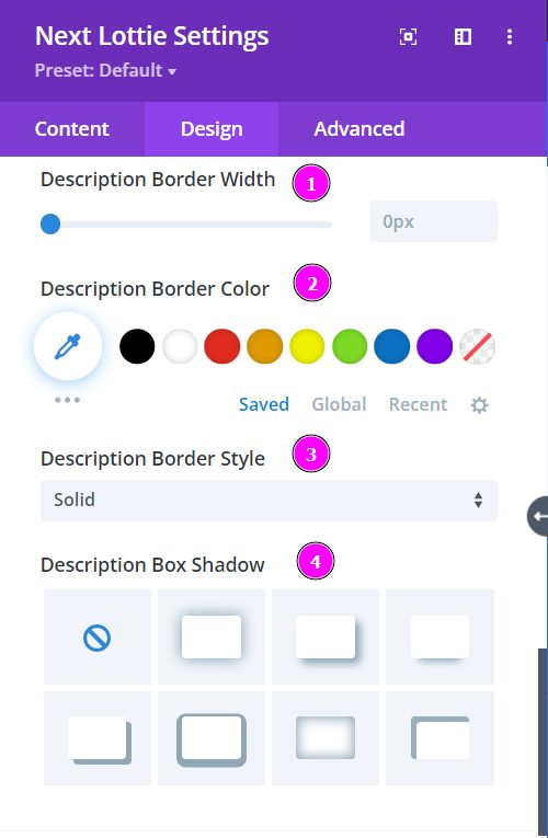
Design → Description (continued)
- Border Width – adjust the width of the border using the slider.
- Border Color – pick a color for the border you’ve added.
- Border Style – select a style of the border from the premade border styles.
- Box Shadow – choose a box shadow to the description text
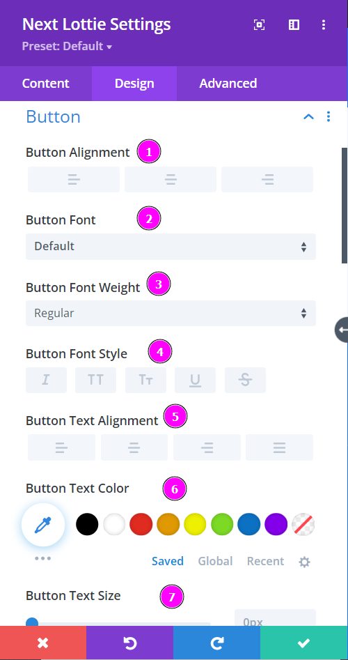
Design → Button
- Button Alignment – align the button either to the left, center, or to the right
- Font – Select a font from the collection or use custom font.
- Font Weight – this is where you define how you want your font to show either regular, italic, bold extra, or even extra light.
- Font Style – Pick a style of font for both front and back.
- Text Alignment – align the text either to the left, right, center, or the right, and keep the
- Text Color – manually select a color for the background of the text using the pointer or you can simply state the hex code and get the exact color you require.
- Text Size – adjust text size using the slider.
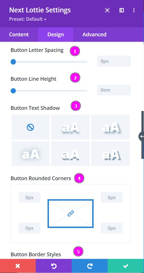
Design → Button (continued)
- Letter spacing – adjust the space betweent the letters using the slider
- Line Height – adjust the space between the lines using the slider.
- Text Shadow – select a prebuilt shadow for your text
- Rounded Corners – adjust the four corners to include rounded corners
- Border Styles – include borders on any side of the text or all four sides.
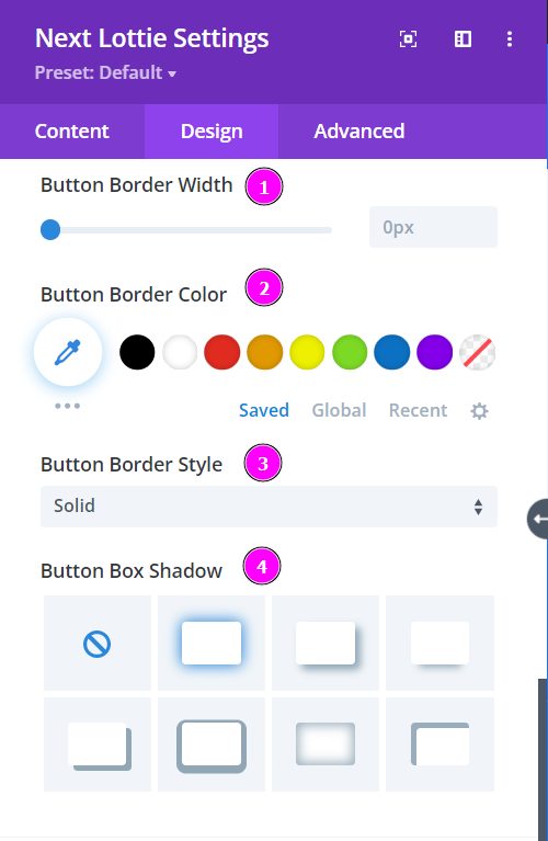
Design → Button (continued)
- Border Width – adjust the width of the border using the slider.
- Border Color – pick a color for the border you’ve added.
- Border Style – select a style of the border from the premade border styles.
- Box Shadow – choose a box shadow to the Button text
