
Divi Post Carousel enables you to create attractive blog archive pages. With no coding required, it comes with fast and intuitive features.
There are nine unique blog layouts with several variations. Create archive pages including categories, tags, authors, dates, custom post types, among others. Additionally, you can add a category filter to the blog page so that users can easily browse content from different categories.

Content → Post Settings
Here, I will talk about the features available within Post Settings in the Content Tab.
- Select Layout – there are 9 layouts for you to pick from
- Post Type – this allows you to select between types of posts you’d like to add, such as post, page, doc, and etc.
- Post Count – here you type in how many posts you’d like to view per slide.
- Post Offset – this allows you to remove a specific number of posts
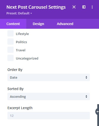
- Included Categories – this helps you specify the category of the posts included in the slider,
- Order by – here you can choose how you want your posts to be ordered. For example – by Date, ID, Author, and etc.
- Sorted by – Sort the posts by either ascending or descending order.
- Excerpt Length – Adjust the length of the content. Leave this blank to use the default size.

Content → Elements
In the Elements toggle, you have the options to:
- Enable/disable features image – choose if you want to show the feature image
- Show author – choose to show author
- Show categories – enable/disable showing the categories
- Show read more button – enable/disable read more button
- Show the excerpt – choose to show the excerpt
- Position the date of the post
Content → Carousel Settings
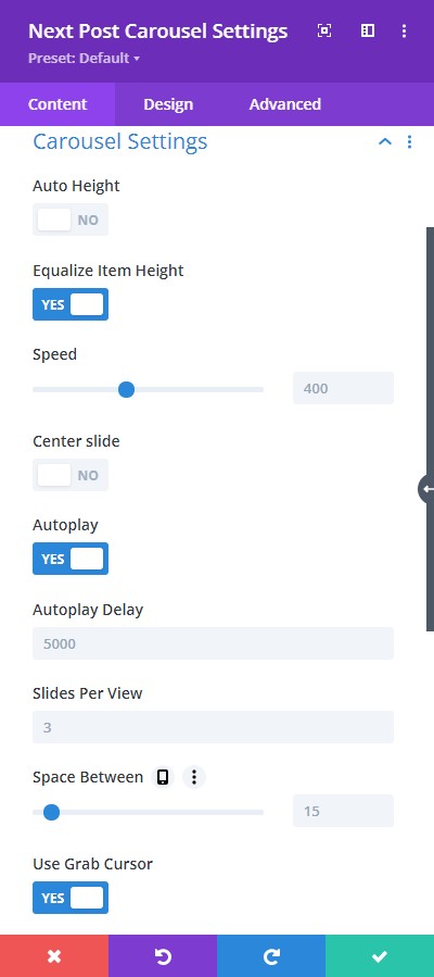
In the Carousel Settings toggle, you have the options to:
- Enable Loop – have the posts slide in a loop
- Autoplay – configure the autoplay feature easily
- Adjust the delay
- Center Slide to highlight one of the slides that are in view
- Adjust the Speed
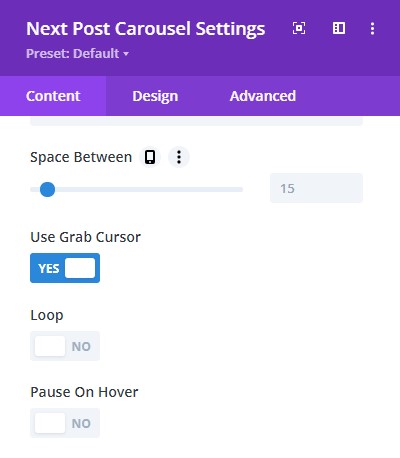
- Space Between – edit the space between the posts
- Put a number of Slides Per View to pick a specific number of slides you want to appear on your website
- Pause on hover allows the slider to pause when you hover on it.

Content → Navigation Settings
In the Navigation Settings, you have the option to select the provided navigation tools.
- Grab Cursor shows a handtool for you to move the slider manually.
- Keyboard Navigation helps the slider move with the keyboard arrow buttons
- Mousewheel Navigation helps the slider move using the mouse scroller.
- Arrow Navigation puts arrows on each side of the design and on click you can move the slider.
- Dynamic Bullets helps show the active bullet when sliding.

Content → Effect Settings
This feature helps put a little effect on each item in the slider.
- Add a little shadow enabling the Use Slide Shadow option
- Adjust Slide Rotate so the items will slide with the rotation level applied to the item.
- Add Stretch and Depth to adjust the space between the items.
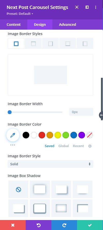

Design → Image
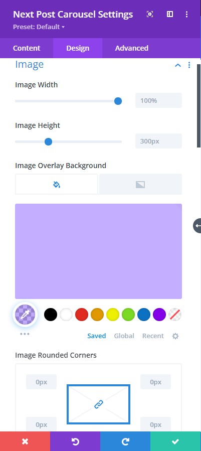
Image Settings allow you to stylize the image you’ve added to your design layout.
To elaborate, we have some helpful design tools present here.
- Add rounded corners
- Include border style, width, and color
- Adjust image filter using the editing tools provided.
- You can also add box-shadow here
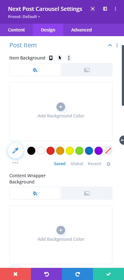
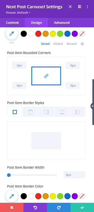
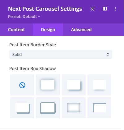
Design → Post Item
Within the Post Item toggle, you have stylizing features such as:
- Setting a Background color with either fill color or gradient
- Add color to the Content wrapper background
- Have rounded corners
- Add a Border
- Pick Border Style
- Adjust Border Width
- Add color to the border
- Include the box-shadow effect
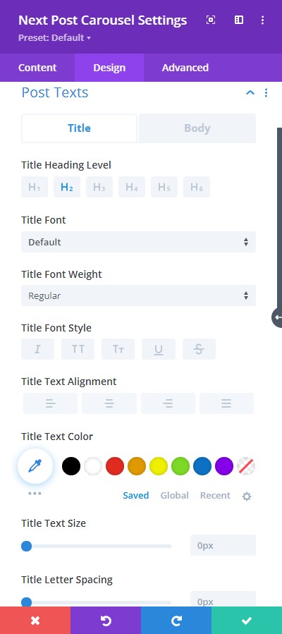
Design → Post Text
Within the Post Text toggle, you have everything you need to stylize your text:
- Font – select a font from the various types of font to pick from
- Font Style – pick a font style such as bold, italic, and etc.
- Text Alignment – helps you align the text
- Text color – pick a color for the text
- Editing Letter Spacing – edit the space in letters
- Adjust Text Size
- Add a Border
- Pick Border Color
- Add Text Shadow
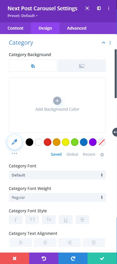

Design → Category
Within the Category toggle, you have everything you need to stylize your text:
- Setting a Background color with either fill color or gradient
- Font – select a font from the various types of font to pick from
- Font Style – pick a font style such as bold, italic, and etc.
- Text Alignment – helps you align the text
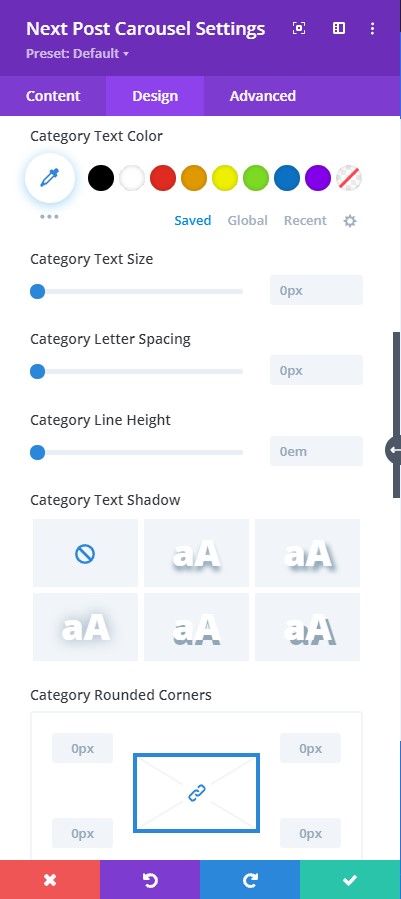
- Text color – pick a color for the text
- Editing Letter Spacing – edit the space in letters
- Adjust Text Size
- Add a Border
- Pick Border Color
- Add Box-Shadow

Design → Meta Alignment
Align the Meta text in the Meta Alignment.
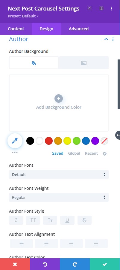

Design → Author
Within the Author toggle, you have everything you need to stylize your text:
- Setting a Background color with either fill color or gradient
- Font – select a font from the various types of font to pick from
- Font Style – pick a font style such as bold, italic, and etc.
- Text Alignment – helps you align the text
- Text color – pick a color for the text
- Editing Letter Spacing – edit the space in letters
- Adjust Text Size
- Add a Border
- Pick Border Color
- Add Box-Shadow
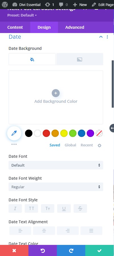
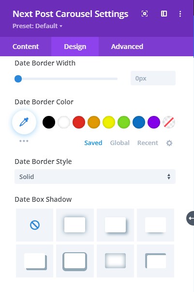
Design → Date
In Date toggle, you have everything you need to:
-
- Setting a Background color with either fill color or gradient
- Font – select a font from the various types of font to pick from
- Font Style – pick a font style such as bold, italic, and etc.
- Text Alignment – helps you align the text
- Text color – pick a color for the text
- Editing Letter Spacing – edit the space in letters
- Adjust Text Size
- Add a Border
- Pick Border Color
- Add Box-Shadow
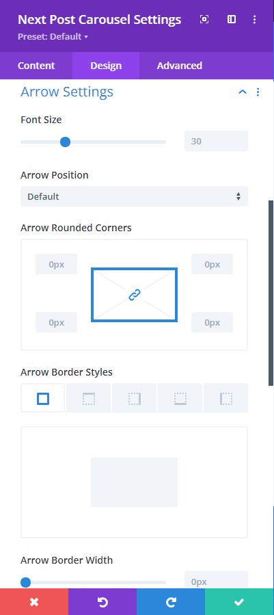
Design → Arrow Settings
In the Arrow Settings, you have very simple features as follows:
- Adjust the arrow size
- Position the arrows
- Add rounded corners
- Include border
- Select a border style
- Adjust border width
- Pick a color for the border

Design → Color Settings
In Color Settings, you get several coloring features that include:
- Choosing a color for the Arrows
- Arrow background-color
- Color for Dots
- Active Dot’s color
- Date icon color
In just a few clicks, you can achieve a great design with this feature.
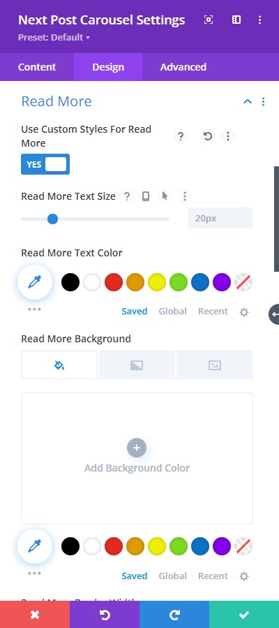
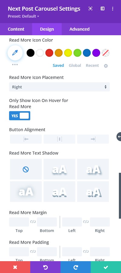
Design → Read More
When you enable custom styles for the Read More feature, you have everything you need to stylize your text for the button.
- Select a read more button icon
- Pick a color for the symbol that you have selected
- Choose a Font for the read more text
- Include Font Style
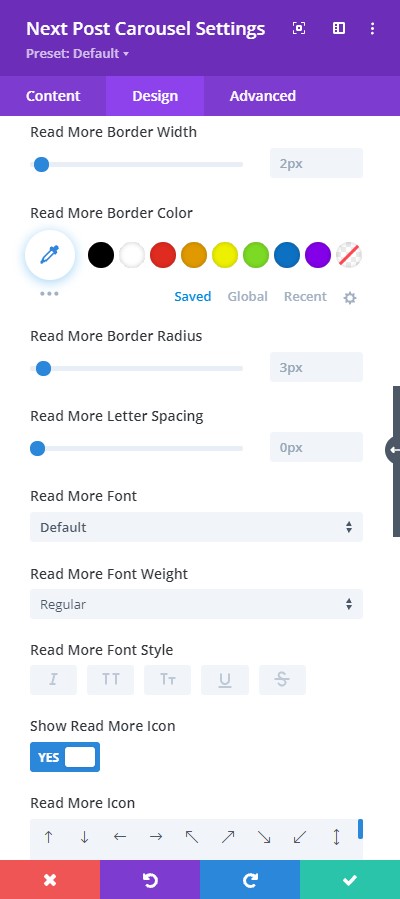
- Text Alignment – align the read more text
- Text color – pick a color for the read more text
- Edit Letter Spacing and adjust Text Size
- Add a Border
- Select Border color
- Add box-shadow