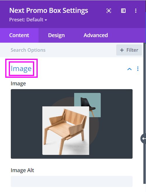
Content → Image
Place the image of your product, goods, and services here in this field.
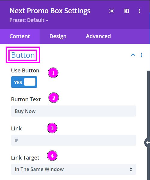
Content → Button
- Use Button – enable to view the settings to include a button
- Button Text – place the text for your button (e.g. Read more, Learn More, Buy Now)
- Link – add a link to the button
- Link Target – when clicking the link, how would you want the user to view the page? (it could be either in a new window or in a new tab)
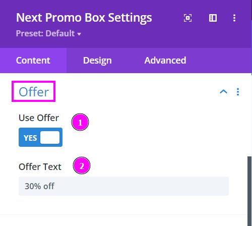
Content → Offer
- Use Offer – enable to place an offer on the product on display
- Offer Text – put the set amount of percentage as an offer
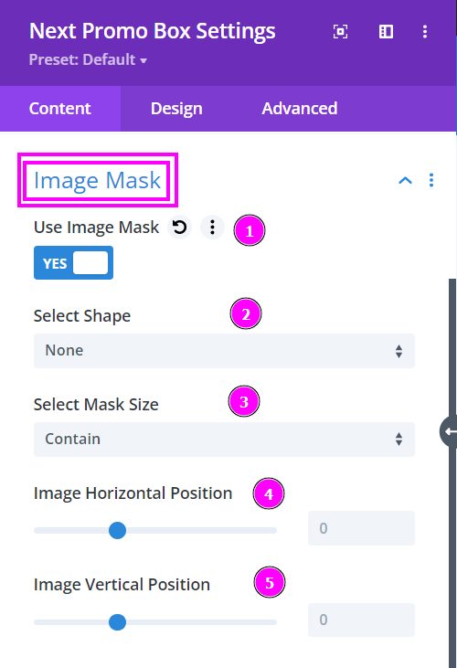
Content tab → Image Mask
Here are the prebuilt shapes included in the Image Masking Feature. You get 15 trendy shapes. Try it out!
Let’s go over the Use Image Mask options:
- Use Image Mask – enable to open the settings for Image Mask.
- Select Shape – there are various premade shapes available here. Select the one you like best and get started.
- Select Mask Size – here, you can either contain or cover the image, and the image will automatically position itself.
- Image Horizontal Position – adjust the horizontal position
- Image Vertical Position – adjust the vertical position
Content → Image Mask (continued)
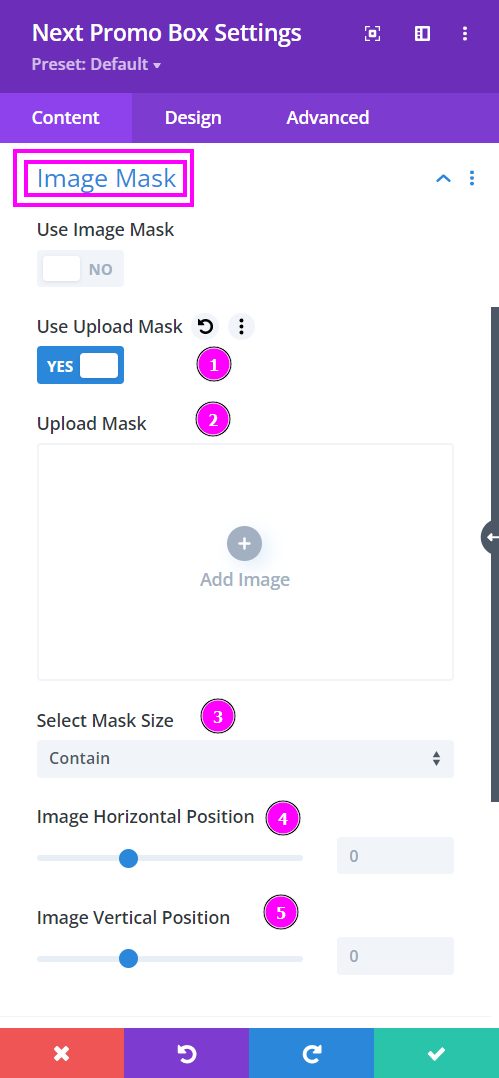
Within the modules where we have placed the Image Mask feature, you also get to upload a custom shape in SVG format!
- Use Upload Mask – enable to see the upload mask tools
- Upload Mask – upload an SVG formatted file where you have set the desired shape for the image
- Select Mask Size – here, you can either contain or cover the image, and the image will automatically position itself.
- Image Horizontal Position – adjust the horizontal position
- Image Vertical Position – adjust the vertical position
Content → Text
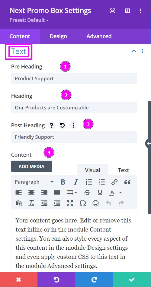
- Pre-Heading – Type the pre heading text in the text field presented here
- Heading – write the title or heading for your promo box design
- Post Heading – type the post heading for the product displayed
- Content – write short summary about the product you have displayed on your promo box design
Design → Pre Heading Settings
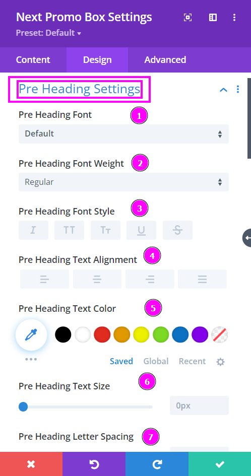
Here we discuss what options you’re getting for text stylization of the pre heading within the Promo Box module.
- Font – Select a font from the collection or use custom font.
- Font Weight – this is where you define how you want your font to show either regular, italic, bold extra, or even extra light.
- Font Style – Pick a style of font.
- Text Alignment – align the text to the left, right, or center.
- Text Color – manually select a color for the background of the text using the pointer or you can simply state the hex code and get the exact color you require.
- Text Size – easily resize the text using the slider.
- Letter Spacing – space out the letters using the slider for an easier read for the website visitors.
Design → Pre Heading Settings (continued)
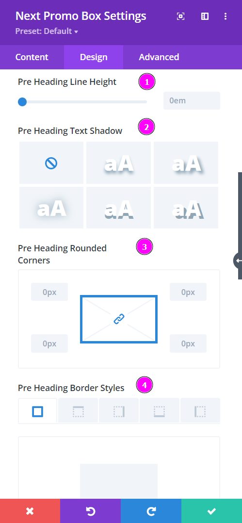
- Line Height – adjust the space between the lines using the slider.
- Text Shadow – select a prebuilt shadow for your text
- Rounded Corners – adjust the four corners to include rounded corners
- Border Styles – include borders on any side of the text or all four sides.
Design → Pre Heading Settings (continued)
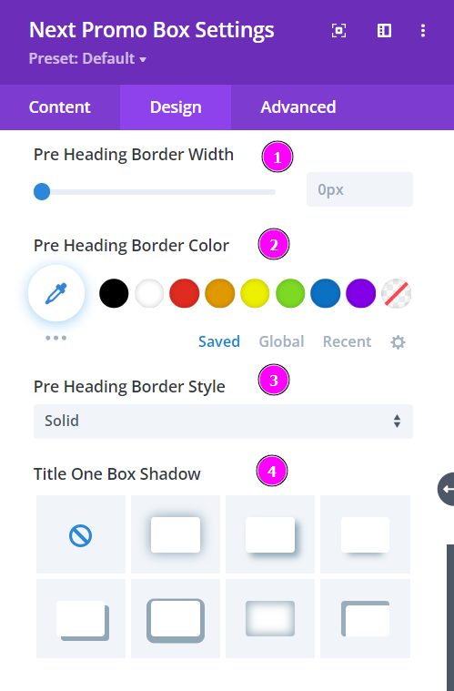
- Border Width – adjust the width of the border using the slider.
- Border Color – pick a color for the border you’ve added.
- Border Style – select a style of the border from the premade border styles.
- Title One Box Shadow – choose a box shadow to the pre heading text
Design → Heading Settings
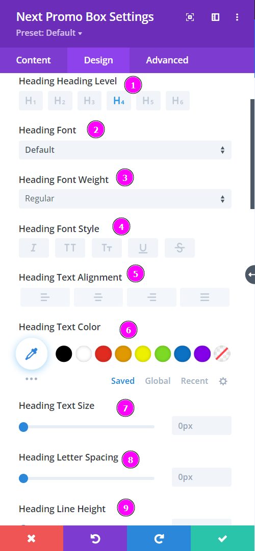
- Heading Level – Select a level for the heading from H1 to H6
- Font – Select a font from the collection or use custom font.
- Font Weight – this is where you define how you want your font to show either regular, italic, bold extra, or even extra light.
- Font Style – Pick a style of font for the design.
- Text Alignment – align the text to the left, right, or center.
- Text Color – manually select a color for the background of the text using the pointer or you can simply state the hex code and get the exact color you require.
- Text Size – easily resize the text using the slider.
- Letter Spacing – space out the letters using the slider for an easier read for the website visitors.
- Line Height – easily include gaps between the lines using the slider
Design → Heading Settings (continued)
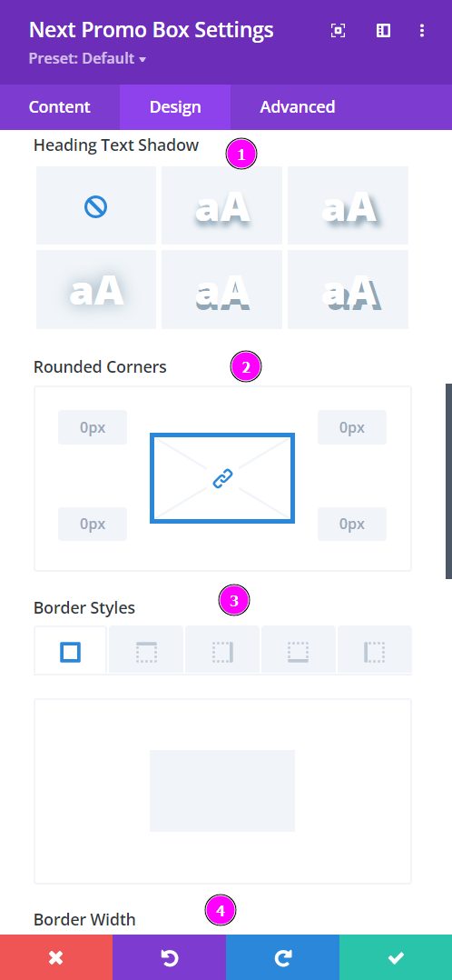
- Text Shadow – select a prebuilt shadow for your text
- Rounded Corners – adjust the four corners to include rounded corners
- Border Styles – include borders on any side of the text or all four sides
- Border Width – adjust the width of the border you have included using the slider
Design → Heading Settings (continued)
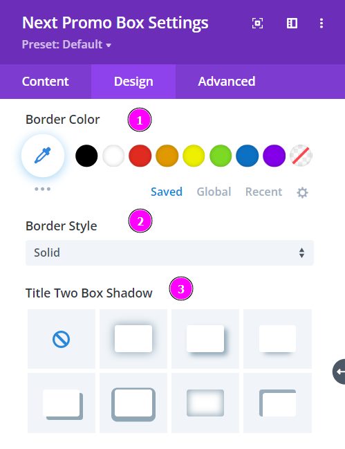
- Border Color – pick a color for the border you’ve added.
- Border Style – select a style of the border from the premade border styles.
- Title Two Box Shadow – choose a box shadow to the heading text
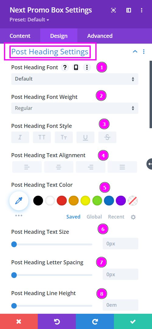
Design → Post Heading Settings
Here we discuss what options you’re getting for text stylization of the post heading within the Promo Box module.
- Font – Select a font from the collection or use custom font.
- Font Weight – this is where you define how you want your font to show either regular, italic, bold extra, or even extra light.
- Font Style – Pick a style of font for the design.
- Text Alignment – align the text to the left, right, or center.
- Text Color – manually select a color for the background of the text using the pointer or you can simply state the hex code and get the exact color you require.
- Text Size – easily resize the text using the slider.
- Letter Spacing – space out the letters using the slider for an easier read for the website visitors.
- Line Height – adjust the space between the lines using the slider
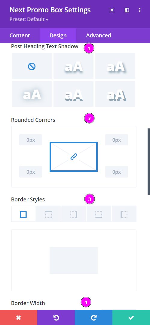
Design → Post Heading Settings (continued)
- Text Shadow – select a prebuilt shadow for your text
- Rounded Corners – adjust the four corners to include rounded corners
- Border Styles – include borders on any side of the text or all four sides
- Border Width – adjust the width of the border you have included using the slider
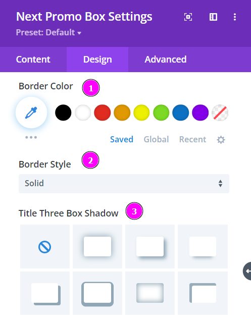
Design → Post Heading Settings (continued)
- Border Color – pick a color for the border you’ve added.
- Border Style – select a style of the border from the premade border styles.
- Title Three Box Shadow – choose a box shadow to the post heading text
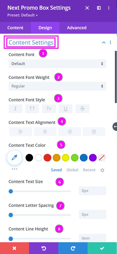
Design → Content Settings
Here we discuss what options you’re getting for text stylization of the content settings within the Promo Box module.
- Font – Select a font from the collection or use custom font.
- Font Weight – this is where you define how you want your font to show either regular, italic, bold extra, or even extra light.
- Font Style – Pick a style of font for the design.
- Text Alignment – align the text to the left, right, or center.
- Text Color – manually select a color for the background of the text using the pointer or you can simply state the hex code and get the exact color you require.
- Text Size – easily resize the text using the slider.
- Letter Spacing – space out the letters using the slider for an easier read for the website visitors.
- Line Height – adjust the space between the lines using the slider
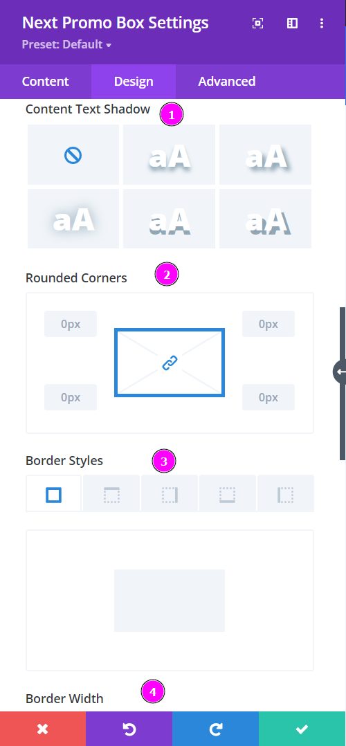
Design → Content Settings (continued)
- Text Shadow – select a prebuilt shadow for your text
- Rounded Corners – adjust the four corners to include rounded corners
- Border Styles – include borders on any side of the text or all four sides
- Border Width – adjust the width of the border you have included using the slider
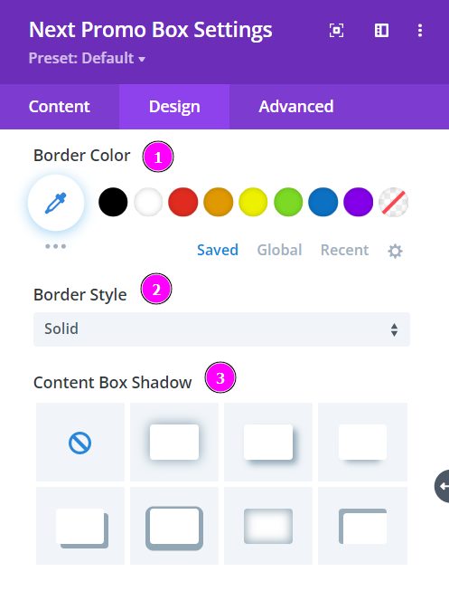
Design → Content Settings (continued)
- Border Color – pick a color for the border you’ve added.
- Border Style – select a style of the border from the premade border styles.
- Content Box Shadow – choose a box shadow to the content text
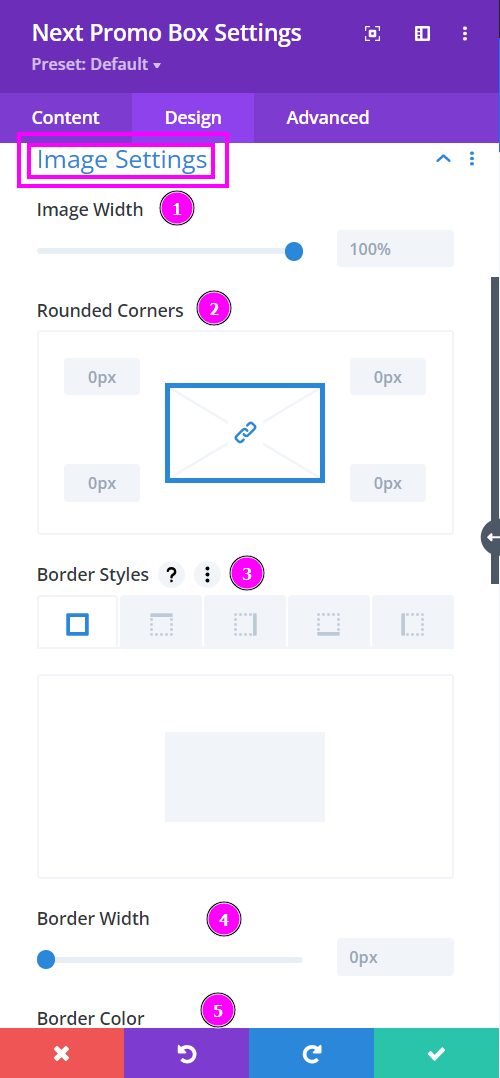
Design → Image Settings
- Image Width – adjust the image width using the slider
- Rounded Corners – adjust the four corners to apply rounded corners
- Border Styles – add a border on each side or on all four sides
- Border Width – adjust the image’s border width using the slider
- Border Color – select a color for the border using the pointer or simply put the hex code to get the exact color required
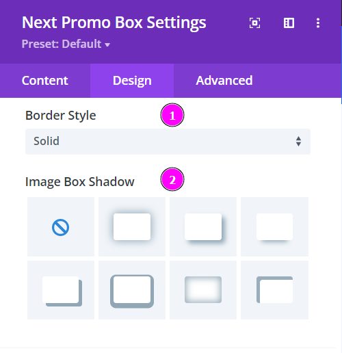
Design → Image Settings (continued)
- Border Style – select a prebuild border for the image
- Image Box Shadow – include a box shadow to your image
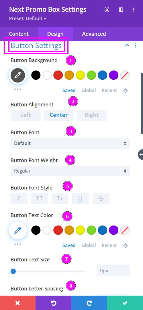
Design → Button Settings
Here we talk about what options you’re getting for text stylization for the Button within the Promo Box module.
- Button Background – select a color for the background of the button using the pointer or you can simply put the hex code and get the exact color you require.
- Button Alignment – align the button either to the Left, Center, or Right.
- Button Font – Select a font from the collection or use a custom font.
- Font Weight – this is where you define how you want your font to show either regular, italic, bold extra, or even extra light.
- Font Style – Pick a style of font for the design.
- Text Color – manually select a color for the text using the pointer or you can simply state the hex code and get the exact color you require.
- Text Size – easily resize the text using the slider.
- Letter Spacing – space out the letters using the slider for an easier read for the website visitors.
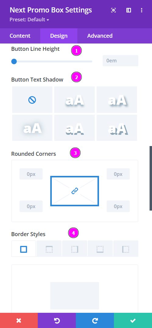
Design → Button Settings (continued)
- Line Height – adjust the space between the lines using the slider
- Border Text Shadow – add shadow to your text from the following prebuilt shadows
- Rounded Corners – adjust the four corners to include rounded corners
- Border Styles – include borders on any side of the text or all four sides
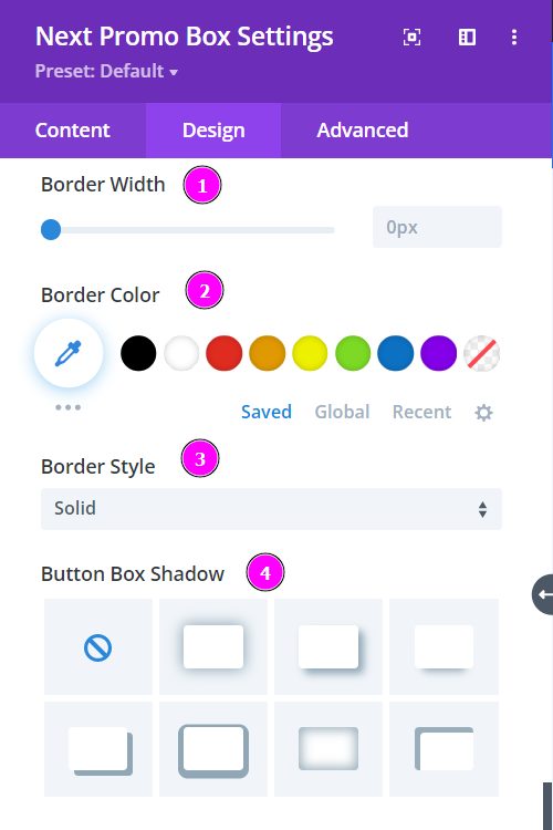
Design → Button Settings (continued)
- Border Width – adjust the width of the border you have included using the slider
- Border Color – select a color for the border using the pointer or simply put the hex code to get the exact color required
- Border Style – select a prebuild border for the button
- Button Box Shadow – include a box shadow to your button
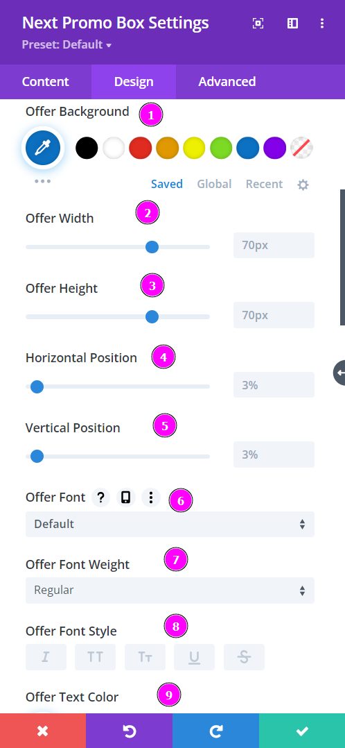
Design → Offer Settings
Here we talk about what options you’re getting for text stylization for the Button within the Promo Box module.
- Offer Background – select a color for the background of the button using the pointer or you can simply put the hex code and get the exact color you require.
- Offer Width – adjust the width of the offer using the slider
- Offer Height – adjust the height of the offer placed
- Horizontal Position – adjust and align the horizontal positioning of the offer.
- Vertical Position – adjust and align the vertical positioning of the offer.
- Offer Font – Select a font from the collection or use custom font.
- Font Weight – this is where you define how you want your font to show either regular, italic, bold extra, or even extra light.
- Font Style – Pick a style of font for the design.
- Text Color – manually select a color for the text using the pointer or you can simply state the hex code and get the exact color you require.
Design → Offer Settings (continued)
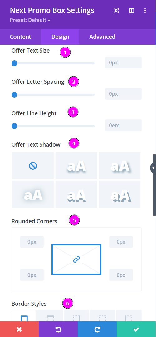
- Text Size – easily resize the text using the slider.
- Letter Spacing – space out the letters using the slider for an easier read for the website visitors.
- Line Height – adjust the space between the lines using the slider
- Text Shadow – add shadow to your text from the following prebuilt shadows
- Rounded Corners – adjust the four corners to include rounded corners
- Border Styles – include borders on any side of the text or all four sides
Design → Offer Settings (continued)
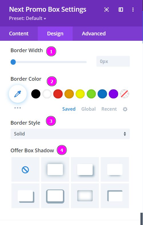
- Border Width – adjust the width of the border you have included using the slider
- Border Color – select a color for the border using the pointer or simply put the hex code to get the exact color required
- Border Style – select a prebuild border for the button
- Offer Box Shadow – include a box shadow in your offer.
