Put an overlay effect on a team member’s image, and give a stylish feel to the presentation of team members.
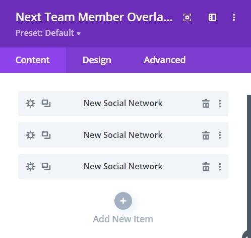
Content → New Item → Social Network
As you add New Items, you will have the option to put the Social Media Link of the specific Team Member’s design layout.
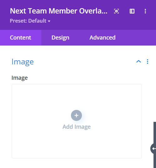
Content → Image
Image – here, you can add a professional picture of a Team Member by clicking on Add Image
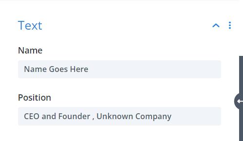
Content → Text
Name – type the name of the team member in the text field
Position – type the position he/she holds in the company in the text field
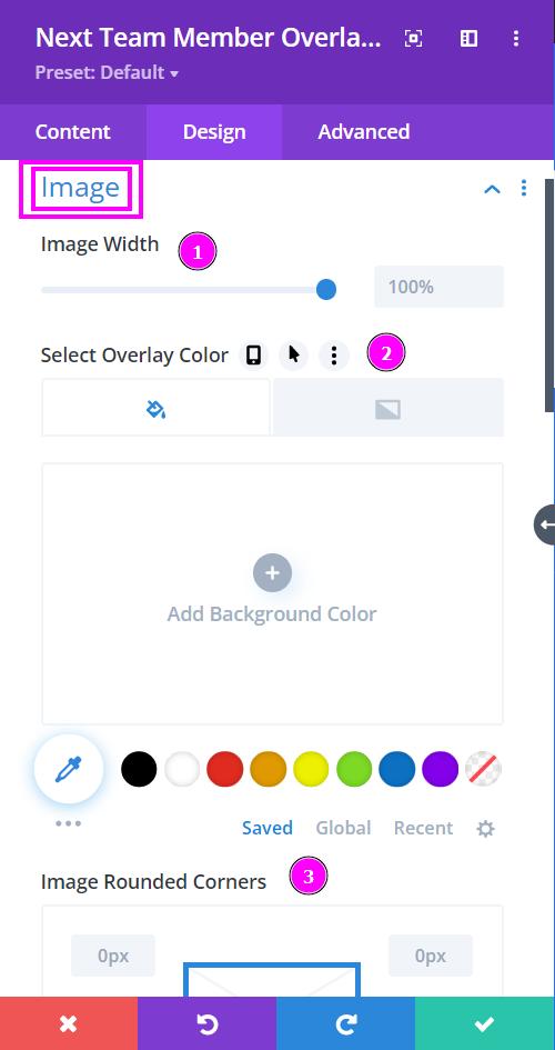
Design → Image
- Image Width – adjust the width of the image using the slider
- Select Overlay Color – select a color for the overlay by using the pointer or simply add the hex code to achieve the exact color required
- Image Rounded Corners – adjust the four corners of the image to give rounded corners to it
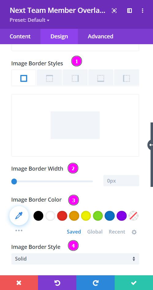
Design → Image (continuation)
- Image Border Styles – include a border to the image either on all four sides or wherever you prefer
- Image Border Width – adjust the width of the border added to the image
- Image Border Color – pick a color for the border using the pointer or you can copy/paste the hex code to get the exact color required for the border
- Image Border Style – select a premade style of border
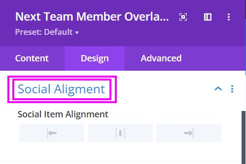
Design → Social Alignment
Social Alignment – position the social networks either to the left, center, or right.
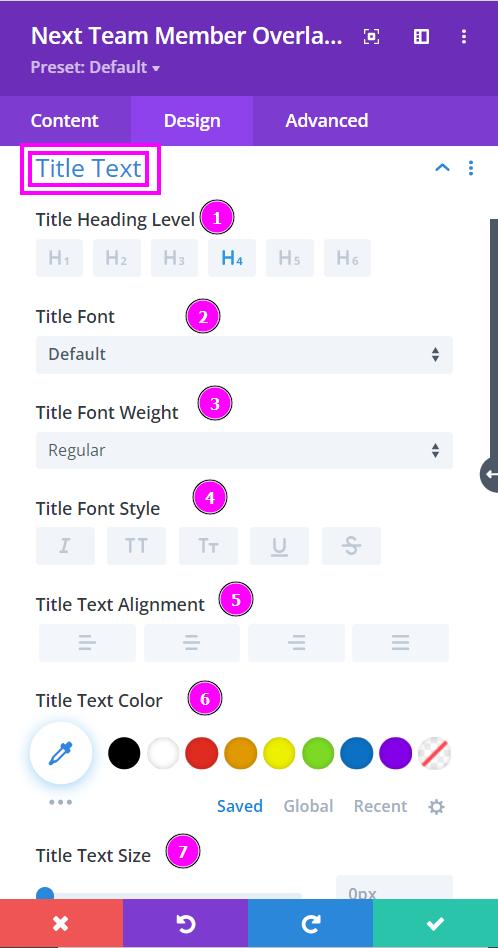
Design → Title Text
- Title Heading Level – Pick a level for the heading
- Font – Select a font from the collection or use a custom font
- Font Weight – is where you define how you want your font to show either regular, italic, bold extra, or even extra light.
- Font Style – Pick a style of font for the text.
- Text Alignment – align the text for Title Text.
- Text Color – manually select a color for the background of the text using the pointer, or you can state the hex code and get the exact color you require.
- Text Size – easily resize the text using the slider.
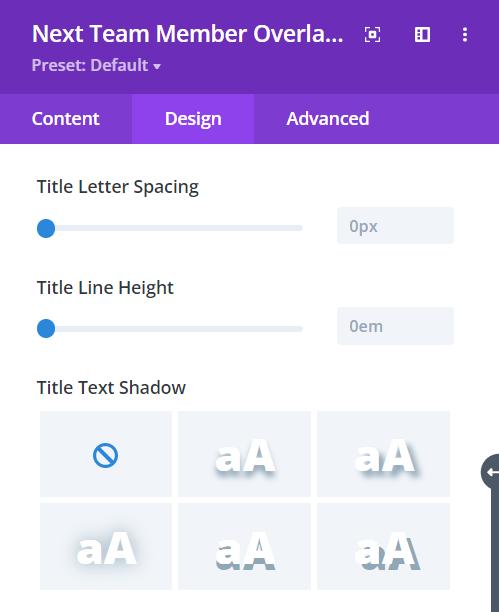
Design → Title Text (continuation)
- Letter Spacing – space out the letters using the slider for an easier read for the website visitors
- Line Height – easily include gaps between the lines using the slider
- Text Shadow – add text shadow to have the texts highlighted
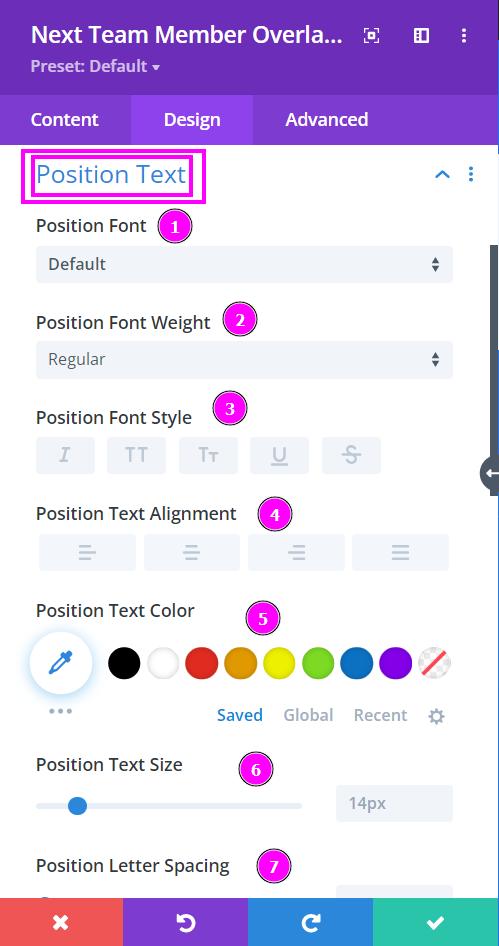
Design → Position Text
- Font – Select a font from the collection or use a custom font
- Font Weight – is where you define how you want your font to show either regular, italic, bold extra, or even extra light.
- Font Style – Pick a style of font for the text.
- Text Alignment – align the text for Title Text.
- Text Color – manually select a color for the background of the text using the pointer, or you can state the hex code and get the exact color you require.
- Text Size – easily resize the text using the slider.
- Letter Spacing – space out the letters using the slider.
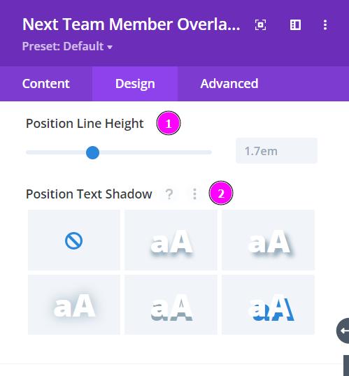
Design → Position Text (continuation)
- Line Height – easily include gaps between the lines using the slider
- Text Shadow – add text shadow to have the texts highlighted
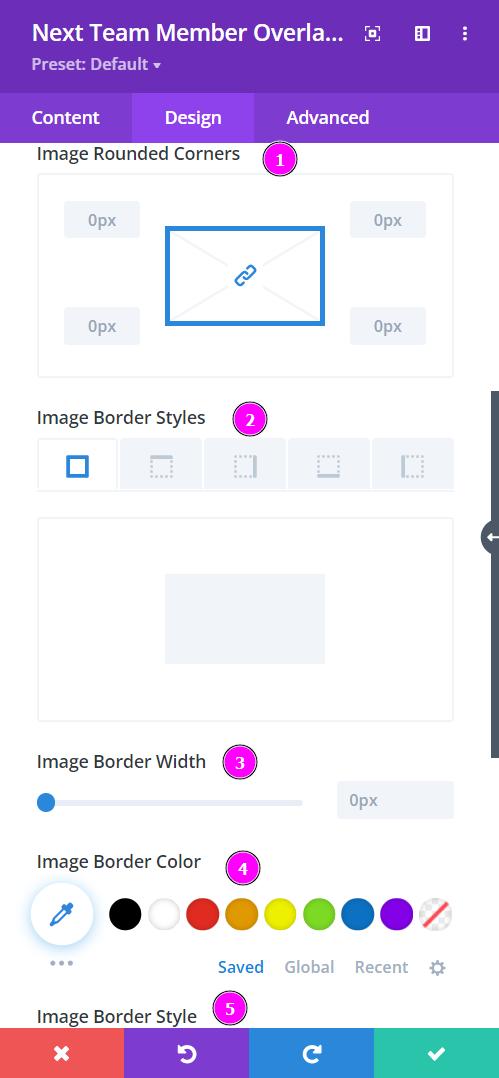
Design → Image Overlay Border
- Rounded Corners – adjust the four corners of the content to give rounded corners to it
- Border Styles – include a border to the image either on all four sides or wherever you prefer
- Border Width – adjust the width of the border added to the image
- Border Color – pick a color for the border using the pointer or you can copy/paste the hex code to get the exact color required for the border
- Border Style – select a premade style of border
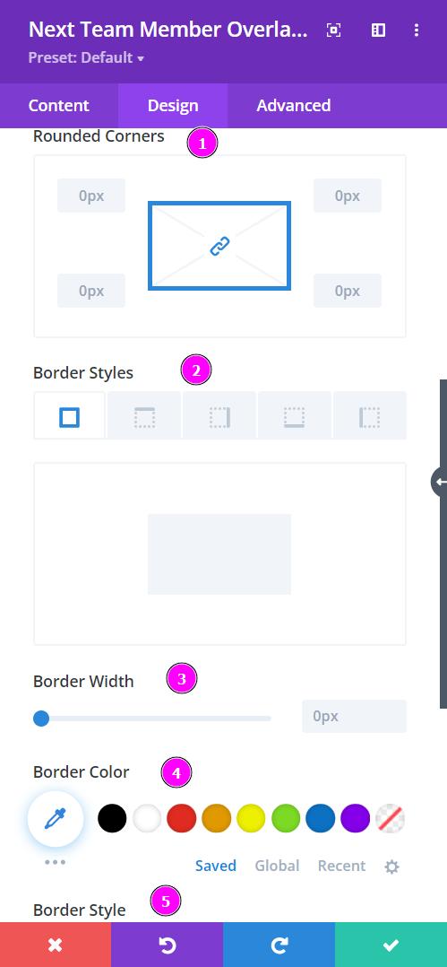
Design → Content Border
- Rounded Corners – adjust the four corners of the content to give rounded corners to it
- Border Styles – include a border to the image either on all four sides or wherever you prefer
- Border Width – adjust the width of the border added to the image
- Border Color – pick a color for the border using the pointer or you can copy/paste the hex code to get the exact color required for the border
- Border Style – select a premade style of border
