Create an elegant card-shaped team member design with an overlay effect on the images revealing the body text and social network icons. This makes the section more appealing to look at for the viewers.
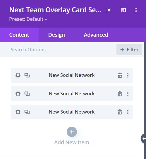
Content → New Item → Social Network
As you add New Items, you will have the option to put the Social Media Link of the specific Team Member’s design layout.
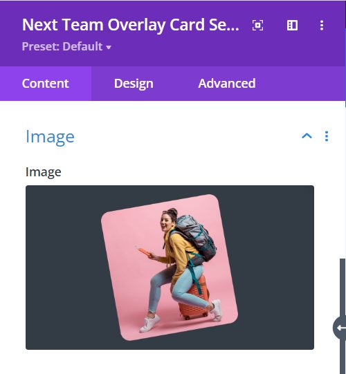
Content → Image
Image – add a suitable picture of a Team Member by clicking Add Image.
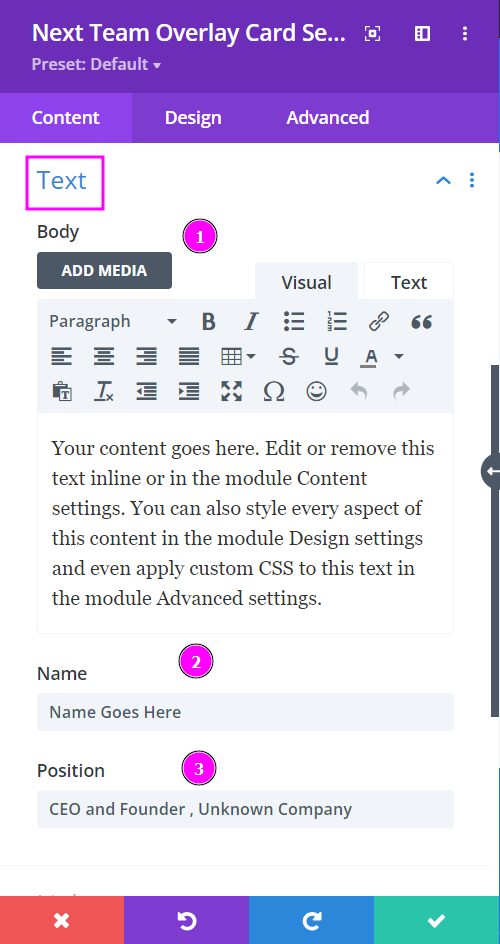
Content → Text
- Body – write a summary about their work and what is charming about their efforts in the company.
- Name – type the name of the team member in the text field.
- Position – place the position they hold in your company.
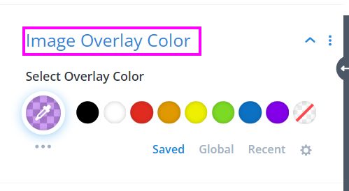
Content → Image Overlay Color
Select a color to set as an overlay to reveal the content and social icons on hover.
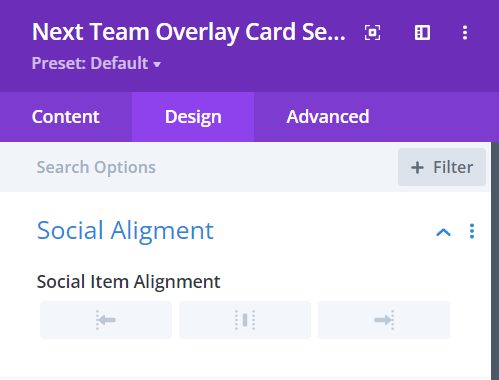
Design → Social Alignment
Align the social icons to the left, center, or right.
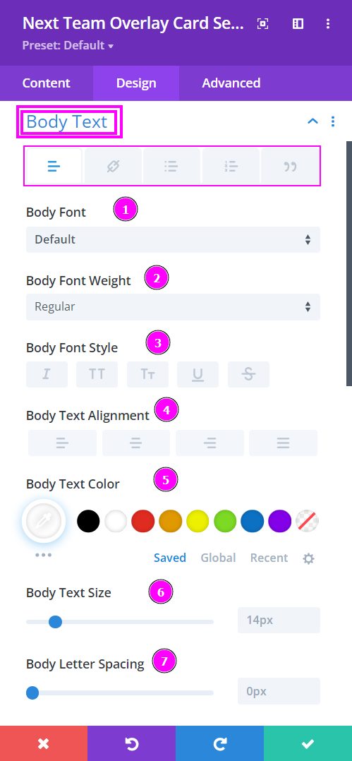
Design → Body Text
Other than the basic text stylization, we included the option to use paragraphs, links, bullet points, and numbered and quoted texts.
- Font – Select a font from the collection or use a custom font
- Font Weight – is where you define how you want your font to show either regular, italic, bold extra, or even extra light.
- Font Style – Pick a style of font for the text.
- Text Alignment – align the text for Title Text.
- Text Color – manually select a color for the background of the text using the pointer, or you can state the hex code and get the exact color you require.
- Text Size – easily resize the text using the slider.
- Letter Spacing – use this to space out the letters utilizing the slider.
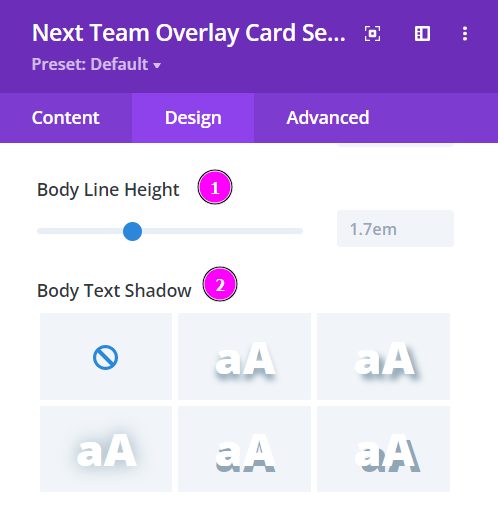
Design → Body Text (continued)
- Line Height – easily include gaps between the lines using the slider
- Text Shadow – add text shadow to have the texts highlighted
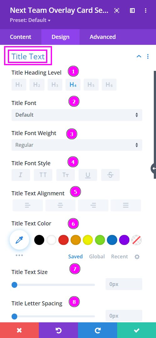
Design → Title Text
- Title Heading Level – Pick a level for the heading
- Font – Select a font from the collection or use a custom font
- Font Weight – is where you define how you want your font to show either regular, italic, bold extra, or even extra light.
- Font Style – Pick a style of font for the text.
- Text Alignment – align the text for Title Text.
- Text Color – manually select a color for the background of the text using the pointer, or you can state the hex code and get the exact color you require.
- Text Size – easily resize the text using the slider.
- Letter Spacing – space out the letters using the slider for an easier read for the website visitors
Design → Title Text (continued)
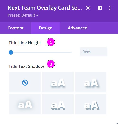
- Line Height – easily include gaps between the lines using the slider
- Text Shadow – add text shadow to have the texts highlighted
Design → Position Text
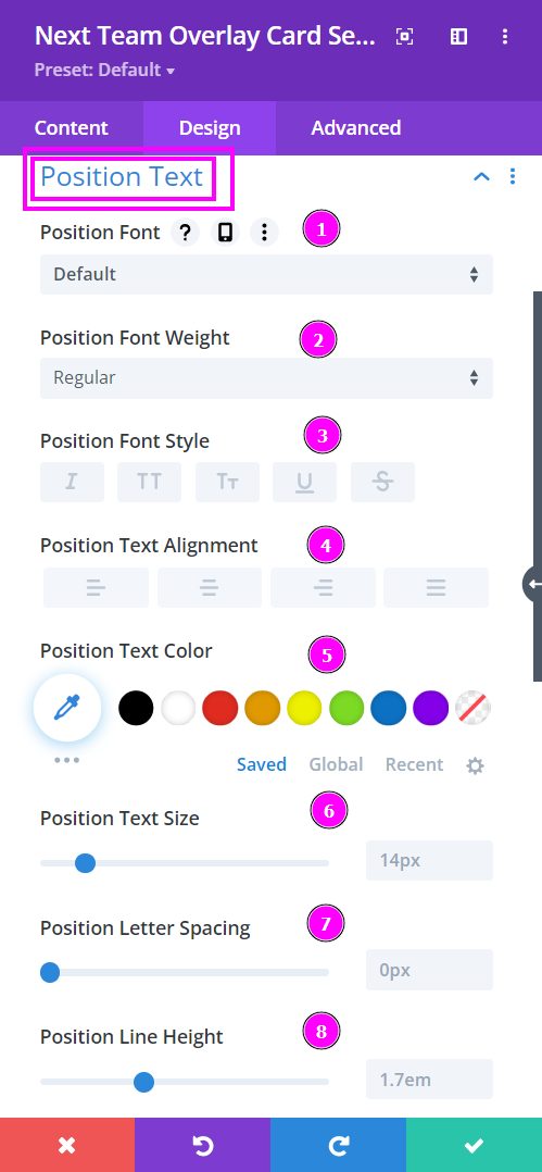
- Font – Select a font from the collection or use a custom font
- Font Weight – is where you define how you want your font to show either regular, italic, bold extra, or even extra light.
- Font Style – Pick a style of font for the text.
- Text Alignment – align the text for Title Text.
- Text Color – manually select a color for the background of the text using the pointer, or you can state the hex code and get the exact color you require.
- Text Size – easily resize the text using the slider.
- Letter Spacing – space out the letters using the slider for an easier read for the website visitors
- Line Height – easily include gaps between the lines using the slider.
Design → Position Text (continued)
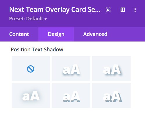
Text Shadow – add text shadow to have the texts highlighted. Configure the intensity and position of the shadow after selection.
Design → Image Border
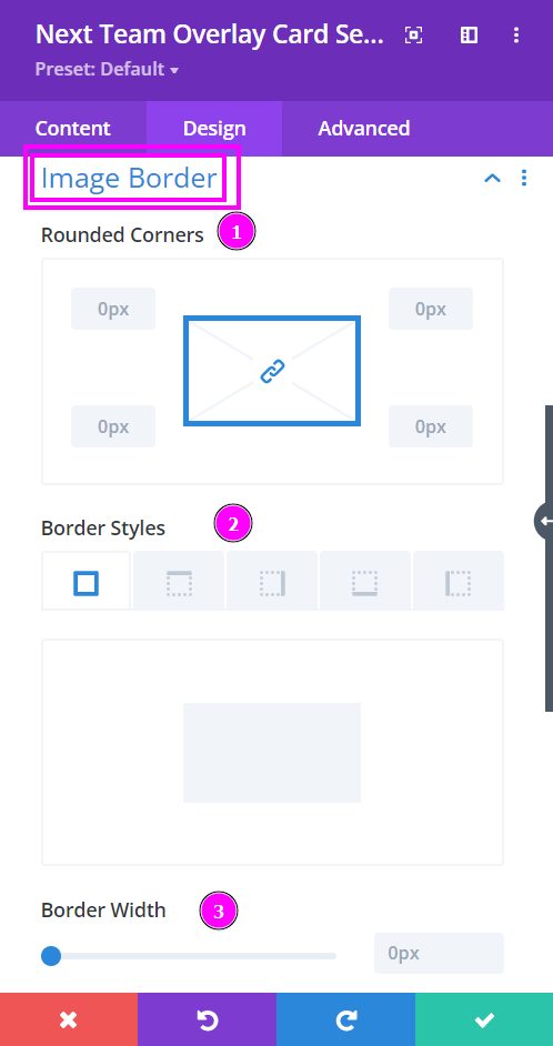
- Rounded Corners – adjust the four corners of the image to give rounded corners.
- Border Styles – include a border to the image on all four sides or wherever you prefer.
- Border Width – adjust the width of the border added to the image
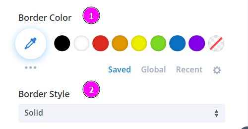
Design → Image Border (continued)
- Border Color – pick a color for the frame using the pointer, or you can copy/paste the hex code to get the exact shade required for the border
- Border Style – select a premade style of border
