Add a team member’s image and reveal the social media sites as one hovers on the design. Great for showcasing social networking and self-promotion of team members.
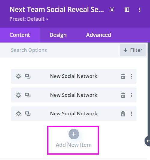
Content → New Item → Social Network
As you add New Items, you will have the option to put the Social Media Link of the specific Team Member’s design layout.
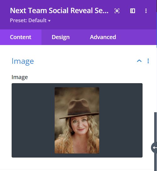
Content → Image
Image – add a professional picture of a Team Member by clicking on Add Image.
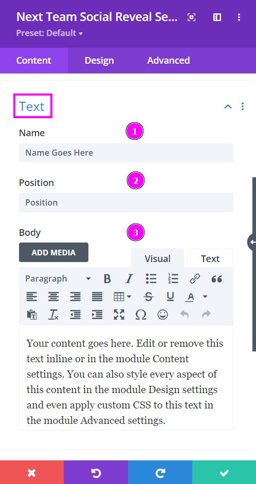
Content → Text
- Name – type the name of the team member in the text field.
- Position – place the position they hold in your company.
- Body – write a summary about their work and what is charming about their efforts in the company.
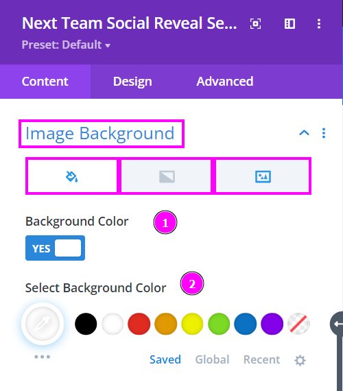
Content → Image Background
- Background Color – enable to select a color for the image’s background.
- Select Background Color – pick a color using the pointer or place the hex code to get the exact color.
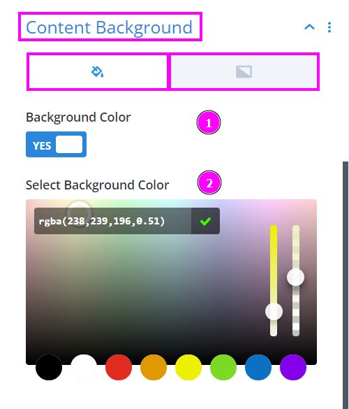
Content → Content Background
Within Content Background, you can either select fill color or gradient.
- Background Color – enable to select a color for the content’s background.
- Select Background Color – pick a color using the pointer or place the hex code to get the exact color.
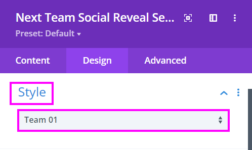
Design → Style
Select a style between the two styles available.
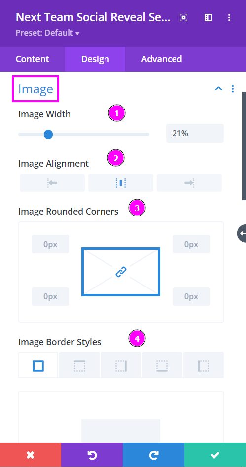
Design → Image
- Image Width – adjust the width of the image using the slider
- Image Alignment – align the image to the left, center, or right.
- Image Rounded Corners – adjust the four corners of the image to give rounded corners to it.
- Image Border Styles – include a border to the image either on all four sides or wherever you prefer.
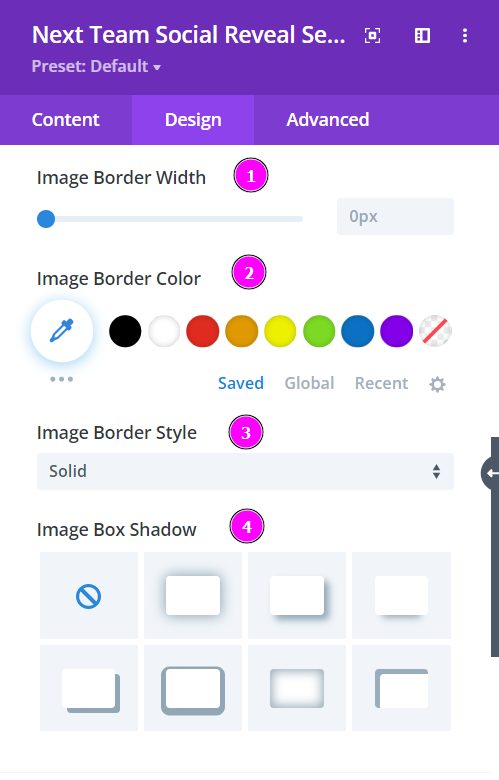
Design → Image (continued)
- Image Border Width – adjust the width of the border added to the image
- Image Border Color – pick a color for the frame using the pointer, or you can copy/paste the hex code to get the exact shade required for the border
- Image Border Style – select a premade style of border
- Image Box Shadow – choose a box shadow for the image and configure the intensity.
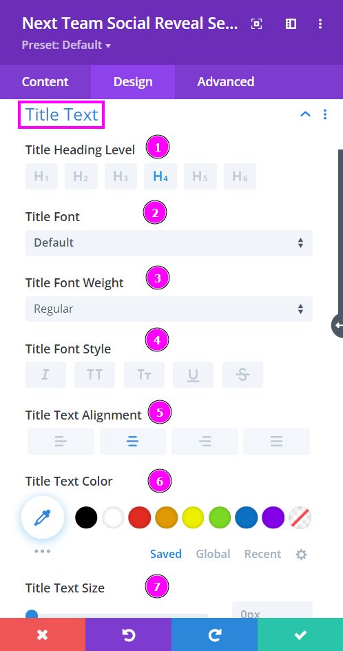
Design → Title Text
- Title Heading Level – Pick a level for the heading
- Font – Select a font from the collection or use a custom font
- Font Weight – is where you define how you want your font to show either regular, italic, bold extra, or even extra light.
- Font Style – Pick a style of font for the text.
- Text Alignment – align the text for Title Text.
- Text Color – manually select a color for the background of the text using the pointer, or you can state the hex code and get the exact color you require.
- Text Size – easily resize the text using the slider.
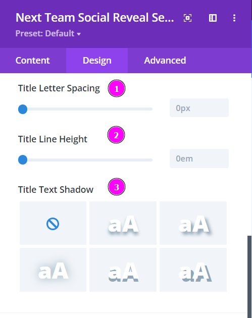
Design → Title Text (continued)
- Letter Spacing – space out the letters using the slider for an easier read for the website visitors
- Line Height – easily include gaps between the lines using the slider
- Text Shadow – add text shadow to have the texts highlighted
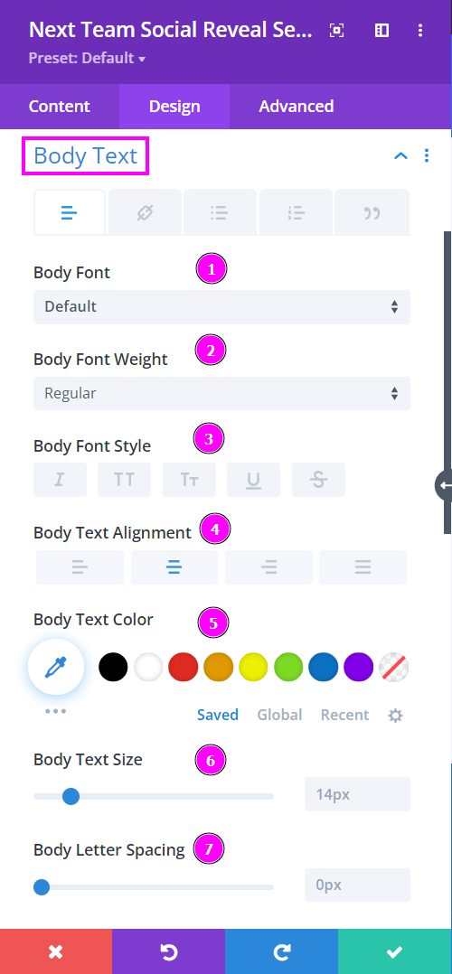
Design → Body Text
- Font – Select a font from the collection or use a custom font
- Font Weight – is where you define how you want your font to show either regular, italic, bold extra, or even extra light.
- Font Style – Pick a style of font for the text.
- Text Alignment – align the text for Title Text.
- Text Color – manually select a color for the background of the text using the pointer, or you can state the hex code and get the exact color you require.
- Text Size – easily resize the text using the slider.
- Letter Spacing – use this to space out the letters utilizing the slider.
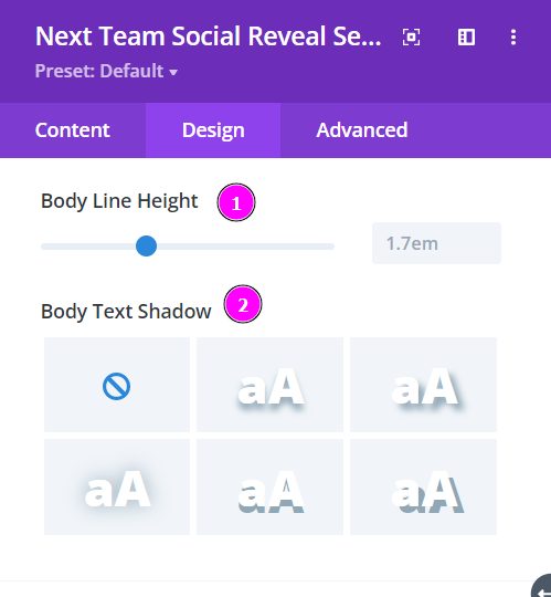
Design → Body Text (continued)
- Line Height – easily include gaps between the lines using the slider
- Text Shadow – add text shadow to have the texts highlighted
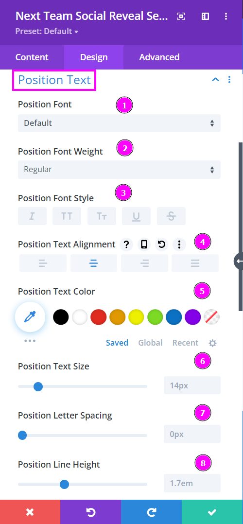
Design → Position Text
- Font – Select a font from the collection or use a custom font
- Font Weight – is where you define how you want your font to show either regular, italic, bold extra, or even extra light.
- Font Style – Pick a style of font for the text.
- Text Alignment – align the text for Title Text.
- Text Color – manually select a color for the background of the text using the pointer, or you can state the hex code and get the exact color you require.
- Text Size – easily resize the text using the slider.
- Letter Spacing – use this to space out the letters utilizing the slider.
- Line Height – easily include gaps between the lines using the slider.
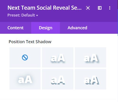
Design → Position Text (continued)
Text Shadow – add text shadow to have the texts highlighted. You can also configure the intensity using the text shadow settings after selection.
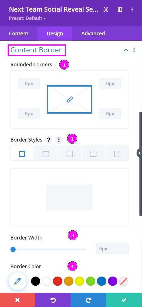
Design → Content Border
- Rounded Corners – adjust the four corners of the content to give rounded corners to it.
- Border Styles – include a border to the content on all four sides or wherever you prefer.
- Border Width – adjust the width of the border added to the content.
- Border Color – pick a color for the frame using the pointer, or you can copy/paste the hex code to get the exact shade required for the border.

Design → Content Border (continued)
Border Style – select a premade style of border
