Create well-structured and engaging to read headlines with the Divi Text Divider module. It features a variety of border styles. You can also align the texts according to your design in addition to placing them between the Dividers.
Let’s go over how Divi Text Divider works!
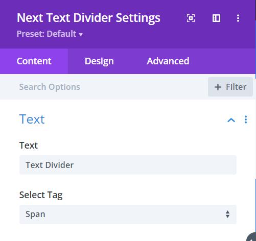
Content → Text
- Text – type down the divider text in this field
- Select Tag – select a tag for the divider text
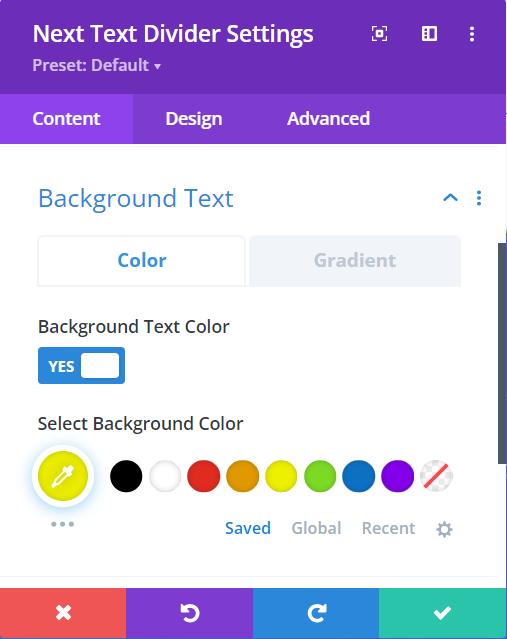
Content → Background Text
For the Text Divider’s background color you can either pick a fill color or gradient.
- Select Background Text Color – Enable this within the Color tab to select the fill color for the background
- Select Background Color – pick a color using the pointer or you can copy/paste the hex code to get the exact color required for the design.
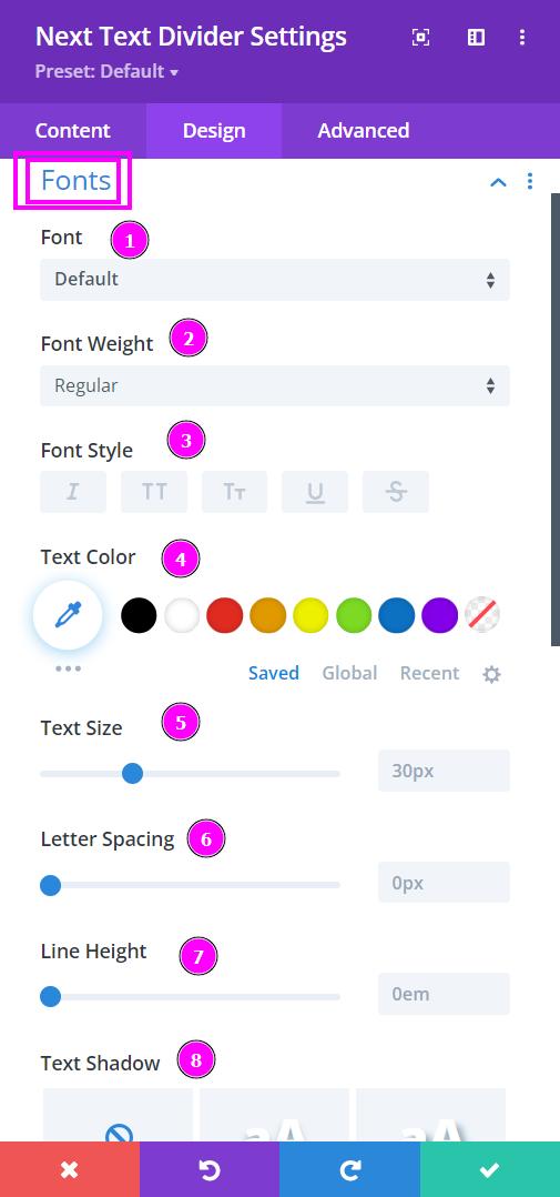
Design → Fonts
- Font – Select a font from the collection or use a custom font.
- Font Weight – this is where you define how you want your font to show either regular, italic, bold extra, or even extra light.
- Font Style – Pick a style of font for both front and back.
- Text Color – manually select a color for the background of the text using the pointer or you can simply state the hex code and get the exact color you require.
- Text Size – easily resize the text for both the front and back parts of the flip box.
- Letter Spacing – space out the letters using the slider for an easier read for the website visitors.
- Line Height – easily include gaps between the lines using the slider
- Text Shadow – add text shadow to have the texts highlighted.
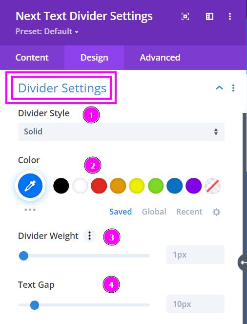
Design → Divider Settings
- Divider Style – there are 8 styles of dividers/separators, select the one you like best.
- Color – select a color with the pointer or simply copy/paste the hex code to get the exact color you require.
- Divider Weight – adjust the weight of the divider depending on how thick or thin you want them.
- Text Gap – adjust the gap between the text and the dividers.
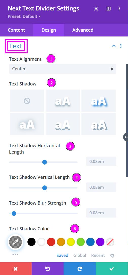
Design → Text
- Text Alignment – align the text to the left, center, or right.
- Text Shadow – Add a text shadow for the Divider Text.
When you select Text Shadow here are the settings that appear:
- Text Shadow Horizontal Length – position the shadow horizontally using the slider.
- Text Shadow Vertical Length – position the shadow vertically using the slider.
- Text Shadow Blur Strength – adjust the strength of the blur surrounding the shadow.
- Text Shadow Color – choose a color using the pointer or simply copy/paste hex code to get the exact color you require.