Create an awesome step by step visual imagery with instructions using this smart module. Change directions, counters, and make them look creative with icons, texts, and colors.
Content → Step Flow
- Icon – select an icon from the collection for your step flow design. This will appear in the middle of the center circle.
- Badge Title – input a title for your badge in the text field.
- Alignment – align the design either to the left, center, or right.
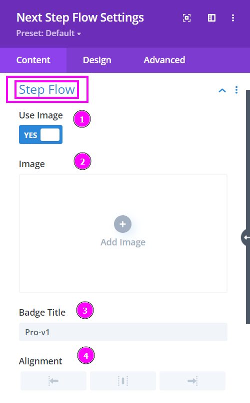
Here, we will talk about what happens when you enable the Use Image switch for your Step Flow design.
Content → Step Flow (Use Image)
- Use Image – enable to open the settings available when using an image for your design.
- Image – upload the image you plan on using within the design
- Badge Title – input a title for your badge in the text field.
- Alignment – align the design either to the left, center, or right.
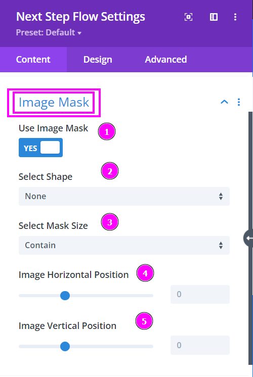
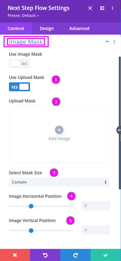
Content → Image Mask
- Use Image Mask – enable the switch to use Image Mask
- Select Shape – select a prebuilt shape to mask the image to
- Select Mask Size – select how you want the image to cover or contain within the shape of the mask
- Image Horizontal Position – adjust the horizontal position of the image within the shape
- Image Vertical Position – adjust the vertical position of the image within the shape
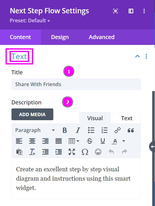
Content → Text
- Title – place an attractive title to the content design
- Description – write a small paragraph or a summary related to the title.
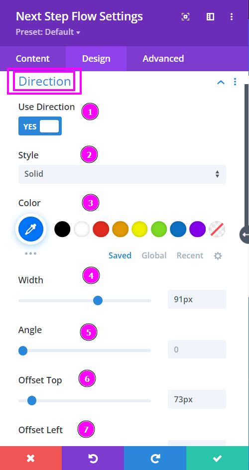
Design → Direction
- Use Direction – enable to view the settings for the direction of the arrow
- Style – select a prebuilt style for the step flow arrow
- Color – you can change the color by using the pointer or simply place the hex code to get the exact color required
- Width – adjust the width of the direction arrow
- Angle – adjust the angle at which the arrow should be pointed
- Offset Top – using the slider simply adjust the direction of the arrow to either on top or bottom
- Offset Left – using the slider simply adjust the direction of the arrow further to the left or attach it to the circle of the step flow design.
Design → Icon Box Style
- Size – adjust the size of the icon box
- Background Color – select a suitable background color for the box behind the icon.
- Icon Color – select a color for the icon using the pointer or simply put the hex code to get the exact color required
- Icon Size – resize the icon
- Rounded Corners – adjust the four corners to apply rounded corners
Design → Icon (continuation)
- Border Styles – include a border around the icon box
- Border Width – adjust the width of the border using the slider.
- Border Color – pick a color for the border you’ve added.
- Border Style – select a style of the border from the premade border styles
- Circle Shadow – add a box shadow to the circle element
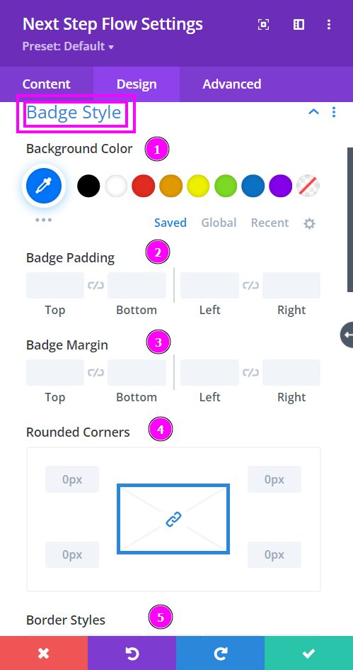
Design → Badge Style
- Background Color – select a color for the background using the pointer
- Badge Padding – add padding to the sides of the badge
- Badge Margin – use this to re-position the badge
- Rounded Corners – include rounded corners by adjusting the four corners
- Border Styles – add a border to the badge
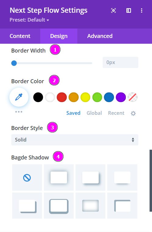
Design – Badge Style (continued)
- Border Width – adjust the width of the border using the slider.
- Border Color – pick a color for the border you’ve added.
- Border Style – select a style of the border from the premade border styles
- Badge Shadow – add a box shadow to the Badge element
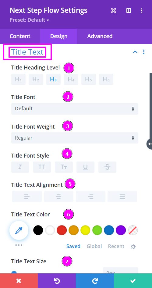
Design → Title Text
- Heading Level – select a level for the heading from the options given. (H1 being the largest to H6 being the smallest heading level)
- Font – Select a font from the collection or use a custom font.
- Font Weight – this is where you define how you want your font to show either regular, italic, bold extra, or even extra light.
- Font Style – Pick a style of font for both front and back.
- Text Alignment – align the text for both the front and back text.
- Text Color – manually select a color for the background of the text using the pointer or you can simply state the hex code and get the exact color you require.
- Text Size – easily resize the title text for the Step Flow design.
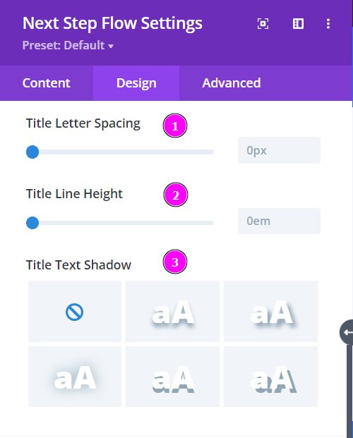
Design → Title Text (continued)
- Letter Spacing – space out the letters using the slider for an easier read for the website visitors.
- Line Height – easily include gaps between the lines using the slider
- Title Text Shadow – add text shadow to have the texts highlighted.
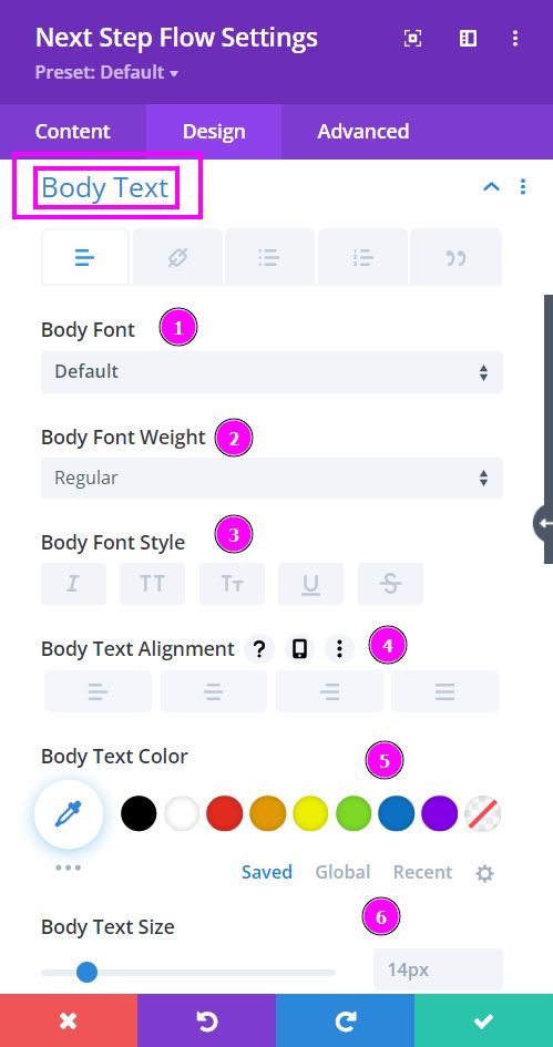
Design → Body Text
- Body Font – Select a font from the collection or use a custom font.
- Font Weight – this is where you define how you want your font to show either regular, italic, bold extra, or even extra light.
- Font Style – Pick a style of font for both front and back.
- Text Alignment – align the text for both the front and back text.
- Text Color – manually select a color for the background of the text using the pointer or you can simply state the hex code and get the exact color you require.
- Text Size – easily resize the body text for the Step Flow design.
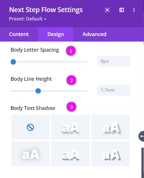
Design → Body Text (continued)
- Letter Spacing – space out the letters using the slider for an easier read for the website visitors.
- Line Height – easily include gaps between the lines using the slider
- Body Text Shadow – add text shadow to have the texts highlighted.
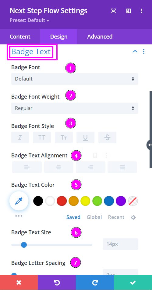
Design → Badge Text
- Badge Font – Select a font from the collection or use a custom font.
- Font Weight – this is where you define how you want your font to show either regular, italic, bold extra, or even extra light.
- Font Style – Pick a style of font for both front and back.
- Text Alignment – align the text for both the front and back text.
- Text Color – manually select a color for the background of the text using the pointer or you can simply state the hex code and get the exact color you require.
- Text Size – easily resize the badge text for the Step Flow design.
- Badge Letter Spacing – space out the letters using the slider for an easier read for the website visitors.
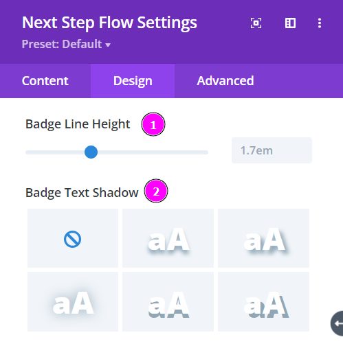
Design → Badge Text (continued)
- Line Height – easily include gaps between the lines using the slider
- Body Text Shadow – add text shadow to have the texts highlighted.
