Organize images in all shapes and sizes! And create a stunning collage with Divi Masonry!
Content Tab
Content → Images
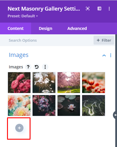
Add multiple images to form a collage and select the image order as you prefer it.
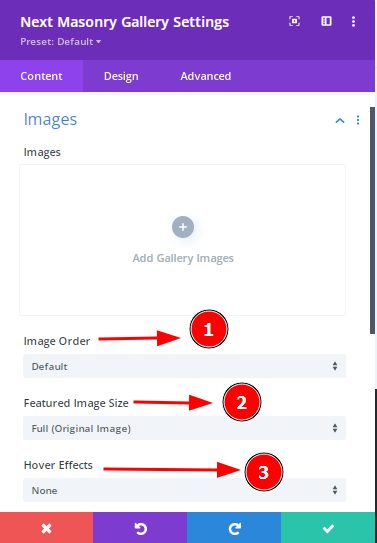
Content tab → Images → Media Library → Gallery Categories
Add an image from the media library and there you will find the option to type the gallery category for that particular image. This will help you achieve the filtered category feature.
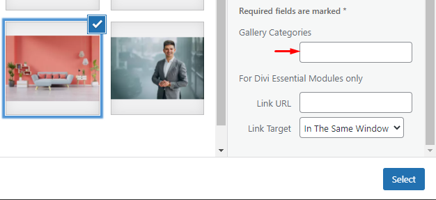
Content Tab → Images → Image Order
Image Order : By selecting this option, the images can be shown in default mode or images can be shown in Random mode. Using this option you can change the image order easily.
Content Tab →Images → Featured Image Size
Choose this option so that you might use the
Full(Original Image)/Medium/Small/Custom size images.
Content Tab → Images → Hover Effects
You can select the hover option from here.
There are lots of Hover effects available here such as Push Up, Push Down, Flip Horizontal, Flip Vertical, Shutter In vertical, Shutter Inout Horizontal, Zoom In, Zoom out, Image Rotate Left, Circle up, Bounce out, Flash top left, etc.
Content Tab → Settings

Content Tab → Settings → Lightbox/Link
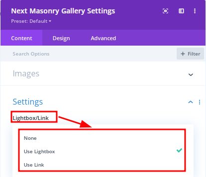
Click on this option and you can select the "None" option if you don't want to use the Lightbox.
Here, For using Link you can choose the "Use Link" option.
Moreover, Lightbox option is available here and for using this option you can select the " Use LightBox " option which will increase more
Content tab → Settings → Show Title
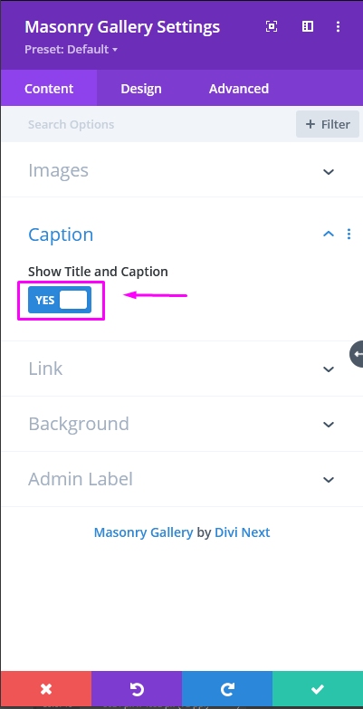
If you want to show Title then must enable this option from here.
Content tab → Settings → Caption
As you upload the images you will see on the right there are options to add Title and Caption text for the images as shown in the screenshot below:
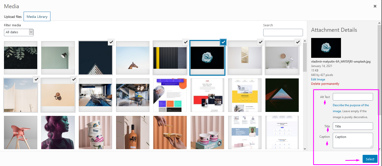
You can choose to view them by enabling this:
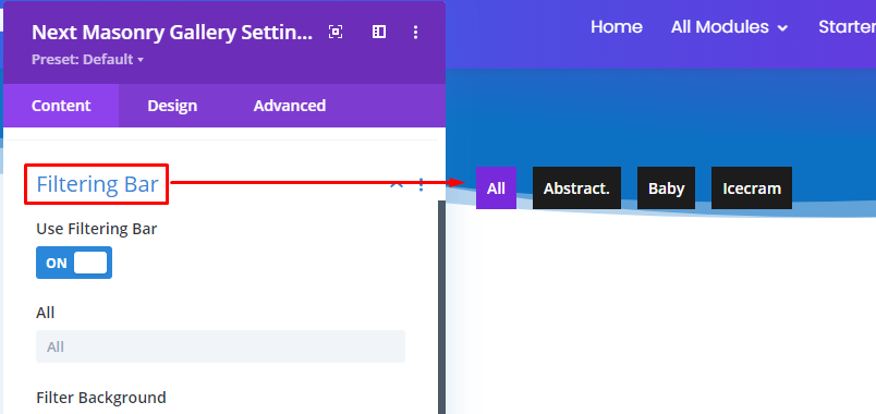
Content tab → Filtering Bar
Within the Filtering Bar toggle, you can enable this to categorize the grids.
We have added this new feature and by selecting this option you can use the "Filter Bar Layout Option"
Content Tab → Overlay Background
Select this option to use the Overlay Background. You might add the gradient color here as well. We have added the latest Feature here in Content Tab.
Design Tab
Design tab → Grid
Adjust the Columns and space between the images with Gutter
Design tab → Image
Stylize your images with all the features provided. In this option you can get the Image Rounded corner option, Border Styles, Border width as well as Border color, style moreover Image Box shadow option.
Design tab → Title
Here you will get the same options as "Caption". You can add your attractive caption easily.
Design tab → Caption
In this option select On Galery/On Lightbox, and you can get the below options:
- Caption Font
- Caption Font weight
- Caption Font Style
- Caption Text Alignment
- Caption Text Color
- Caption Text Size
- Caption Letter Spacing
- Caption Text Shadow
Now you can stylize your caption and add the appealing captoin here smoothly.
Design tab → Hover Icon
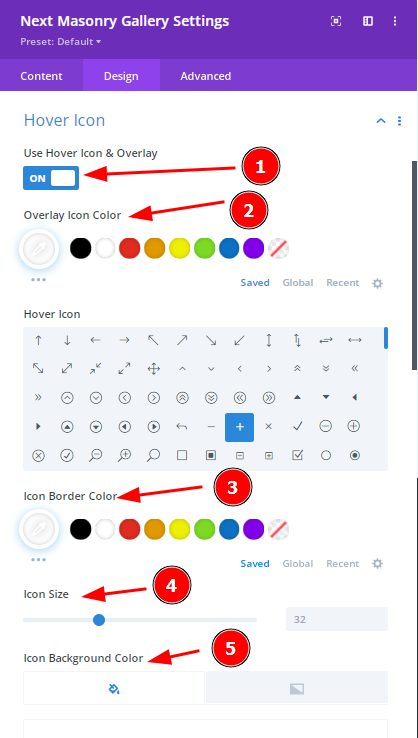
By enabling the Hover Icon and Overlay you can change the Hover Icon, Icon Border color, Icon Size, Icon Background color, border styles as well as Overlay color moreover the Style which will add an extra ordinary feelings.
Design tab → LightBox Color
You can design the Lightbox by adding the Arrow Color, Close Button Color, the overlay Background color of Lightbox.
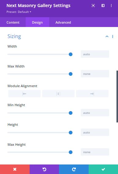
Design tab → Sizing
The sizing is a process and using this process you can change the width, Max width, Module Alignment, Min Height, Height, Max Height of Mansory Module. Easily you can adjust by using this option.
Design tab → Spacing
The simplest way to add spacing is available now. You can use the below options :
- Title Margin
- Title Padding
- Caption Margin
- Caption Padding
- Icon Margin
- Icon Padding
- Filter Menu Margin
- Filter Menu Padding
- Margin
- Padding
FAQS
How to Add Link/ URL/ Title/ Description in Masonry Module?
Using WordPress Media Library you can edit the image Title and Description flexibly. Simply keep in your custom Title and Description text into the input field.
From here you can set any custom URL to each image by inserting a custom URL in the "Link Url" input field under Divi Masonry Module.
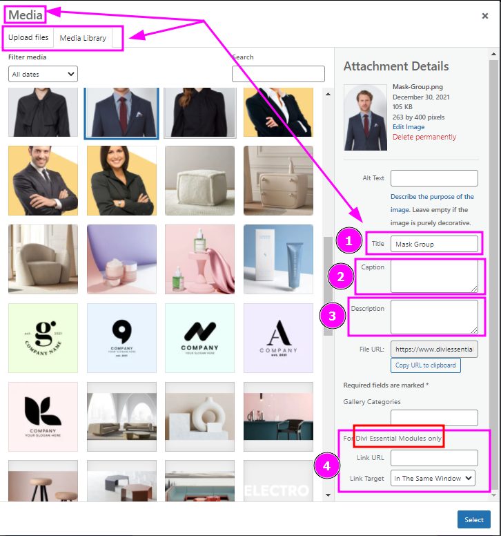
But for using Link or URL you have to enable this option by following below processes
Next Masonry Gallery Module > Settings> Lightbox/Link> Use Link
From the above process must select the "Use Link"
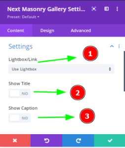
How do I disable the lighbox effect ?
To Disable the LightBox effect please follow the below process as well as the screenshot:
Next Masonry Gallery> Content > Settings > LightBox /Link> None
Follow the above process & you can select the "None" option if you don't want to use the Lightbox.

How do I change the color/Transparency when hovering on an image in Masonry Module?
For changing the color while hovering on image, please enable the Hover Icon
Masonry Module → Design → Hover Icon and
Then you will see in the Content tab, the Overlay Background option will be appeared after enabling the Hover icon. From there now you can select the Color and Transparent option.
Content → Overlay Background Option → Select Color and Transparent