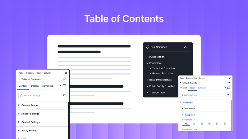
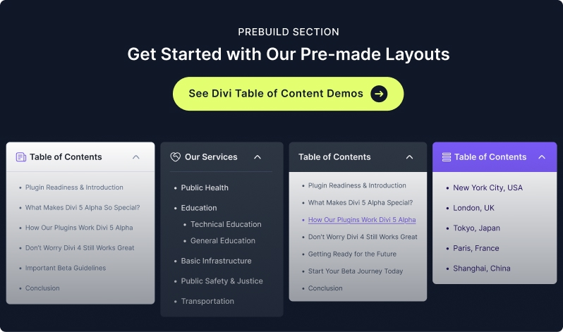
The Table of Contents (TOC) module for Divi Essential is a powerful tool designed to improve user experience and SEO. It automatically generates a navigable list of headings from your page, allowing users to jump to specific sections instantly.
Content Tab
The Content Tab is where you define the structure and data source of your TOC.
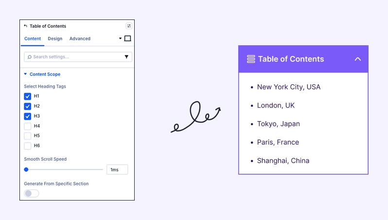
Content Scope:
Select Heading Tags: Choose which headings (H1 – H6) should appear in the TOC.
Scroll Offset: Adjust the stopping point when a user clicks a link (useful for sticky headers).
Smooth Scroll Speed: Control the duration of the scroll animation.
Generate From Specific Section: Enable this to limit the TOC to headings within a specific part of the page rather than the whole page.
Collapsible Table: Toggle whether users can expand or collapse the TOC.
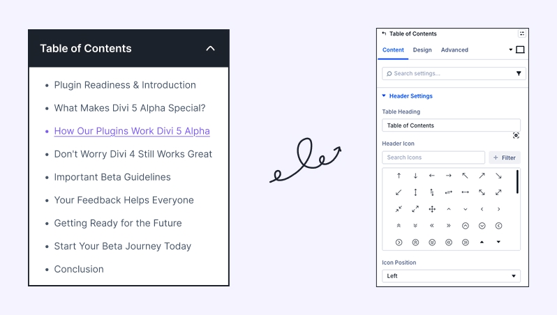
Header Settings:
Table Heading: Enter the title for your TOC (e.g., "In This Article" or "Summary").
Header Icon: Choose an icon to display next to your heading.
Icon Position: Set the icon to the Left or Right of the text.
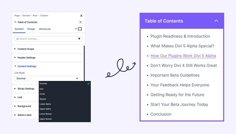
Content Settings:
List Style: Select how your list items are displayed (e.g., Decimal, Bullets, or None)
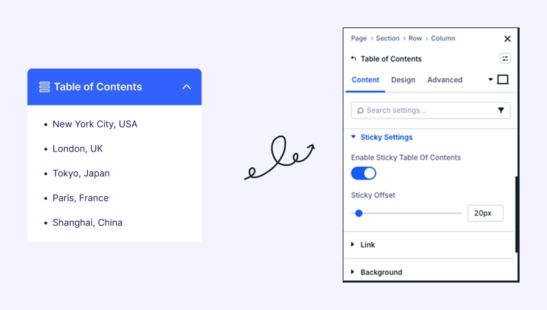
Sticky Settings
Enable Sticky TOC: Keep TOC visible while scrolling.
Link
Optional link settings (usually not needed).
Background
Set background color, gradient, or image for the TOC container.
Admin Label
Rename the module for easy identification in Divi Builder.
Design Tab
The Design Tab gives you full control over the visual aesthetics of the TOC.
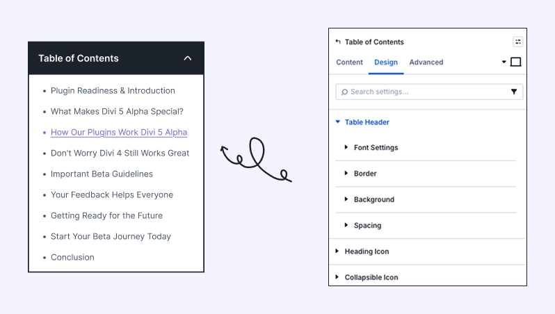
Table Header:
Font Settings: Customize the font, weight, style, and color of the TOC title.
Background: Apply a specific background color or gradient to the header area.
Spacing: Adjust the internal padding and external margins of the header.
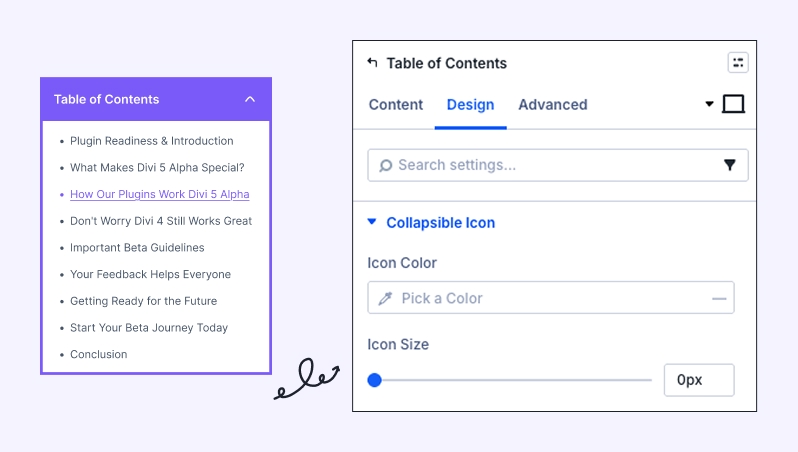
Heading Icon & Collapsible Icon
Customize icon size, color, and alignment.
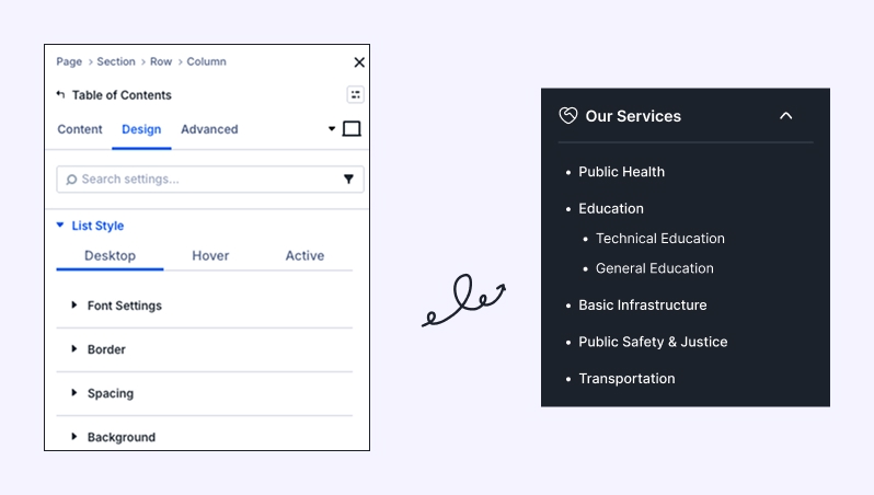
List Style (Desktop & Hover):
This section allows you to style the actual links within the table. You can set different styles for the Idle state and the Hover state.
Font Settings: Style the text of the heading links.
Spacing & Background: Add padding between list items and set background colors for the list container.
Sizing:
Control the Width, Max Width, and Alignment (Left, Center, Right) of the entire TOC module.
Set Min/Max Height to ensure the TOC fits perfectly within your layout.
Border & Box Shadow:
Add borders, rounded corners (Border Radius), and shadow effects to make the TOC pop off the page.
Borders & Box Shadows
Add structure and depth for a premium look.
Filters & Transform
Apply subtle effects for creative designs.
Animation
Entrance animations (fade, slide) for smooth loading.
