Easily guide your visitors to the top of your pages with a stylish and customizable “Back to Top” button. This extension for Divi Essential enhances user navigation with extensive customization options, seamlessly integrating with your Divi theme.
The Back to Top Button extension for Divi Essential provides a smooth and customizable way for users to quickly scroll back to the top of any page on your Divi website. While Divi offers a default back-to-top button, this extension elevates that functionality by providing significantly more control over the button’s appearance, placement, and behavior.
You can personalize the button to perfectly match your site’s design, choosing from various icon and text combinations, adjusting colors, controlling icon sizes, defining button positioning, and even managing its visibility on different devices. All settings are conveniently managed within the Divi Essential admin area, featuring a real-time preview to see your changes instantly.
✅ Dependency: Please note that this extension relies on Divi’s default “Back to Top Button” option being enabled. If Divi’s native back-to-top feature is disabled in your Divi Theme Options, this extension’s button will not be visible.
✅ Getting Started
Enabling and configuring the Back to Top Button is straightforward:
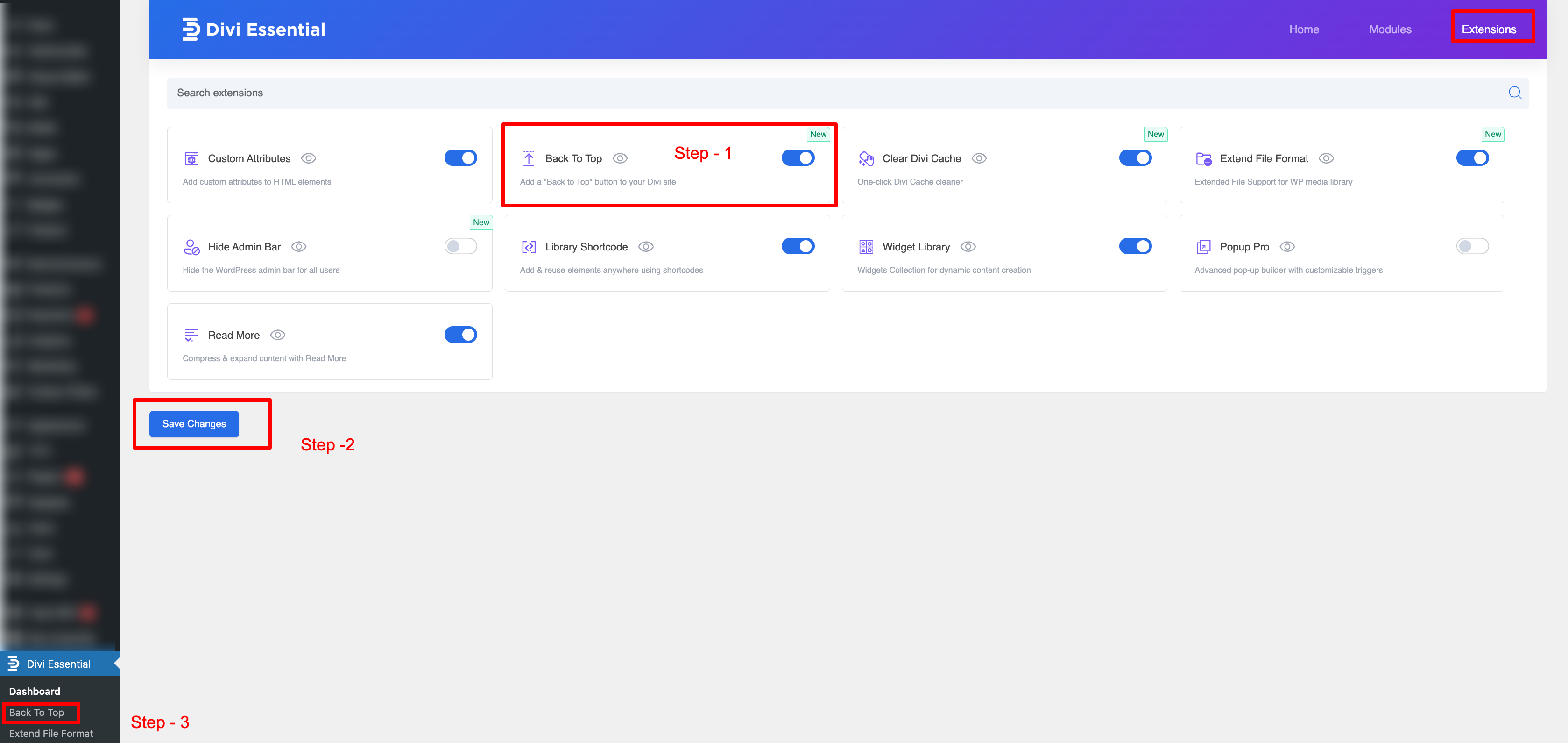
- Navigate to the Divi Essential settings panel in your WordPress dashboard.
- Locate the “Extensions” tab or section.
- Find the “Back to Top Button” extension and ensure it is enabled.
Once enabled, you can access its dedicated settings panel to begin customization.

✅ Key Features & Functionality
This extension offers a robust set of features to create the perfect back-to-top experience:
✅ Flexible Content Styling:
- Button Style: Choose to display an Icon Only, Text Only, or Icon & Text.
- Text Display (for Text or Icon & Text styles): Opt for Horizontal or Vertical text orientation.
- Icon Types:
- Dashicon: Select from WordPress’s built-in Dashicon library.
- Custom Image: Upload your image to use as an icon.
- External Image URL: Link to an image hosted elsewhere.
✅ Advanced Button Customization:
- Icon/Image Size: Precisely control the size of your icon or uploaded image in pixels.
- Border Radius: Adjust the roundness of the button’s corners in pixels.
- Colors: Customize the Button Background Color and Button Hover Background Color.
- Button Padding: Define specific padding values (top, right, bottom, left) in pixels for the button content.
✅ Precise Button Positioning:
- Button Position: Display the button on the Left Side or the Right Side of the screen.
- Offsets: Fine-tune the button’s exact position using Right Offset (or Left Offset, depending on selection) and Bottom Offset values in pixels.
✅ Mobile Visibility:
- Responsive Control: A simple toggle to control the button’s visibility on mobile devices, ensuring an optimal experience.
After enabling “Mobile Visibility,” you will gain access to additional controls specifically designed for mobile devices, allowing you to precisely position where the “Back to Top” button appears on mobile screens.
Input Field (e.g., 1024 PX): Enter a pixel value in this field. The “Back to Top” button will remain hidden until the user’s browser window or device screen width reaches or exceeds this specified pixel value. For example, if set to “1024 PX,” the button will only appear on screens that are 1024 pixels wide or larger.
✅ Real-Time Live Preview:
See your customizations in real-time directly within the settings panel via the “Back To Top Button – Preview” area.
✅ How to Configure Your Back to Top Button
- Access Settings: In your WordPress dashboard, navigate to Divi Essential and find the settings area for the Back To Top Button extension.
- Dependency Check: Before you begin, ensure Divi’s native “Back To Top Button” is enabled. You can find this under Divi > Theme Options > General > Back To Top Button. If this feature is turned off, the Divi Essential Back To Top button won’t be activated from the dashboard.
- Main Settings Tabs: The configuration options are organized into three main tabs: Content Style, Button Customization, and Button Position.
✅(Tab 1) Content Style: - Select Button Style: Choose from the dropdown:
- Icon Only
- Text Only (Assumed, based on typical options and your previous draft)
- Icon & Text (Assumed, based on typical options and your previous draft)
- Display Text: (This option likely appears if Text Only or Icon & Text is selected)
- Horizontal
- Vertical
- Icon Type: Select your preferred icon source:
- Dashicon: If selected, a field will appear to “Select Dashicon” (e.g., dashicons-arrow-up-alt2). Click “Select Icon” to browse and choose.
- Custom Image: If selected, an option to upload an image will appear.
- External Image URL: If selected, a field to paste the image URL will appear.
- ✅(Tab 2) Button Customization:
- Icon/Image Size: Enter a numerical value in pixels (e.g., 24 PX).
- Border Radius: Enter a numerical value in pixels to round the button’s corners (e.g., 5 PX).
- Button Background Color: Click “Select Color” to choose a background color for the button.
- Button Hover Background Color: Click “Select Color” to choose a background color for when the mouse hovers over the button.
- Button Padding: Enter numerical values in pixels for Top, Right, Bottom, and Left padding (e.g., 10 PX for all).
- ✅(Tab 3) Button Position:
- Button Position: Select from the dropdown:
- Right Side
- Left Side
- Right Offset / Left Offset: Depending on your “Button Position” choice, a field for either “Right Offset” or “Left Offset” will be available. Enter a numerical value in pixels (e.g., 10 PX).
- Bottom Offset: Enter a numerical value in pixels to set the distance from the bottom of the screen (e.g., 10 PX).
- Mobile Visibility: Use the toggle switch to enable or disable the button’s visibility on mobile devices. (Blue/On typically means visible, Grey/Off means hidden on mobile).
- ✅ Save Settings: After configuring all options to your preference, click the “Save Settings” button (or similar, like “Save Changes”) to apply your customizations.