Introduction
The Header & Navigation extension for Divi Essential provides powerful, easy-to-use controls to completely transform your website’s header and primary navigation. Utilizing the intuitive WordPress Customizer, this extension allows you to implement modern design, enhanced functionality, and a seamless user experience without writing code.
Getting Started: Enabling the Header & Navigation Extension
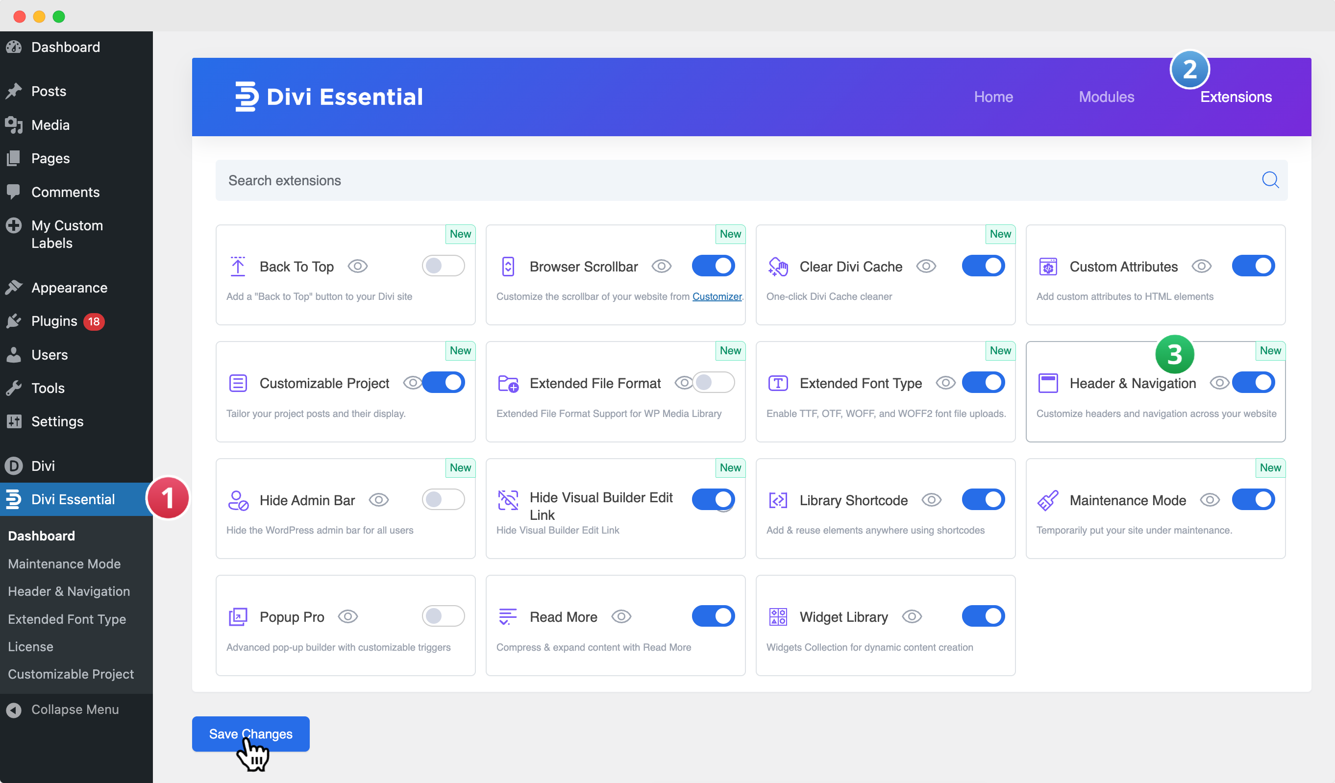
Navigate to Divi Essential
❗️Make sure your Divi Essential Plugin is active!
- Go to your WordPress Dashboard → Divi Essential → Open the Extensions Tab → Locate Header & Navigation.
- Enable Header & Navigation and click Save.
The Two-Step Customization Process
To ensure all customization options are available and functional, you must first Activate the features in the backend, and then Customize the styles via the WordPress Customizer.
Step 1: Backend Activation
The backend settings page is where you enable the core functionality. Only features enabled here will appear in the Customizer.
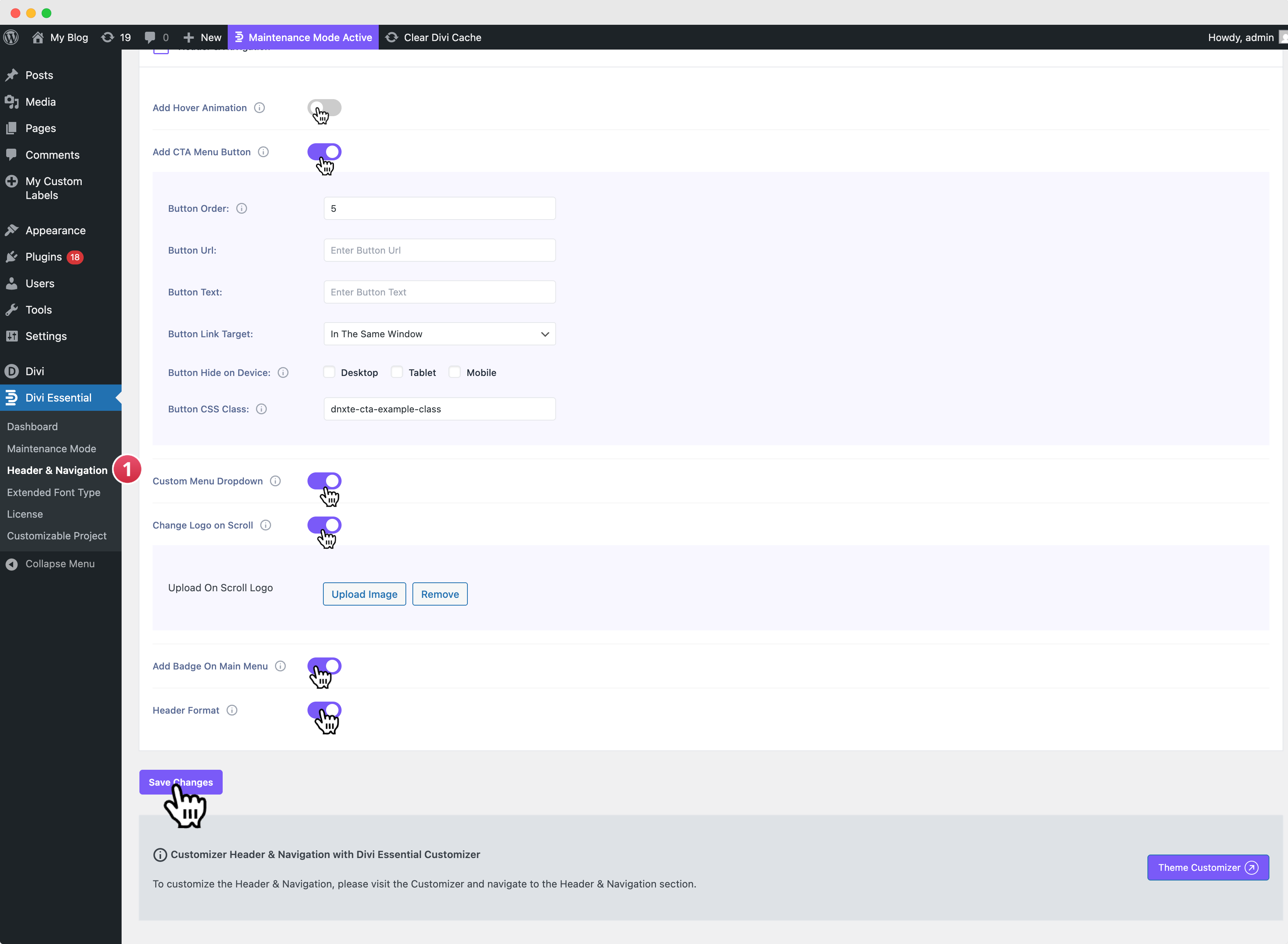
- From your WordPress dashboard, navigate to Divi Essential and then locate the Header & Navigation tab.
- Review and Enable Features: Use the toggles to activate the features you wish to customize, such as Add Hover Animation, Add CTA Menu Button, Custom Menu Dropdown, Change Logo on Scroll, and Add Badge on Main Menu.
- Configure Initial Settings: For features like the CTA Button, you can define basic parameters (Button Text, URL, etc.) here.
Save Changes: Click the Save Changes button at the bottom of the page to apply your selections.
Step 2: Customizer Customization
Once activated, all styling controls are available in the Customizer.
- From your WordPress dashboard, navigate to Appearance → Customize.
- In the Customizer menu, click the Header & Navigation section to view the settings menus.
Customization Options Overview
Customization: Header Elements
These simple fields allow you to add essential utility features to your header.
Show Social Icons: Check this option to display social media icons within your header.
Show Search Icon: Check this option to display a clickable search icon within your header.
Phone Number: Enter the phone number you want to display in the header area.
Email: Enter the email address you want to display in the header area.
Customization: Call To Action Button Style
This controls the style for the CTA button you enabled in the backend.
Call to Action Button Font: Select the font family for the button text. You can adjust this setting group using the following options: Font Size, Header Font Weight, Letter Spacing, Font Style (Bold, Italic, Uppercase, Underline), Text Color, and Hover Text Color.
Icon Settings: Select an icon to display next to the button text. You can adjust this setting group using the following options: Select Icon, Icon Color, Icon Size, Icon Gap, and Icon Position (Right Side or Left Side).
Button Design: Define the visual behavior and spacing of the button. You can adjust this setting group using the following options: Hover Effect, Button Padding (Top, Right, Bottom, Left), Button Background Color, and Button Hover Background Color.
Customization: Dropdown Settings Style
This defines the styling for all sub-menus that drop down from the main navigation.
Dropdown Menu Font: Select the font family for your dropdown menu items. You can adjust this setting group using the following options: Font Size, Header Font Weight, Letter Spacing, and Font Style (Bold, Italic, Uppercase, Underline).
Submenu Link Colors: Define the colors for the link text. You can adjust this setting group using the following options: Submenu Link Color and Submenu Link Hover Color.
Dropdown Visuals: Control the effects and icons within the dropdown. You can adjust this setting group using the following options: Hover Effect and Select Icon.
Display Dropdown Box Shadow
Toggle this setting on to enable a shadow effect around the entire dropdown box. You can adjust this setting group using the following options: Hover Background Shadow Color, Shadow Offset X, Shadow Offset Y, Shadow Blur, Shadow Spread, and Shadow Color.
Customization: Header Format
These settings define the overall structure and behavior of your header.
Header Style: Allows you to select a pre-defined layout or structural style for your entire header.
Navigation Structure: Modify the basic header behavior. You can adjust this setting group using the following options: Enable Vertical Navigation and Hide Navigation Until Scroll.
Header Shadow: Control shadow effects for the header. You can adjust this setting group using the following options: Display Main Header Shadow (default state) and Display Fixed Header Shadow (sticky state).
Fixed Header Shadow Controls: Define the appearance of the fixed header shadow. You can adjust this setting group using the following options: Fixed Header Shadow Color, Fixed Header Shadow Offset X, Fixed Header Shadow Offset Y, Fixed Header Shadow Blur (Blur radius, e.g., 10), and Fixed Header Shadow Spread (Size/spread, e.g., 2).
Customization: Primary Menu Bar
This controls the main navigation bar and its general appearance.
Menu Bar Layout: Control the basic structure and sizing. You can adjust this setting group using the following options: Make Full Width, Hide Logo Image, Menu Height, and Logo Max Height.
Typography: Define the text styles for the main menu items. You can adjust this setting group using the following options: Text Size, Letter Spacing, Font, and Font Style (Bold, Italic, Uppercase, Underline).
Color Settings: Set the colors for various states and components. You can adjust this setting group using the following options: Text Color, Active Link Color, Background Color, Dropdown Menu Background Color, Dropdown Menu Line Color, and Dropdown Menu Text Color.
Dropdown Menu Animation: Select an animation effect for when the dropdown menu appears.
Header Primary Style: Customize interactive elements and spacing. You can adjust this setting group using the following options: Hover Text Color, Fixed Header Hover Text Color, Menu Item Spacing, Fixed Header Menu Item Spacing, Hover Animated Color, Hover Fixed Animated Color, Element Padding (Top, Right, Bottom, Left), Hover Background Shadow Color, Hover Style to Active Menu, Hover Effect on Dropdown, and Menu Badge Style.
Customization: Secondary Menu Bar
This controls the optional top or bottom navigation bar.
Menu Bar Layout: Control the basic structure. You can adjust this setting group using the following option: Make Full Width.
Typography: Define the text styles for the secondary menu items. You can adjust this setting group using the following options: Text Size, Letter Spacing, Font, and Font Style.
Color Settings: Set the colors for the background, text, and dropdown elements. You can adjust this setting group using the following options: Background Color, Text Color, Dropdown Menu Background Color, and Dropdown Menu Text Color.
Dropdown Menu Animation: Select an animation effect for when the dropdown menu appears.
Customization: Fixed Navigation Settings
These controls override the default header styles specifically when the header is fixed/sticky to the top of the screen.
Hide Logo Image: Check this option to hide the main logo image when the header is in its fixed state.
Fixed Menu Height: Adjust the vertical height of the menu bar when it is sticky (e.g., 40px).
Text Size: Adjust the size of the menu link text when the header is fixed (e.g., 14px).
Background Color: Define the background color for both menu bars when the header is sticky. You can adjust this setting group using the following options: Primary Menu Background Color and Secondary Menu Background Color.
Link Color: Define the color of the link text for both menu bars when the header is sticky. You can adjust this setting group using the following options: Primary Menu Link Color and Secondary Menu Link Color.
Active Primary Menu Link Color: Choose the color for the link text of the currently active page in the primary menu when the header is sticky.

