Popup Pro: The Complete User Guide
Welcome to the latest addition to the Divi Essential plugin – the Popup Pro extension. This extension enhances your website’s interaction and engagement by displaying various types of Pop-ups (Promoting special offers, collecting email subscriptions, and sharing Essential announcements).
We have added unlimited functions and customizability to the Popup Pro extension, enabling you to create dynamic and creative Popups that effectively target your desired audience and boost your business.
Whether you are a web designer or a website owner, Popup Pro is here to elevate your online presence to the next level.
Getting Started: Enabling the Popup Pro Extension
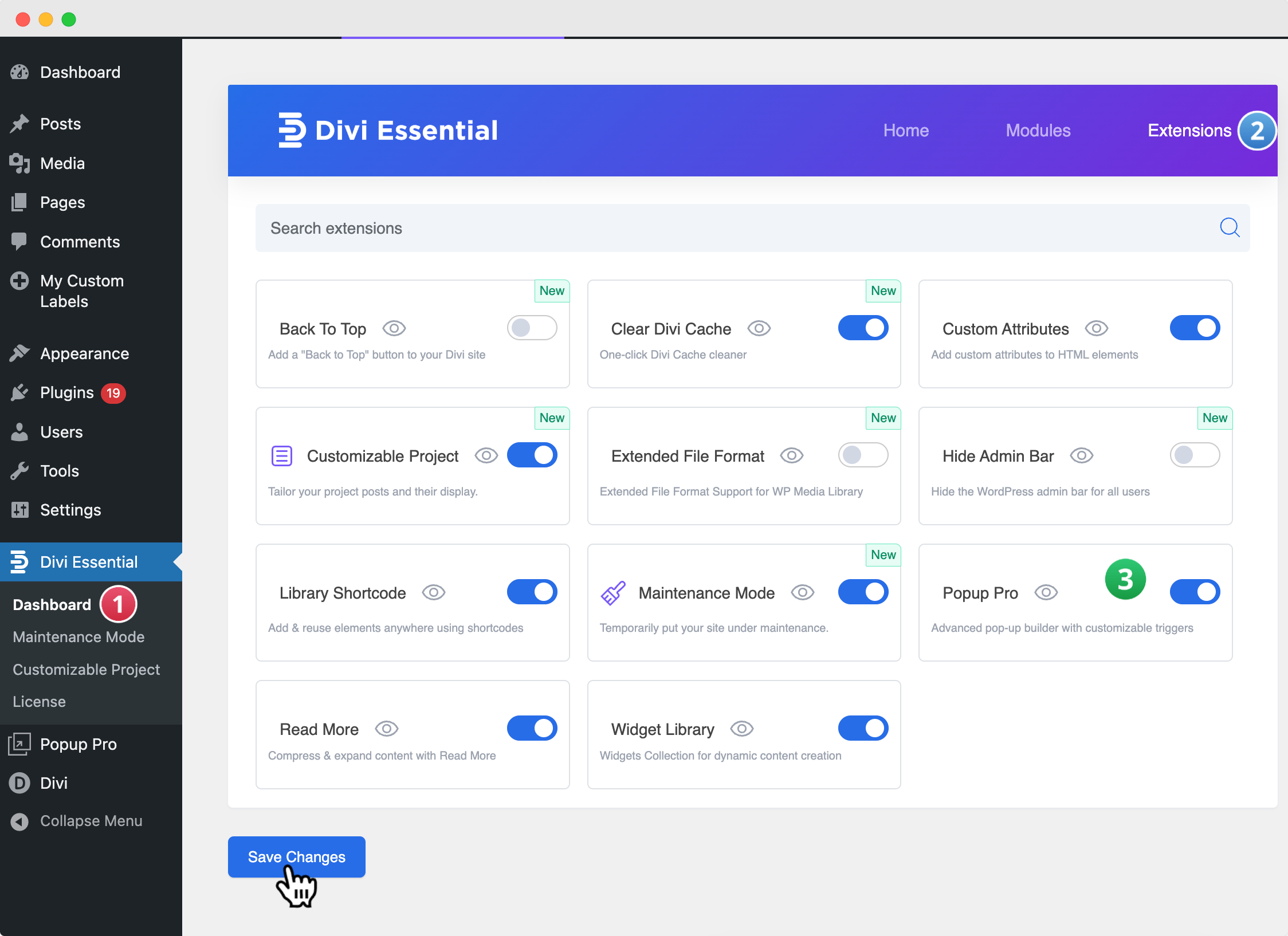
Navigate to Divi Essential
❗️Make sure your Divi Essential Plugin is active!
- Go to your WordPress Dashboard → Divi Essential → Open the Extensions Tab → Locate Popup Pro.
- Enable Popup Pro and click Save.
Enable PopUp Pro for Divi Builder
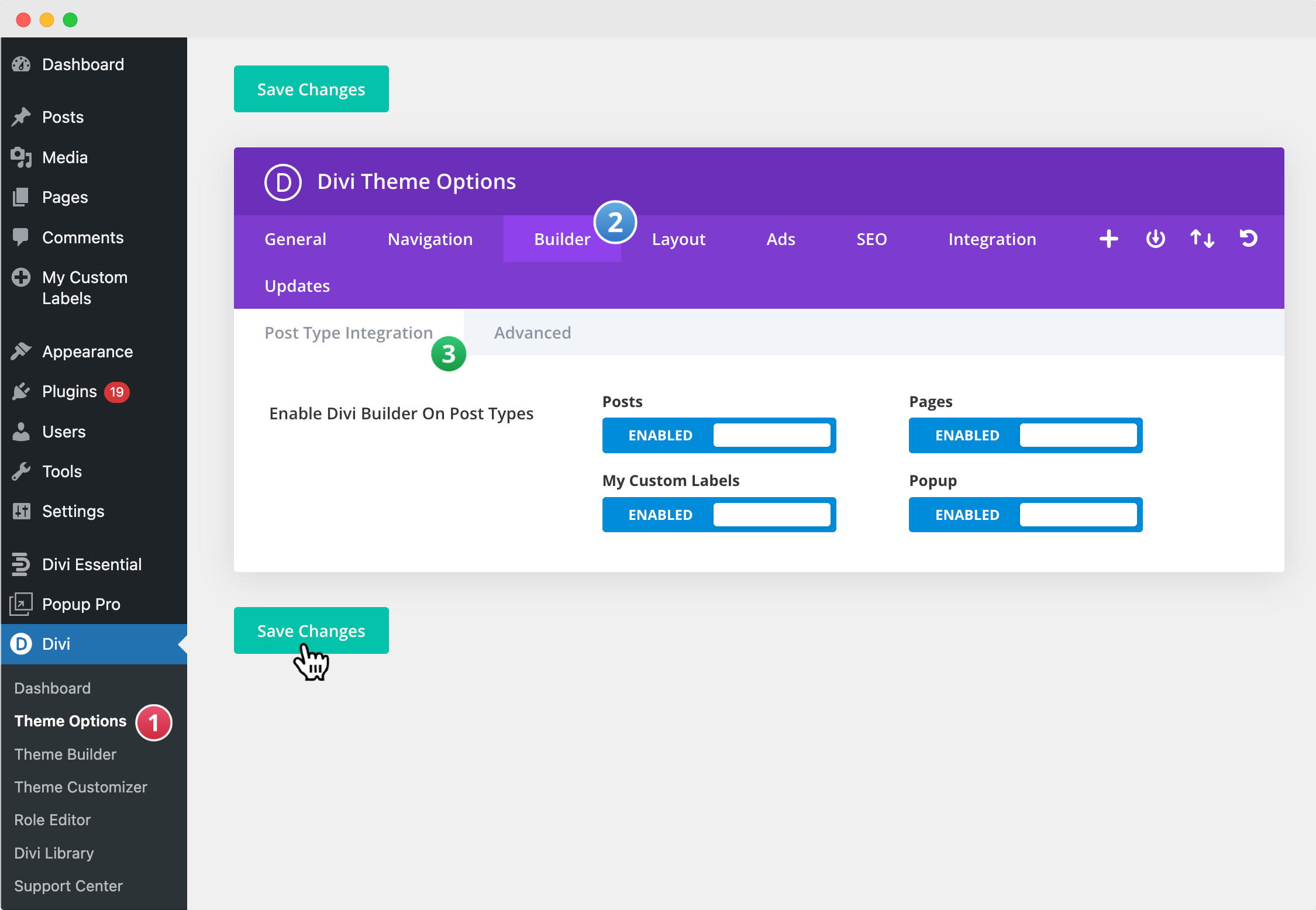
- Go to your WordPress Dashboard → Divi → Theme Options → Builder → Post Type Integration.
- Enable PopUp Pro and click Save.
Create Your First PopUp Using Divi
Add a New PopUp Pro
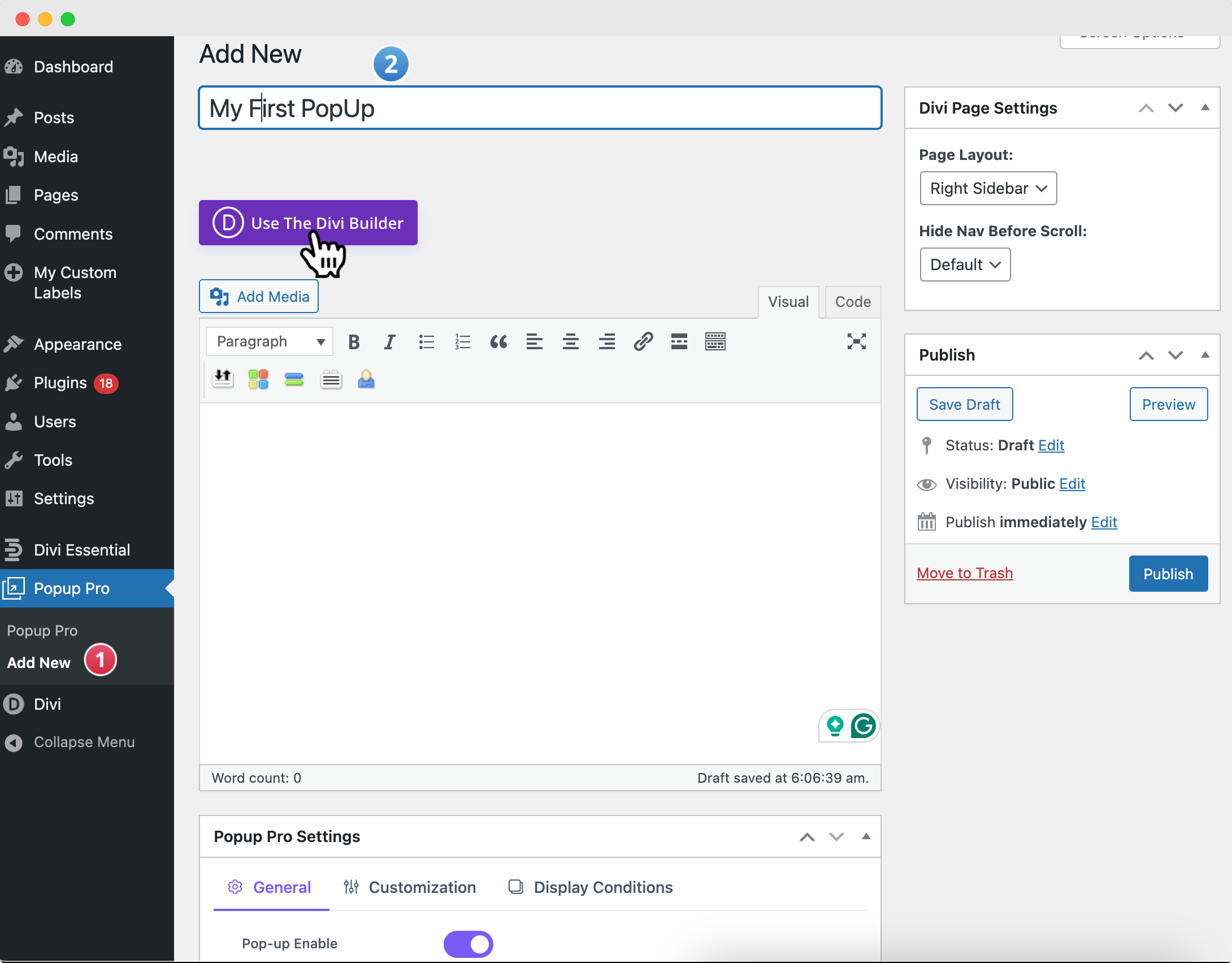
- From your WordPress Dashboard, navigate to PopUp Pro → Add New.
- This will open a new editor page (WordPress/Gutenberg editor).
- Enter a Title for your Popup Pro(e.g., First PopUp).
- Since you’ve enabled PopUp Pro Post Type Integration, you will also see the option “Use Divi Builder.”
Configure PopUp Pro Settings
Before designing, you can configure the essential display settings found below the editor:
- Enable: Ensure that the PopUp is enabled from the editor.
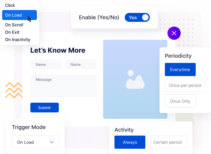
- Trigger Mode: Set how the bar appears (on page load, on click, on exit intent, on scroll, or on inactivity).
- Other Options – Adjust additional behavior settings as needed.
Once you’ve configured the PopUp Pro settings, the next step is to launch the Visual Builder to design your first PopUp using Divi.
Launch the Visual Builder
- Click on Use Divi Builder to start designing.
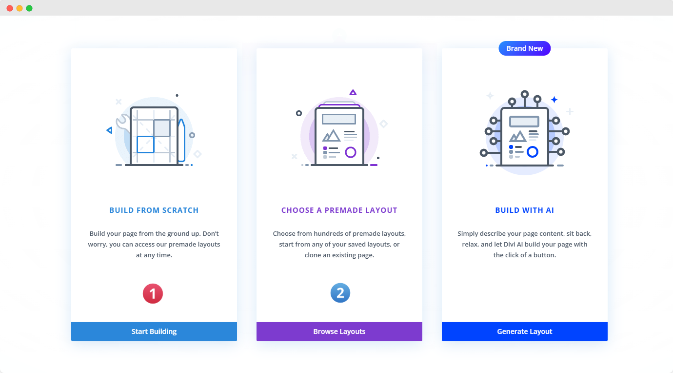
- You’ll be prompted to choose how to create your alert bar:
- Build From Scratch – Design your own layout entirely. You can import the JSON file ready to use on our site.
General Tab Settings
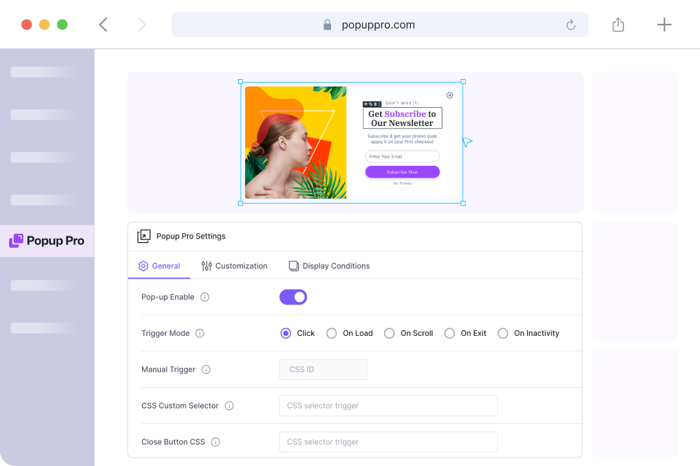
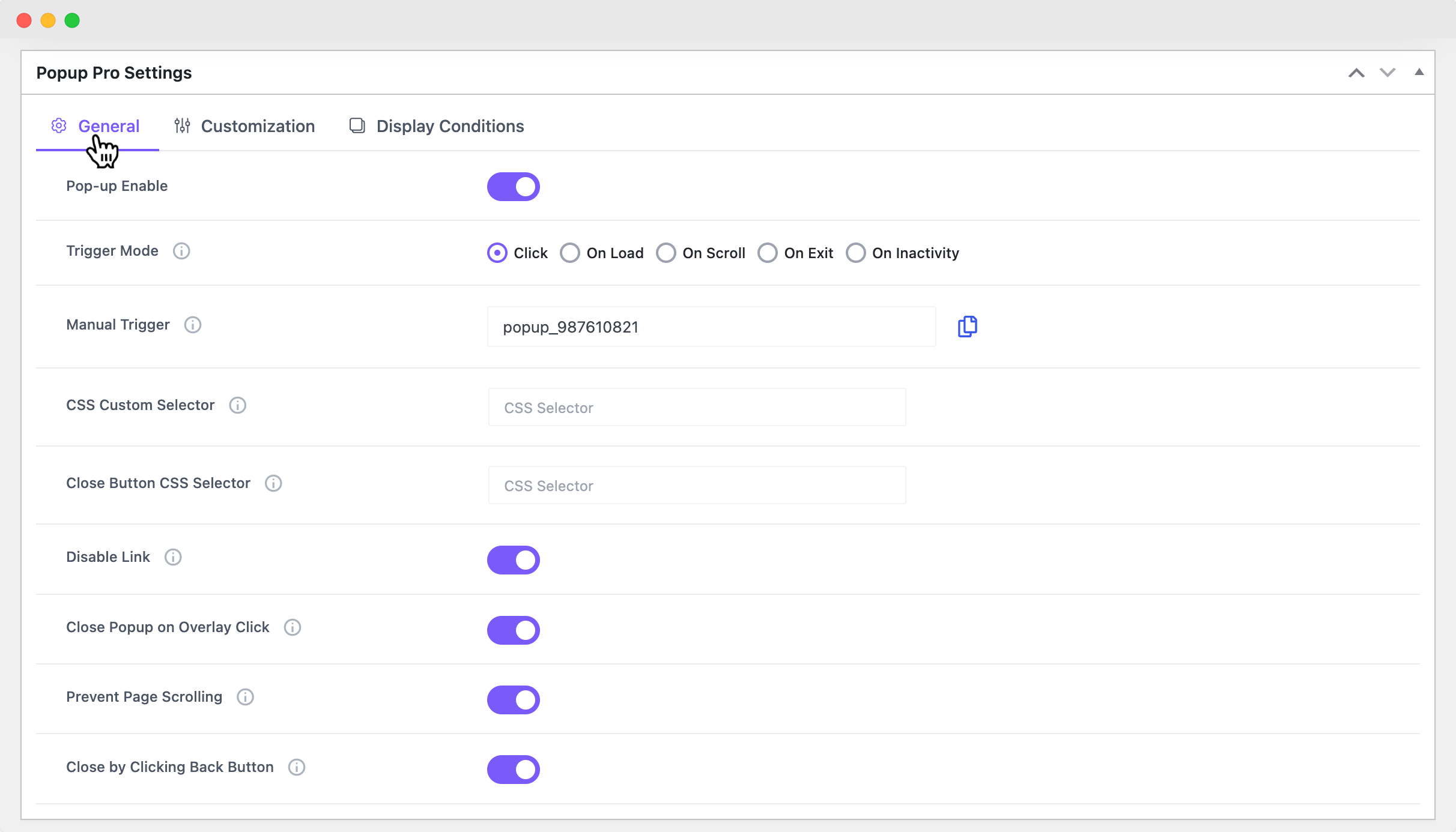
In the Popup Pro Dashboard, you will find the following settings:
- Use Divi Builder – This will allow you to design your Pop-up using the Divi Builder.
- Popup Pro Settings – Here, you can configure and customize your Popup and publish for public appearance.
Trigger Options
Define what action should cause the alert bar to appear. Options include:
- On Load – Display immediately when the page loads (optionally with a delay).
- On Scroll – Display after the user scrolls a certain percentage of the page.
- On Exit – Trigger when the mouse moves toward the top of the browser window.
- On Inactivity – Show after the user has been idle for a set period.
- Each trigger will expand with its own additional controls, so you can customize how it behaves.
Manual Trigger: You can manually trigger popups using a CSS ID. This feature allows you to activate the Popup by using the specified CSS ID. You can use the default CSS ID which is generated for individual popups.
Custom CSS Selector: You can define custom CSS selectors to target specific elements for Popup activation. Specify CSS selectors (e.g., .popup-class, #pop-upid) to trigger popups.
Closing CSS Selector: This option specifies the CSS selector that will close the open Popup. Define the selector for elements that will close the currently displayed popup.
Close On Overlay Click: Here, you can use this option so that the Popup should close when users click on the background overlay. Toggle this option to enable or disable the ability to close the Popup by clicking outside the Popup area.
Clickable Under Overlay: This setting enables website elements to remain clickable when a Popup is open and displayed over them. Toggle this option to allow users to interact with elements beneath the overlay.
Prevent Page Scrolling: It prevents page scrolling, enable the “Prevent Page Scrolling” option.
Close By Clicking Back Button: Close the Popup when the browser or mobile back button is clicked, and activate the “Close By Clicking Back Button” setting.
Customization Tab Settings
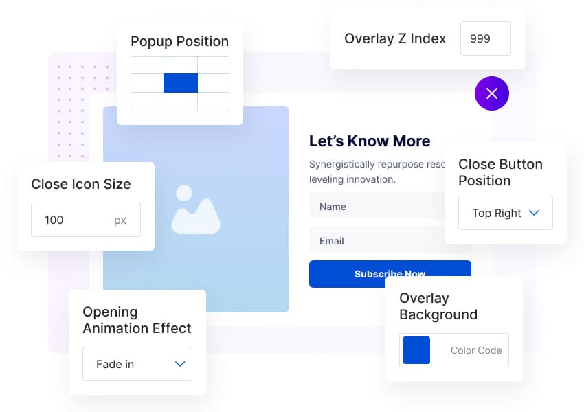
In this tab, you have complete control over your Popup’s appearance and functionality. You can adjust the overlay, animation, positioning, blur effect, and even the close button.
The close button can be hidden or placed inside the popup on certain devices.
To create a visually stunning design, you can customize the close button’s color, background, position, icon size, padding, margin, and border-radius.
These settings empower you to design a beautiful and user-friendly popup that suits your website’s style and user experience.
Display Tab Settings
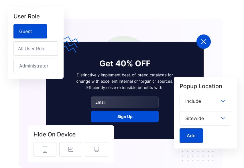
In the user role, the Popup extension offers precise control over which user roles can access and view the Popup content on a website.
Here, you can configure Popup display settings. You can specify Popup visibility by user role. Define the display area, including/excluding specific pages, posts, projects, or Popups.
