The Data Table module for Divi Essential (Divi 5) is a high-performance tool designed to organize and display complex datasets with ease. It features seamless integration with multiple data sources—including CSV, Google Sheets, and TablePress—while providing visitors with intuitive front-end tools like real-time search, multi-column sorting, and pagination for a professional, user-friendly experience.
Need Introduction Video Here…
Table Content
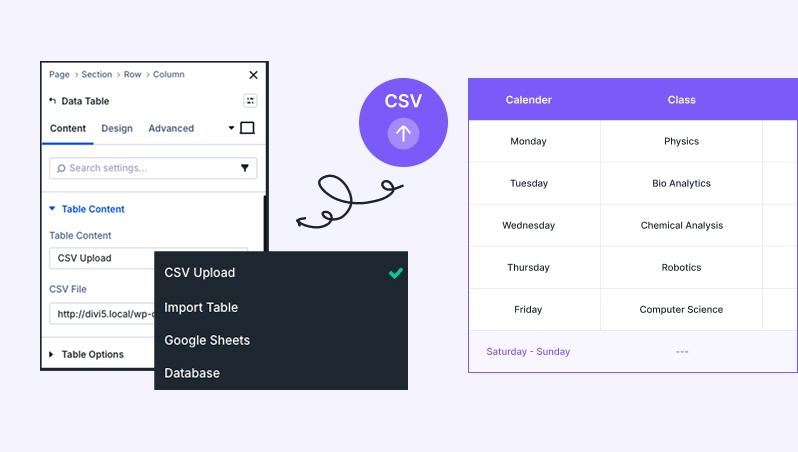
This section allows you to choose how your data is imported or connected to the module. You can select from several powerful data source options:
Table Content
Need an image here to describe Table Content.
CSV Upload: Use this to quickly populate your table by uploading a standard .csv file. This is perfect for static data that you have already organized in Excel or Google Sheets.
Import Table: This option allows you to bring in data from other supported table formats or existing table modules within your site.
Google Sheets: Connect your table directly to a Google Sheet. This enables dynamic updates, where changes made in the Google Sheet can reflect automatically on your website.
Database: For advanced users, this allows you to fetch and display data directly from your WordPress database tables.
Table Options
Table Options
Need an image here to describe Table Option.
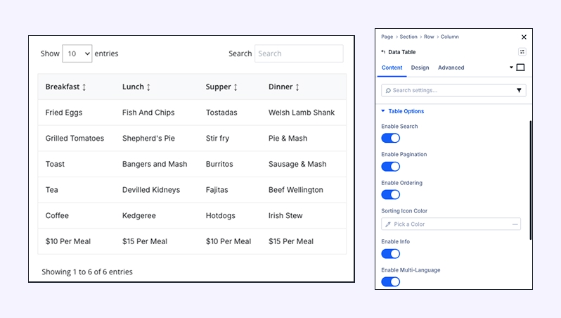
These settings control the functional behavior of the table on the front end, ensuring your users can navigate large datasets easily.
Enable Search: When toggled on, a search bar will appear above the table. This allows visitors to quickly filter the table to find specific keywords or values.
Enable Pagination: Use this for larger tables. It breaks the data into multiple pages (e.g., 10 rows per page) to keep your layout clean and improve page load speed.
Enable Ordering: This enables “Sortable Columns.” When active, users can click on a column header to sort the data in ascending or descending order.
Sorting Icon Color: Customize the color of the arrows that appear next to sortable column headers. This ensures the UI matches your brand’s color palette.
Enable Info: Toggle this to show or hide the table metadata (e.g., “Showing 1 to 10 of 50 entries”) usually located at the bottom of the table.
Enable Multi-Language: Turn this on if you need to provide translated versions of the table interface elements (like the search placeholder or pagination text).
Language: Choose the default language for the table’s built-in strings (Search, Previous/Next, etc.) from the dropdown menu.
Design Tab
Table
Table Options
Need an image here to describe Table Option.
or it can be merge as table option, table head, table body in one frame.
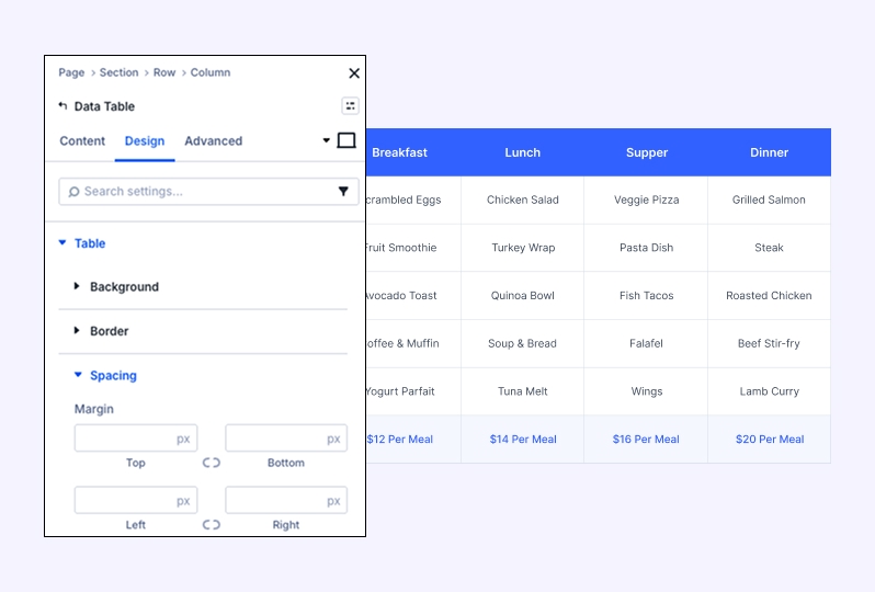
This section controls the overall container of the data table.
Background: Set a custom background color, gradient, or image for the entire table area.
Border: Define the border styles, including weight, color, and corner rounding for the table container.
Table Head
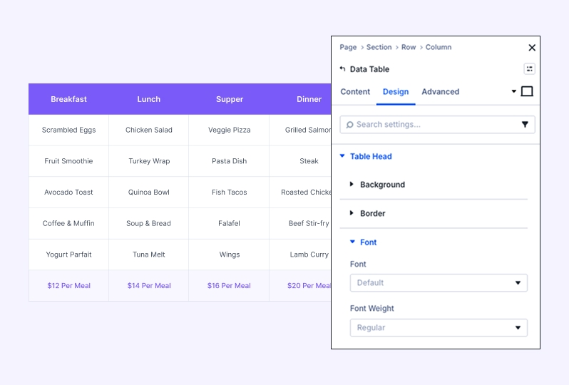
Style the top header row to make your column titles stand out.
Background: Apply a specific color to the header row.
Border: Adjust borders specifically for the header area.
Font: Customize the typography for column titles, including font family, weight, style, and color.
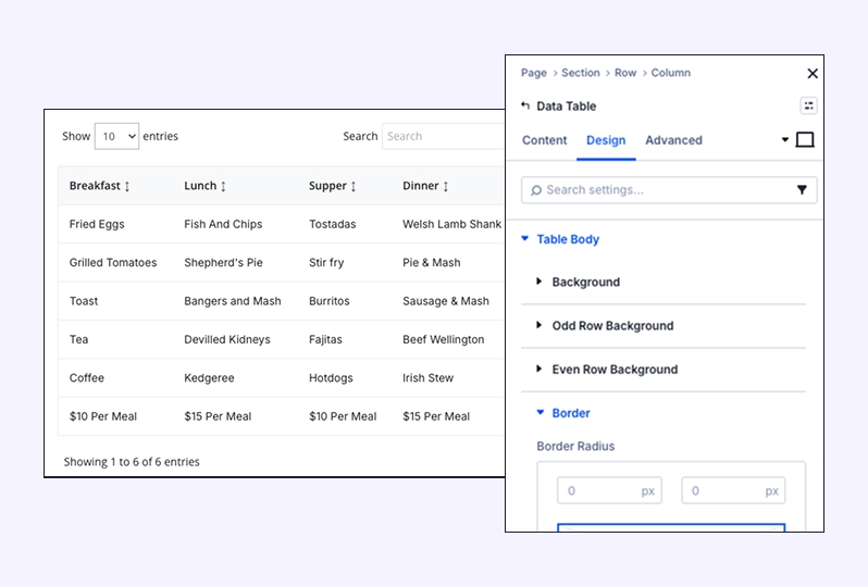
Table Body
Background — Base background for the data area.
Odd Row Background — Alternate row color to improve readability.
Even Row Background — Complementary alternate color.
Border — Row/cell separators.
Font — Typography controls for body cells.
Border & Font: Control the cell borders and text styling for all data entries.
Search & Info
here need an image
Search, pagination style, font style, and sizing can be merged into 1
or can add a short GIF video to show all of these.
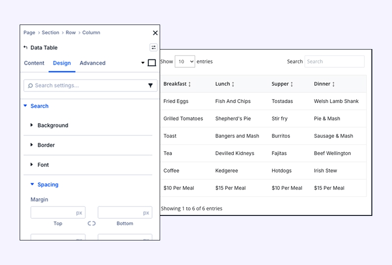
Customize the appearance of the interactive search bar and the table information text.
Search Styling: Adjust the background, border, and font for the search input field.
Info Styling: Style the background, border, and font for the table metadata (e.g., “Showing 1 of 10”).
Pagination & Font Style
Fine-tune the navigation controls at the bottom of your table.
Button Backgrounds: Set distinct colors for standard buttons and the “Active” page button.
Pagination Dot: Customize the style of the pagination separator.
Font Style: Provides granular control over the Input Font, Active Button Font, and Inactive Button Font.
Sizing
Control the physical dimensions and alignment of the module.
Size & Width: Choose between automatic or custom widths and set a Max Width.
Alignment: Align the table to the left, center, or right of its container.
Height: Set Min Height, Height, or Max Height limits.
Column Class: Assign specific classes for advanced CSS targeting.
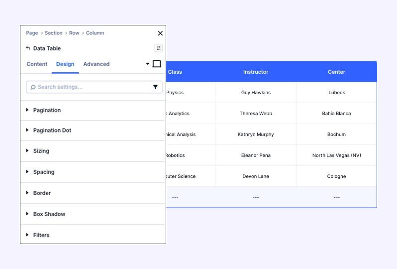
Standard Design Settings
The Data Table also includes standard Divi Essential design sections for full layout integration:
Spacing: Manage internal padding and external margins.
Box Shadow: Add depth with customizable shadows.
Filters: Apply CSS filters like brightness, contrast, or saturation.
Transform & Animation: Rotate, scale, or add entrance animations to your table.
