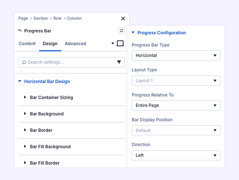
The Reading Progress Bar module for Divi Essential (Divi 5) is a high-performance tool designed to visualize completion. Whether you want to track a user's scroll progress through a long article, this module offers the flexibility of both Horizontal and Circular layouts.
Content Tab Settings
The Content Tab handles the logic and data source of your progress indicator.
Reading Progress Configuration
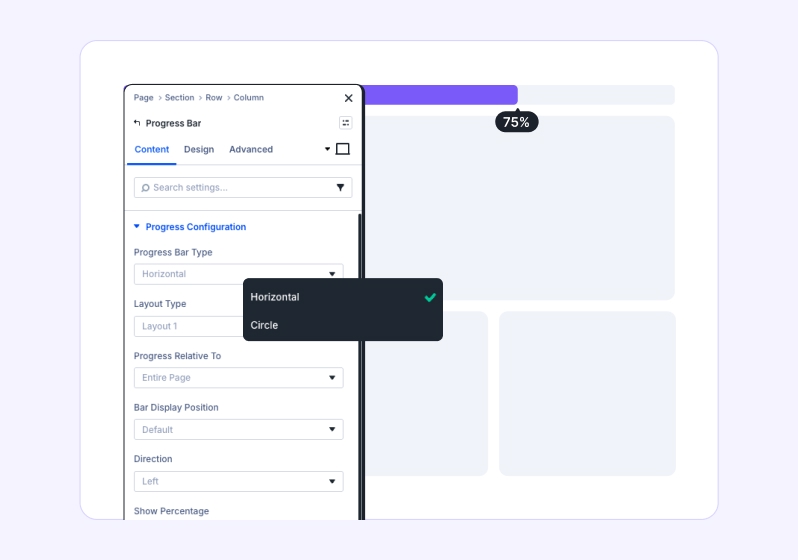
- Reading Progress Bar Type: Select Horizontal for a linear bar or Circle for a radial design.
- Tooltip Style: Choose from pre-defined layouts to display the percentage value in a styled bubble that follows the progress. Reading Progress Relative To: This is the "brain" of the module.
- Page: Tracks progress based on the entire height of the webpage.
- Selector: Tracks progress based on a specific section, row, or element on the page.
- Selector Field: (Visible when Selector is chosen) Enter the CSS ID (e.g., #my-article) or Class (e.g., .post-content) of the element you wish to track
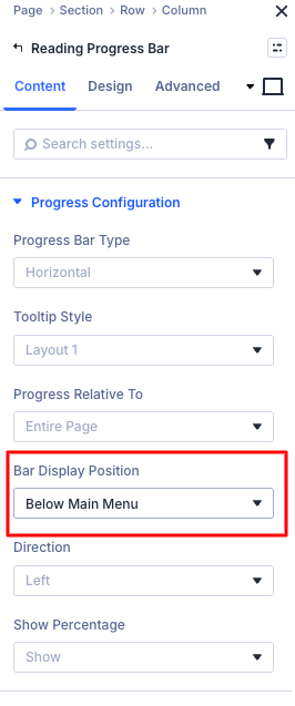
- Bar Display Position: Decide if the bar stays at its layout position or sticks to the Top or Bottom of the viewport. Show
- Percentage: Toggle to show or hide the numerical percentage text.
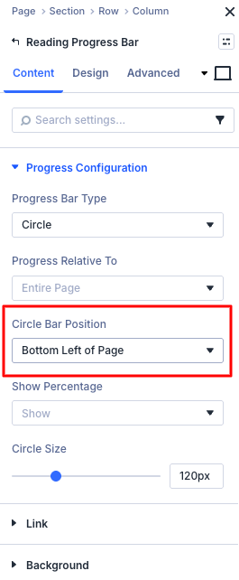
Choose the sticky position of the progress bar:
set Circle at the top, bottom-left, or bottom-right, and Horizontal at the top, below the main menu, or at the bottom of the page.
Design Tab Settings
Style every detail to match your brand's visual identity.
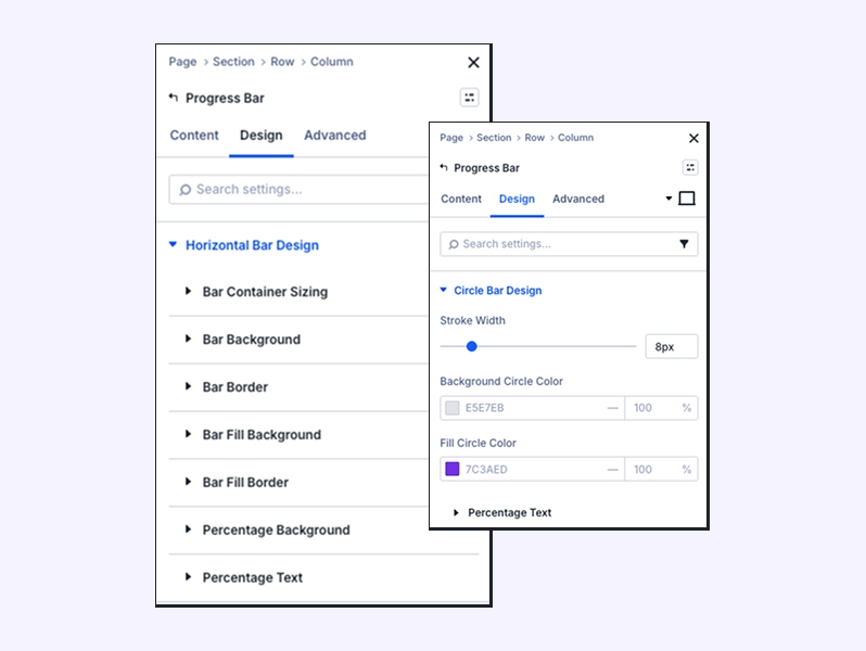
Horizontal & Circle Design
- Thickness: Adjust Bar Height (Horizontal) or Stroke Width (Circle) to control the weight of the progress line.
- Colors: Separately style the Background (the empty track) and the Fill (the active progress).
- Percentage Text: For Circle layouts, use the dedicated Percentage Text sub-section to control the font, weight, and size of the number centered in the ring.
Pro Guide
Tracking a Specific Section (Selector Mode)
One of the most powerful ways to use this module is to track progress for a specific long-form article while ignoring the header, footer, and sidebar.
Step 1: Assign an ID to your Target Section
- Open the settings of the Section or Row that contains your main article text.
- Go to the Advanced Tab > CSS ID & Classes.
- In the CSS ID field, type a unique name, for example: reading-area.
Step 2: Configure the Reading Progress Bar - Open your Reading Progress Bar module settings.
- In the Content Tab, set Reading Progress Relative To to Selector.
- In the Selector field, type your ID with a hashtag: #reading-area.
Step 3: Set the Position
If you want the bar to follow the user as they scroll through that specific section, set the
Bar Display Position to Top.
Why use this? By targeting a specific ID, the Reading progress bar will only start filling when the user reaches the #reading-area and will hit 100% exactly when that section ends, providing a much more accurate "reading time" experience than tracking the whole page.
Scroll Effects (Advanced Tab)
The Scroll Effects settings allow you to control how the Reading Progress Bar behaves while the user scrolls the page. These options are especially useful for keeping the progress bar visible and dynamically responsive to scrolling.
Sticky Position This option determines whether the Reading Progress Bar remains fixed on the screen while scrolling.
Available Options:
- Do Not Stick The progress bar scrolls normally with the page content.
- Stick to Top The progress bar stays fixed at the top of the viewport while scrolling.
✅ Recommended for header‑style reading progress bars. - Stick to Bottom The progress bar stays fixed at the bottom of the viewport.
- Stick to Top and Bottom The progress bar becomes sticky at both positions depending on scroll direction and layout.
Use Case Tip: For blog posts and long articles, Stick to Top provides the best reading experience.
