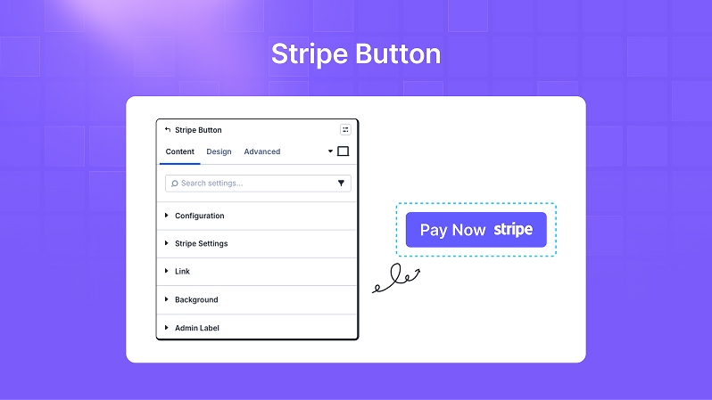
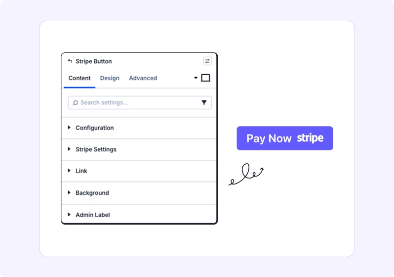
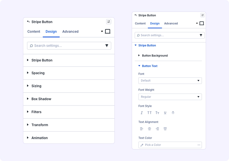
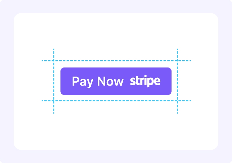
Stripe Button adds a customizable payment button to any Divi layout. Configure payment mode (Test/Live), post‑payment redirects, amount and currency (if exposed in your build), and fully style the button—without custom code. Ideal for single‑item purchases, tickets, donations, or instant access unlocks.
Backend Setup (Integration → Stripe)
Navigate to: Dashboard → Divi Essential → Integration → Stripe. Configure the following:
- 1) Test Mode – Secret Key
Paste your Stripe Test Secret Key (format typically starts withsk_test_...).
Use this during development to run non‑live transactions.
After saving, the module’s Payment Mode = Test will use this key. - 2) Live Mode – Secret Key
Paste your Stripe Live Secret Key (format typically starts withsk_live_...).
Use this for real payments after testing has passed.
After saving, the module’s Payment Mode = Live will use this key. - 3) Payment Currency
Select your default currency (e.g., United States (US) Dollar).
This currency will be used by Stripe Button unless you expose/override currency per module (if your build supports module-level currency).
Ensure your Stripe account supports the selected currency.
Save Changes: Click Save Changes to persist keys and currency globally. - Security Notes
Never publish or expose Secret Keys in front‑end code. Keep them in the backend integration screen only.
Use HTTPS sitewide for all payment pages.
Test keys and live keys are distinct—verify you’ve pasted the correct one for each mode.
Key Features
- One‑click Stripe Checkout (secure, PCI‑compliant via Stripe)
- Payment Mode: Test or Live, for safe staging and production
- Success URL & Cancel URL for clear user flow
Configurable - Amount/Currency (if available in your setup)
- Custom Button Text (e.g., “Pay Now”, “Buy Ticket”, “Donate”)
- Inline Success/Error Messages styling
- Full Design Controls: color, font size, spacing, shadows, filters, transforms, animations
- Responsive Controls for desktop, tablet, and mobile
- Note: Payments are processed on Stripe’s secure checkout page. Your site does not store card data.
Table Content
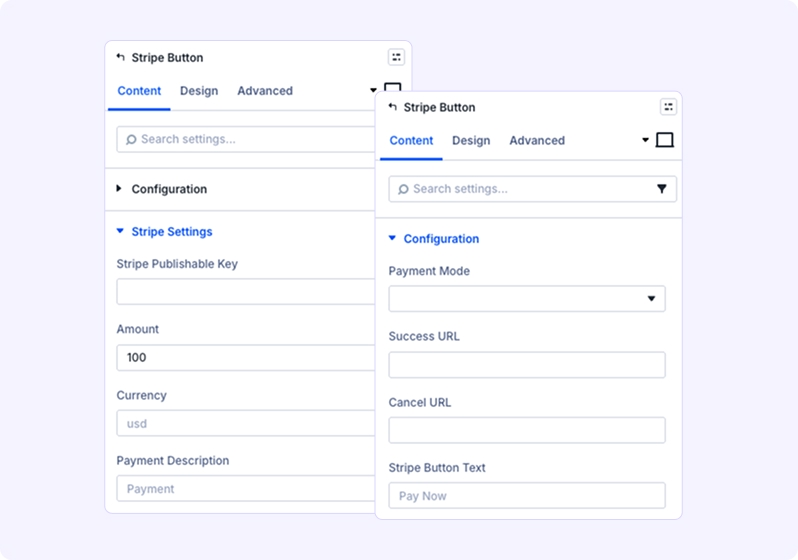
Payment Mode
Choose between:
- Test Mode: Recommended during setup for safe testing using Stripe test cards.
- Live Mode: Enable for real transactions once everything is verified
- Success URL
Enter the page URL where users will be redirected after a successful payment.
Example: /thank-you or a custom confirmation page. - Cancel URL
Enter the page URL where users will land if they cancel the payment or the checkout fails.
Example: /pricing or a support page. - Stripe Button Text
Define the call-to-action label displayed on the button.
Examples: Pay Now, Buy Access, Donate.
Amount & Currency (if available in your build) - Amount: Numeric value (e.g., 50.00).
Currency: ISO code (e.g., USD, EUR, GBP).
Tip: Always confirm your Stripe account supports the selected currency.
Link
Optional setting. Typically not required because the button itself triggers the Stripe Checkout process.
3. Background
Set a background for the module container:
Solid color, gradient, or image.
Useful for creating visual separation from other page elements.
4. Admin Label
Rename the module for clarity inside the Divi Builder interface.
Example: “Stripe – $50 Ticket” or “Stripe Donation Button”
Design Tab
Stripe Button Styling
1. Button Background Color
Choose a color that aligns with your brand identity. For Stripe-inspired designs, use #635BFF.
- Tip: Consider hover states with slightly darker shades for better interactivity.
Button Text Color
Ensure strong contrast between text and background for accessibility (WCAG AA/AAA compliance). - Example: White text (#FFFFFF) on a dark background.
- Button Font Size
Adjust using the slider for precise control.
2. Error Message Styling
Customize the appearance of error messages shown during payment failures or configuration issues:
- Text Color: Use attention-grabbing colors like red (#FF0000) for visibility.
- Typography: Bold or semi-bold for emphasis.
- Spacing: Add padding around the message for clarity.
3. Success Message Styling
Style confirmation messages for successful payments:
- Text Color: Green (#28A745) or your brand’s success color.
- Font Size: Slightly smaller than button text for hierarchy.
- Spacing: Ensure enough margin so it doesn’t overlap with other elements.
4. Spacing
Control layout precision:
- Margin: Adjust outer spacing to position the button correctly within the section.
- Padding: Add inner spacing for a comfortable tap target (minimum 12–16px vertical, 20–28px horizontal).
5. Sizing
Define button dimensions:
- Width / Max Width:
Full-width for mobile (100%).
Fixed width for desktop (e.g., 220–280px). - Height / Max Height:
Recommended: 44–56px for accessibility. - Alignment: Left, Center, or Right.
- Column Class: Use Fullwidth for hero sections or custom for grid layouts.
6. Box Shadow
Add depth for a premium look:
Blur: 12–16px,
Spread: 0,
Opacity: 10–15%,
Color: rgba(0,0,0,0.12)
Tip: Apply a subtle hover shadow for interactivity.
7. Filters
Enhance visual tone:
- Brightness: Slight increase for vibrant buttons.
- Contrast: Improve clarity without overdoing it.
- Saturation: Keep moderate for readability. Warning: Avoid extreme filter values—they can reduce accessibility.
8. Transform
Add micro-interactions for hover effects:
- Scale: Slight enlargement (e.g., scale(1.02)).
- TranslateY: Move up by 2px for a tactile feel.
- Rotate/Skew: Use sparingly for creative designs.
9. Animation
Create smooth entrance effects:
- Options: Fade, Slide, Zoom.
- Duration: 250–400ms for responsiveness.
- Delay: Use minimal delay for instant feedback. Tip: Combine subtle animation with hover transforms for a polished experience.
