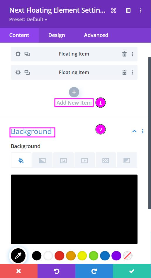
Content → New items → Background
- New Item – create new items to add animated floating items to your design. You can choose between floating text or a floating image.
- Background – add background color to your floating element design
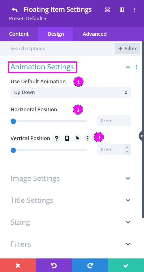
Design → New Item → Animation Settings
Pick from the seven unique float effects. You also get to custom make your float effect using the Custom effect.
- Use Default Animation – choose from the seven effects or use a custom effect.
- Horizontal Position – adjust the Horizontal Position using the slider.
- Vertical Position – edit the upright position using the slider.
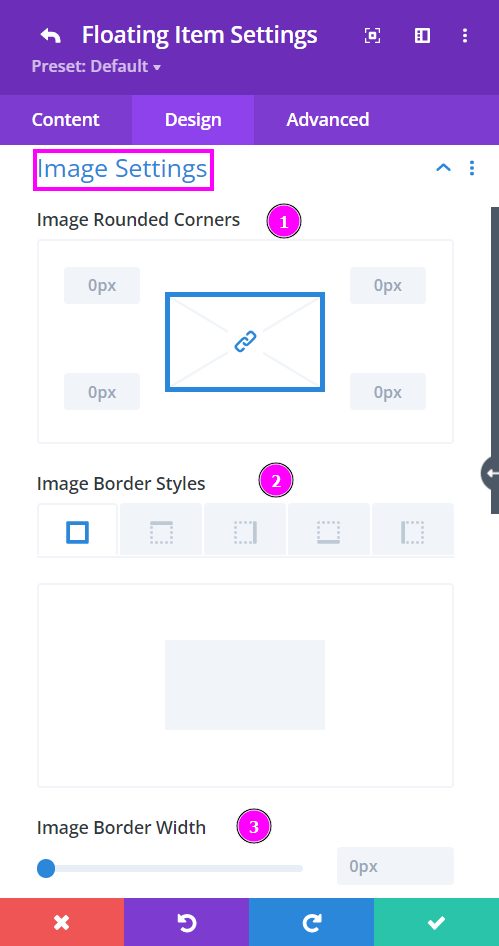
Design → New Item → Image Settings
For each item you add, you can separately add rounded corners, border, and border style for the image you’ve picked for the design layout. Same for the text; you can also stylize the text you’ve added.
Let’s go through what we have for Image Settings:
- Image Rounded Corners – include rounded corners around the edges of the image.
- Image Border Styles – add borders on all four sides or specific sides using border styles.
- Image Border Width – adjust the border width using the slider.
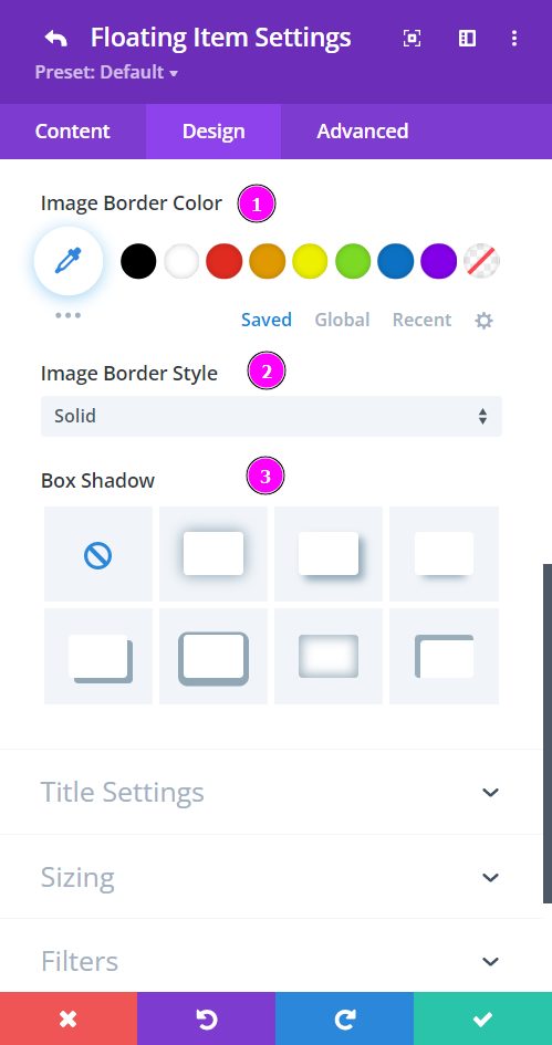
Design → New Item → Image Settings (continued)
For each item you add, you can separately add rounded corners, border, and border style for the image you’ve picked for the design layout. Same for the text; you can also stylize the text you’ve added.
Here are the rest of the image settings tools simplified:
- Image Border Color – add color to the border using the pointer or place the hex code to get the exact color you want for the design.
- Image Border Style – select a premade border style.
- Box Shadow – include box-shadow to the image and configure its settings.
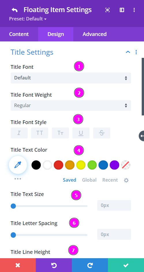
Design → Title Settings
- Font – Select a font from the collection or use a custom font.
- Font Weight – define how you want your font to show either regular, italic, bold extra, or even extra light.
- Font Style – Pick a style of font
- Text Color – manually select a color for the background of the text using the pointer, or you can state the hex code and get the exact color you require.
- Text Size – easily resize the text using the slider.
- Letter Spacing – you can space out the letters using the slider for an easier read for the website visitors.
- Line Height – adjust the space between the lines using the slider
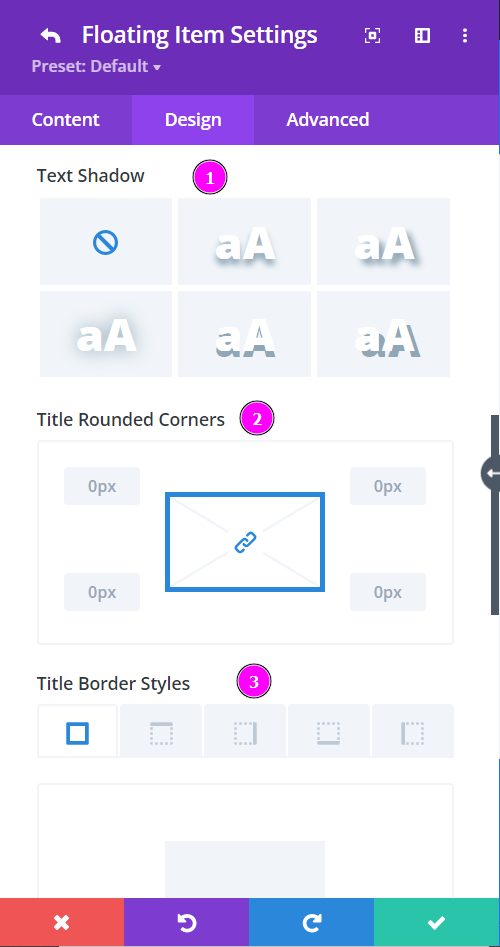
Design → Title Settings (continued)
- Text Shadow – add text shadow to have the texts highlighted.
- Rounded Corners – adjust the four corners to include rounded corners
- Border Styles – include borders on any side of the text or all four sides.
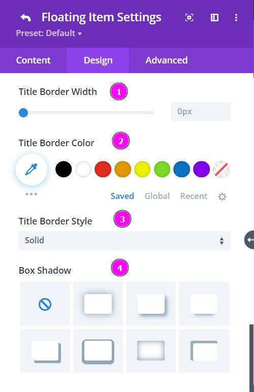
Design → Title Settings (continued)
- Border Width – adjust the width of the border using the slider.
- Border Color – pick a color for the border using the pointer or place the hex code to get the exact color you want for the design.
- Border Style – select a style of the border from the premade border styles.
- Box Shadow – Include a box shadow to the entire design. Choose the best one from the following shadows and adjust them to your liking.


